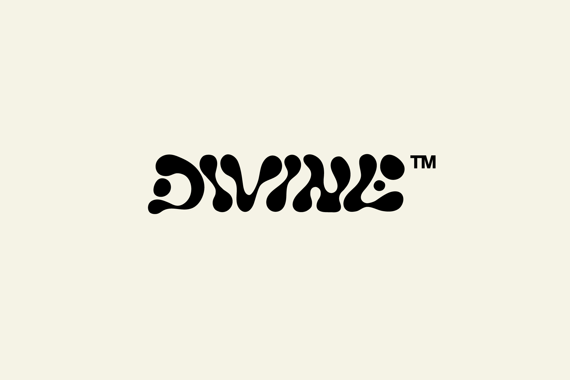
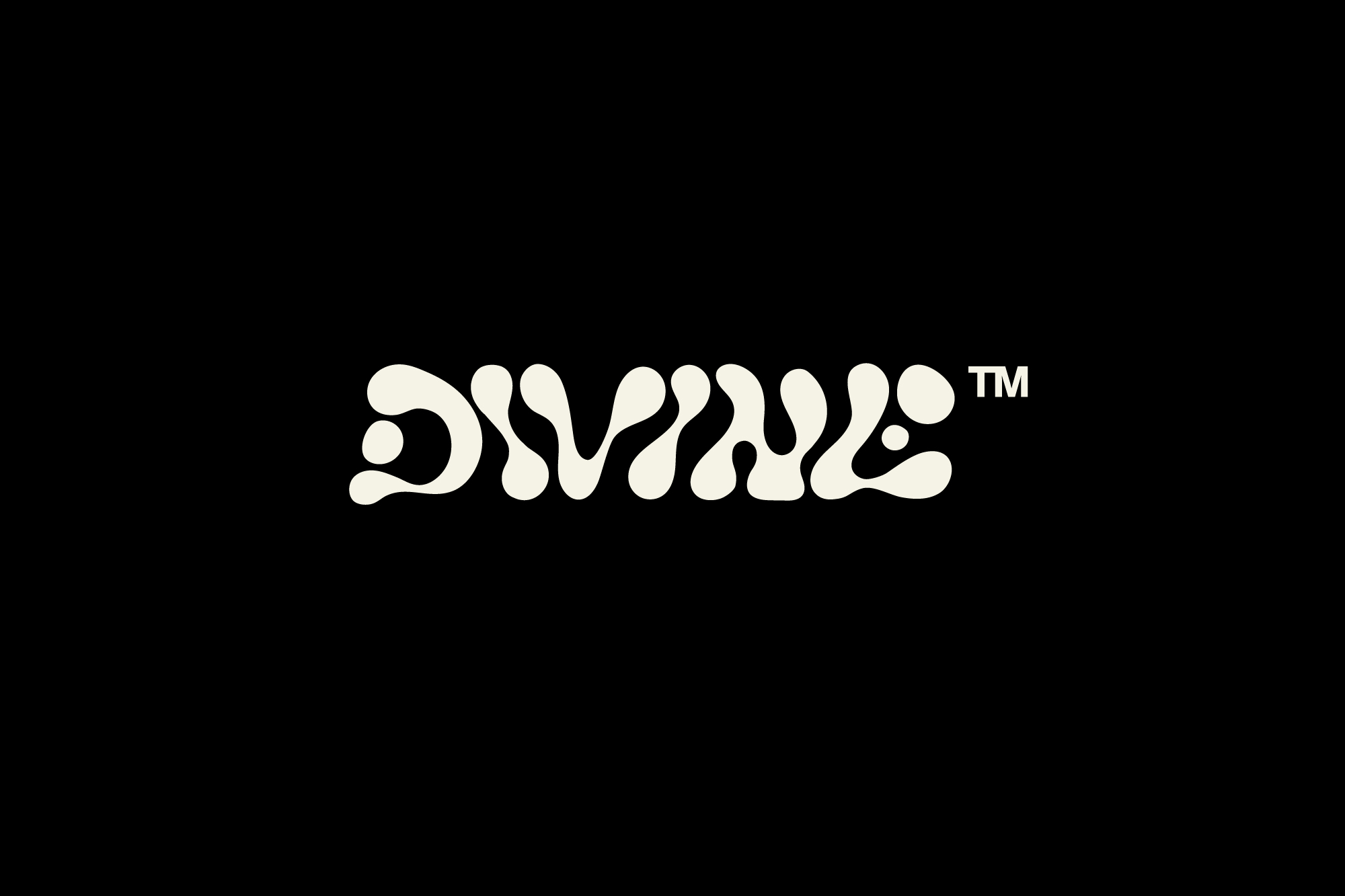
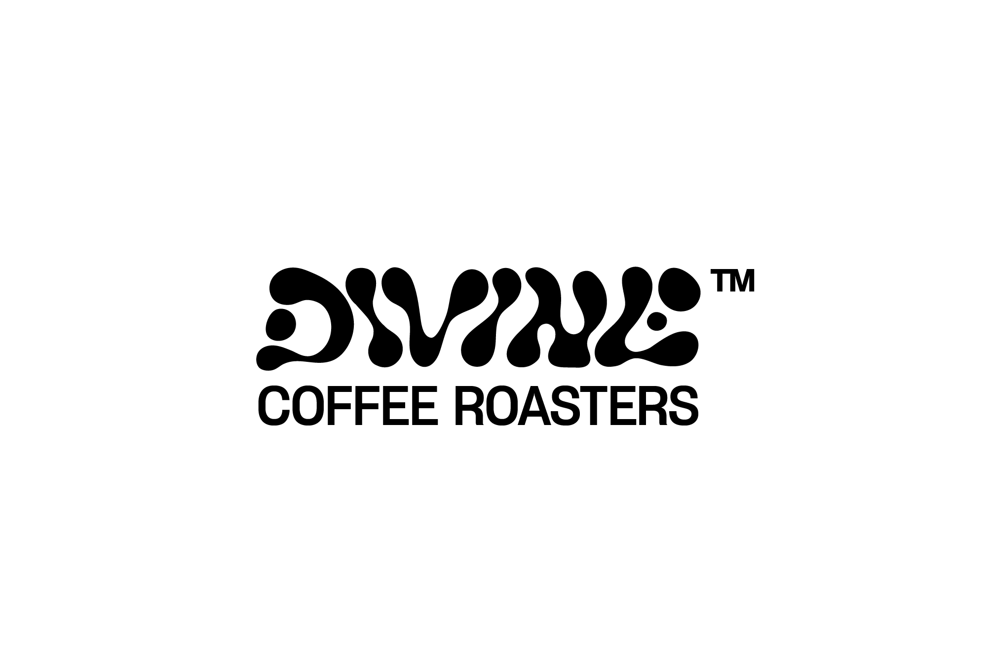
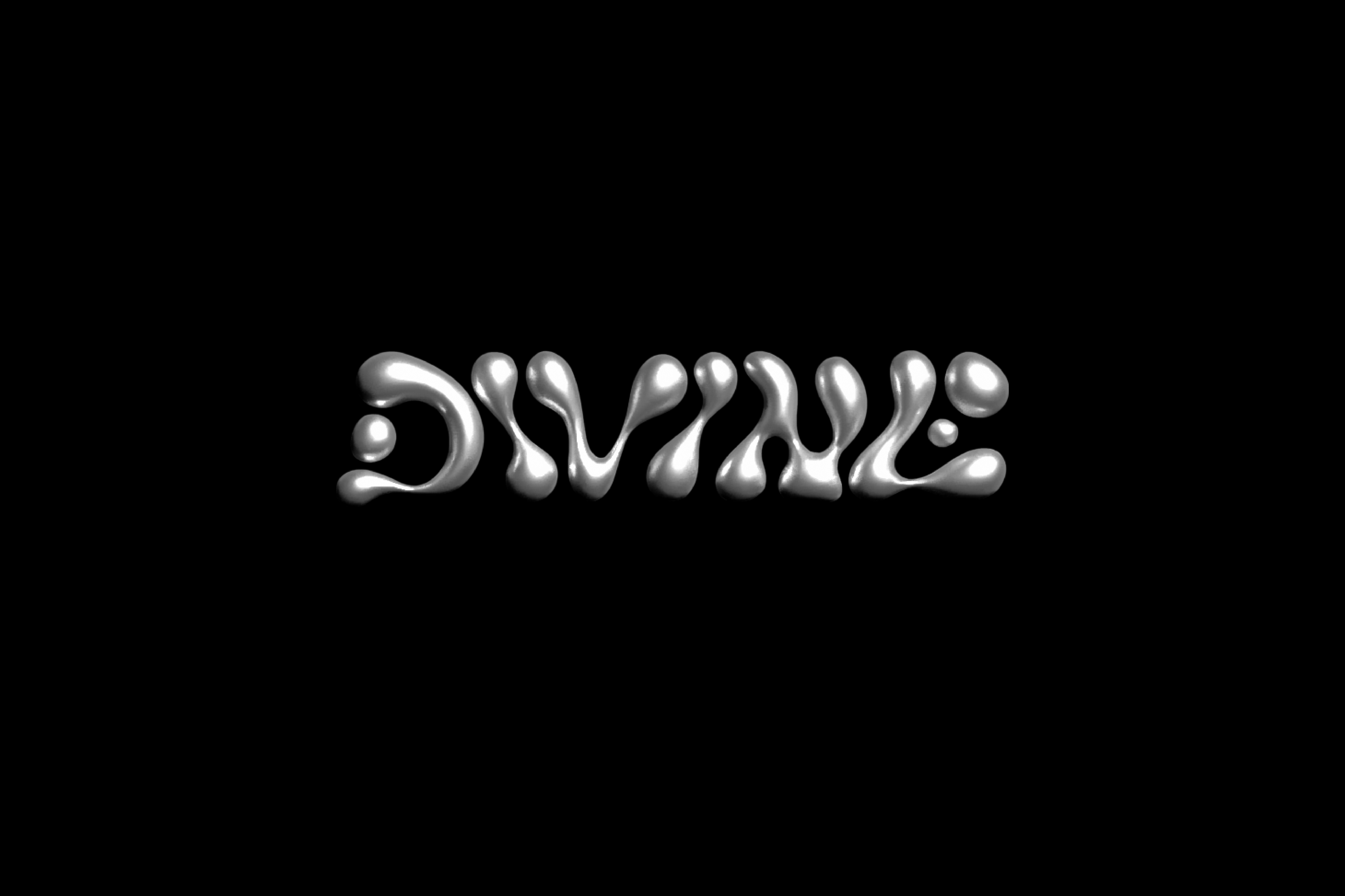
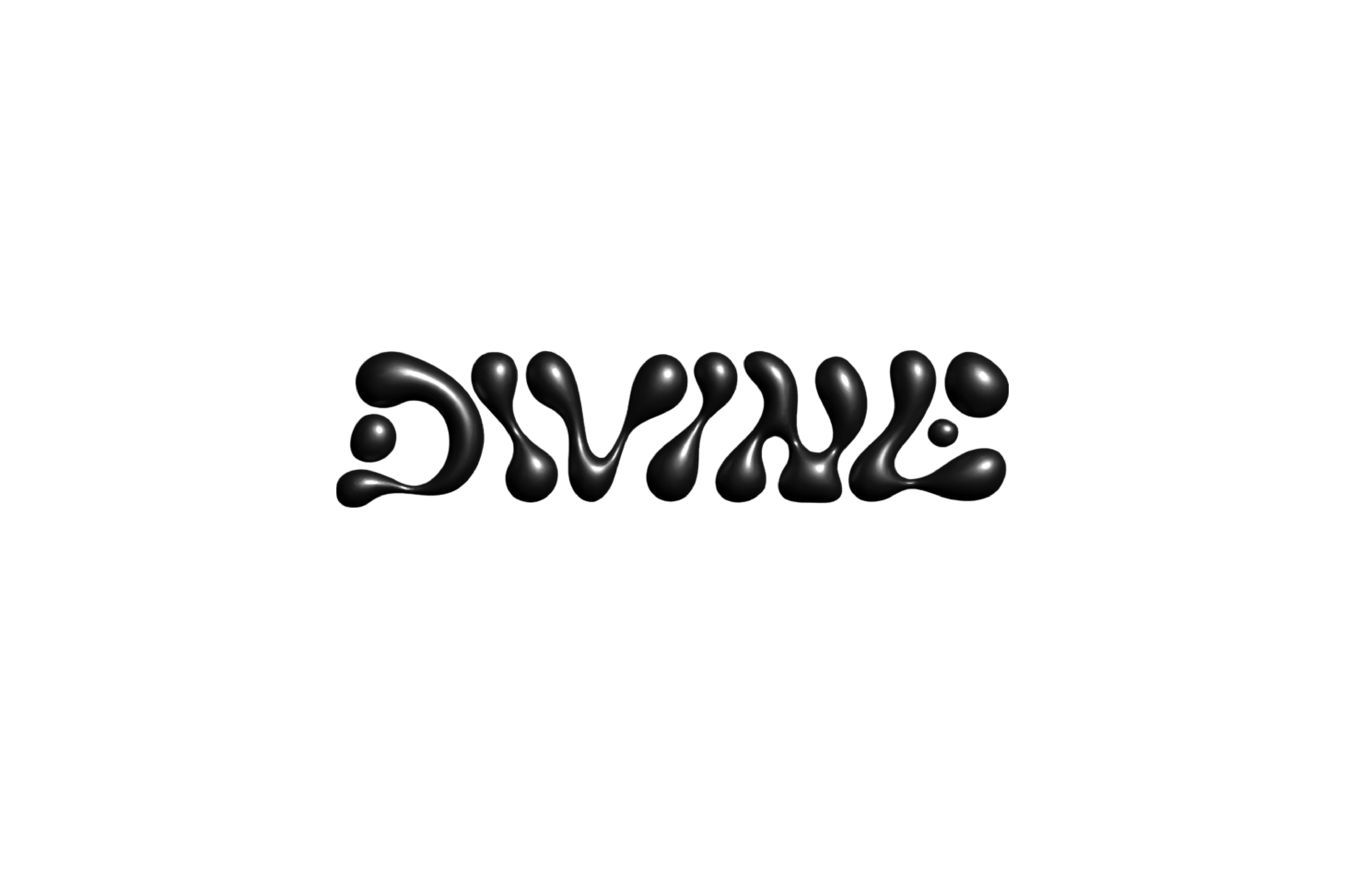
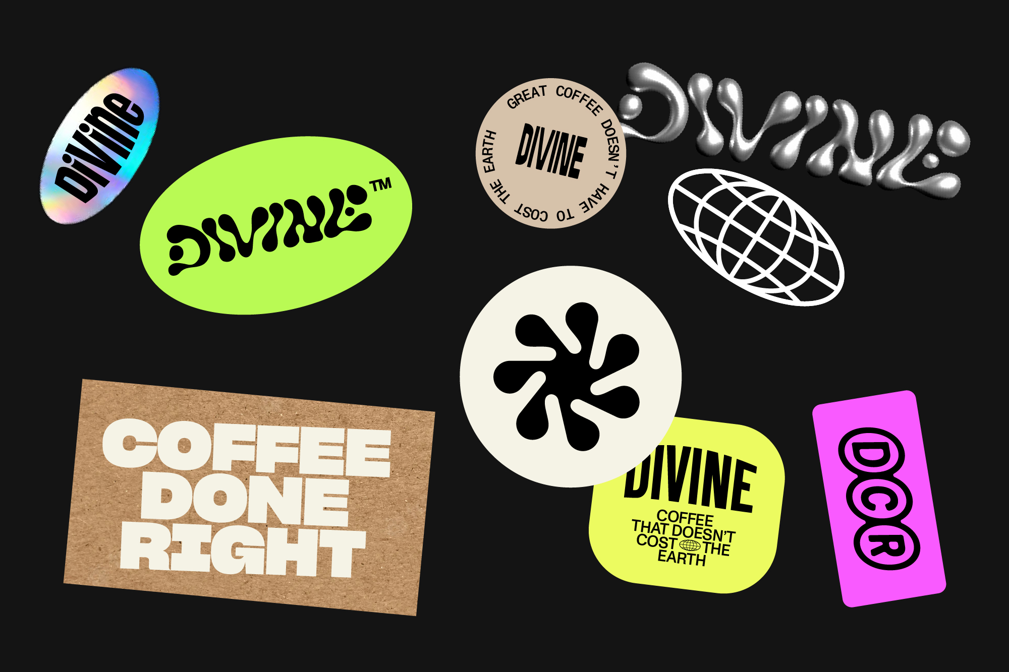
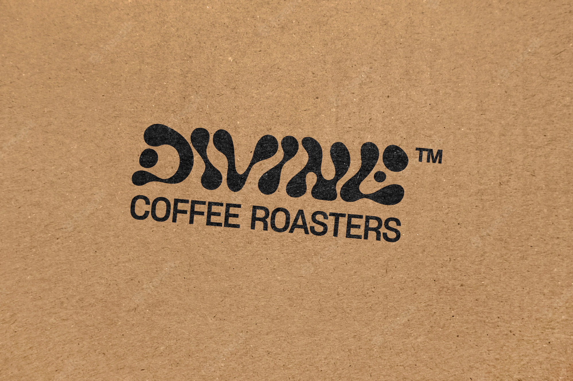
ROUTE 4
This concept route uses hand-drawn, fluid letterforms to create the logotype as though drawn from drips of coffee. The drips connect together to create a flowing logotype.
We think this is a cool look but probably not legible enough for all the many sizes and uses the logotype will be used for: web, packaging, signage etc. Therefore we suggest taking this concept and using it to create one of the label artworks where legibility is less of an issue and sizing is fixed.
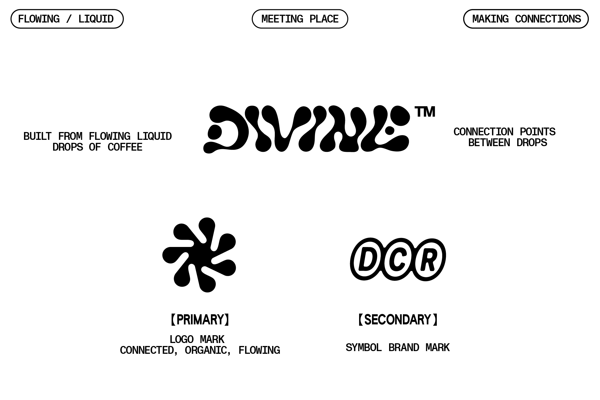
We think this is a cool look but probably not legible enough for all the many sizes and uses the logotype will be used for: web, packaging, signage etc. Therefore we suggest taking this concept and using it to create one of the label artworks where legibility is less of an issue and sizing is fixed.