
LOGOTYPE & Icon
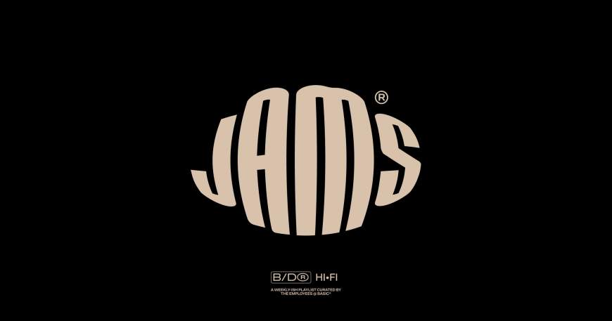
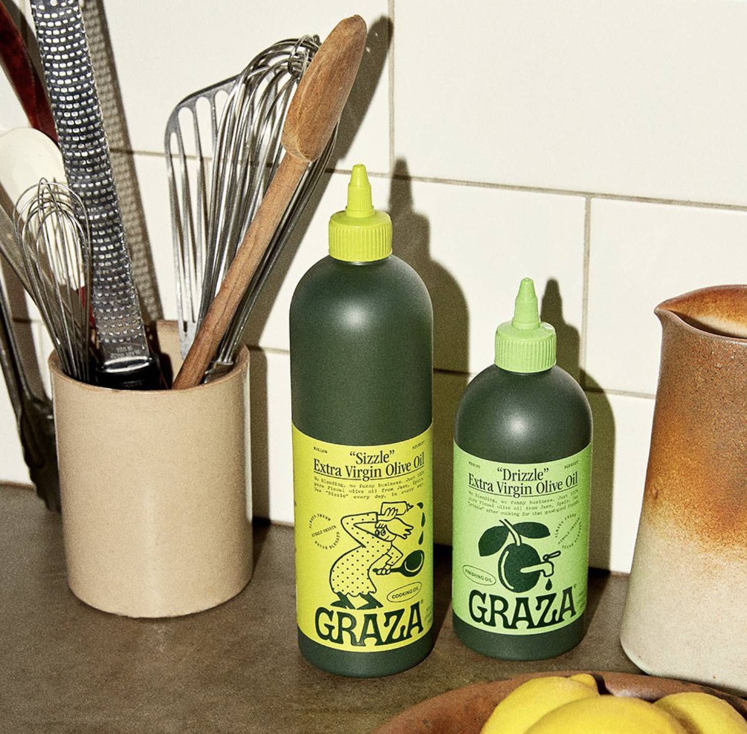
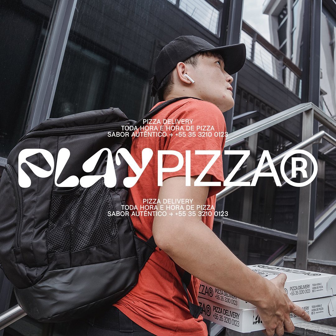
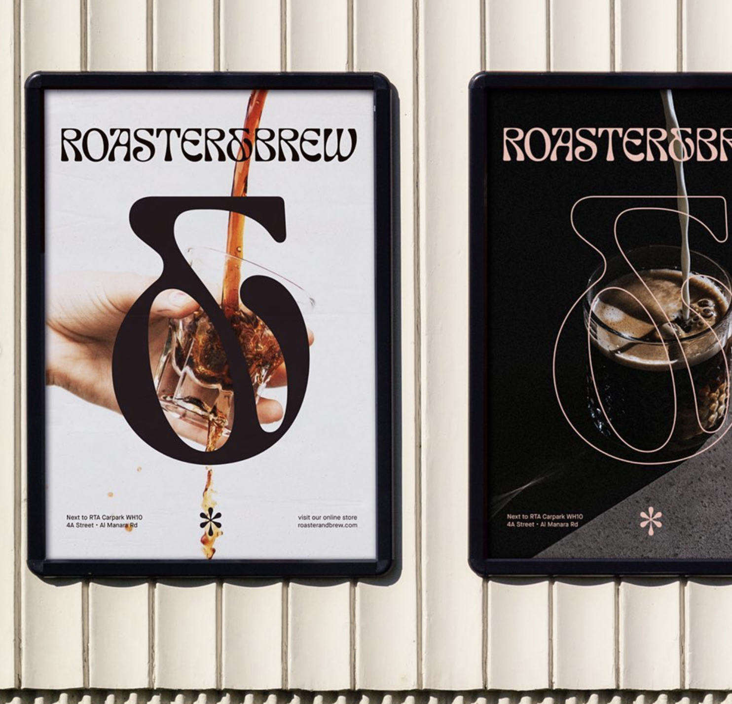
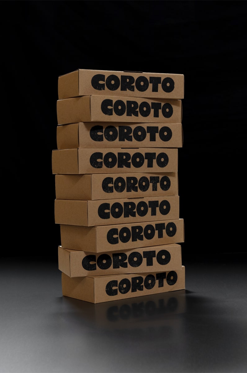
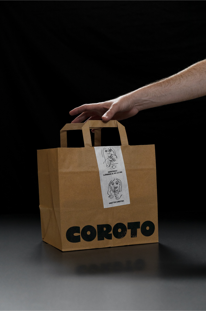
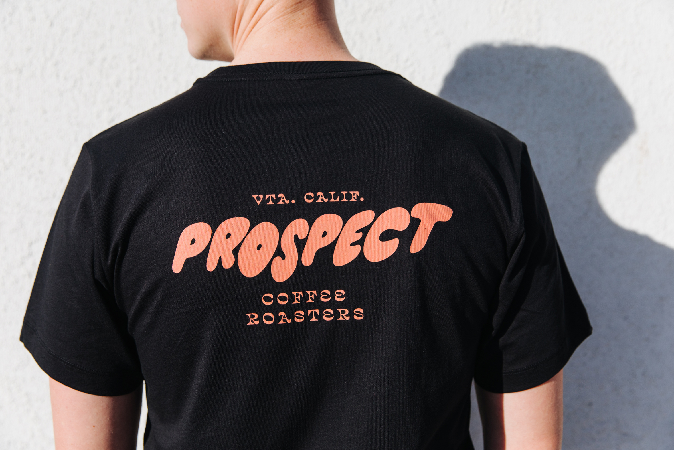
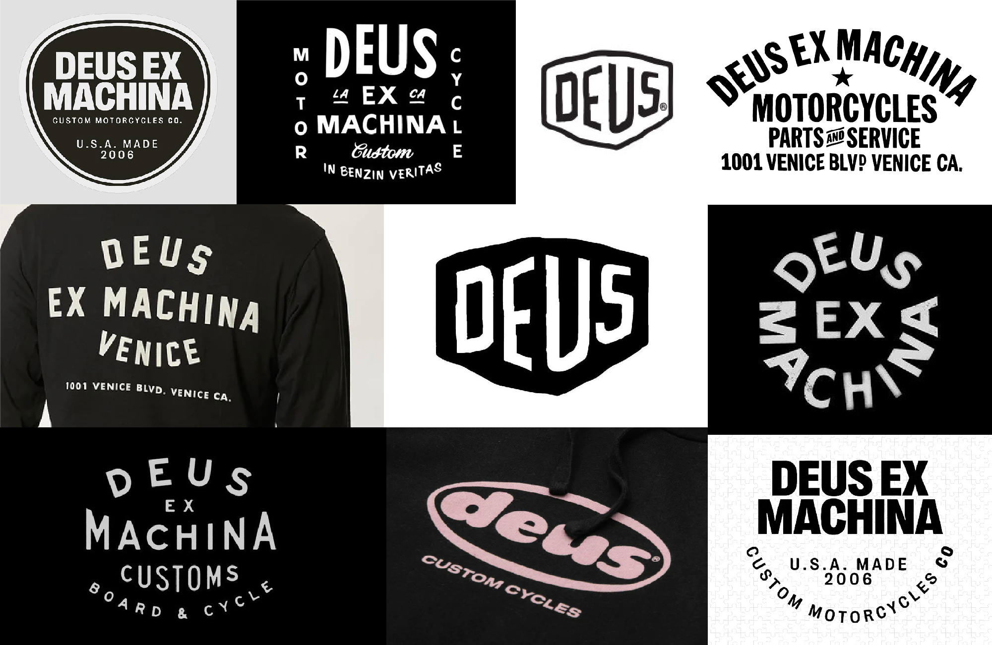
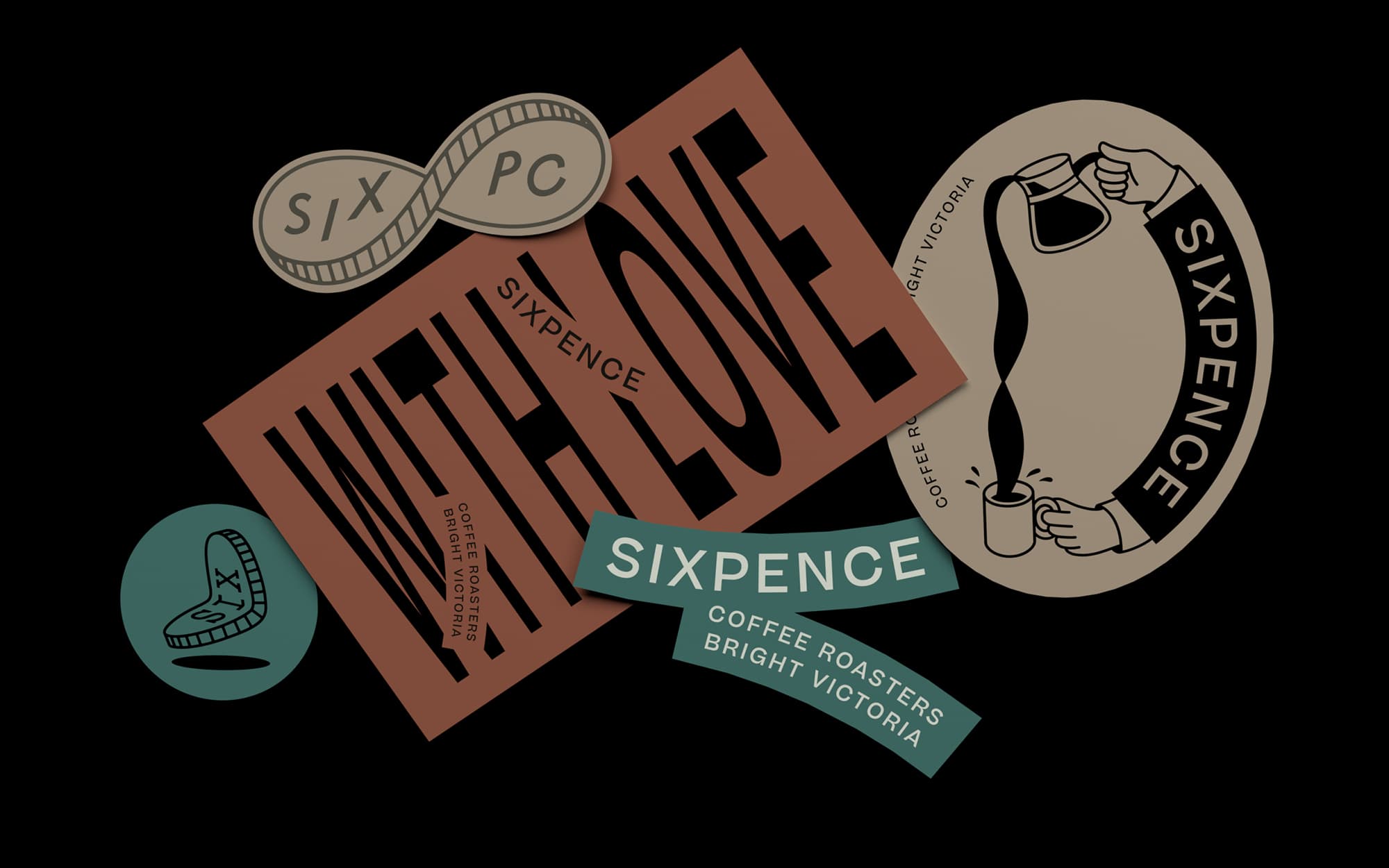
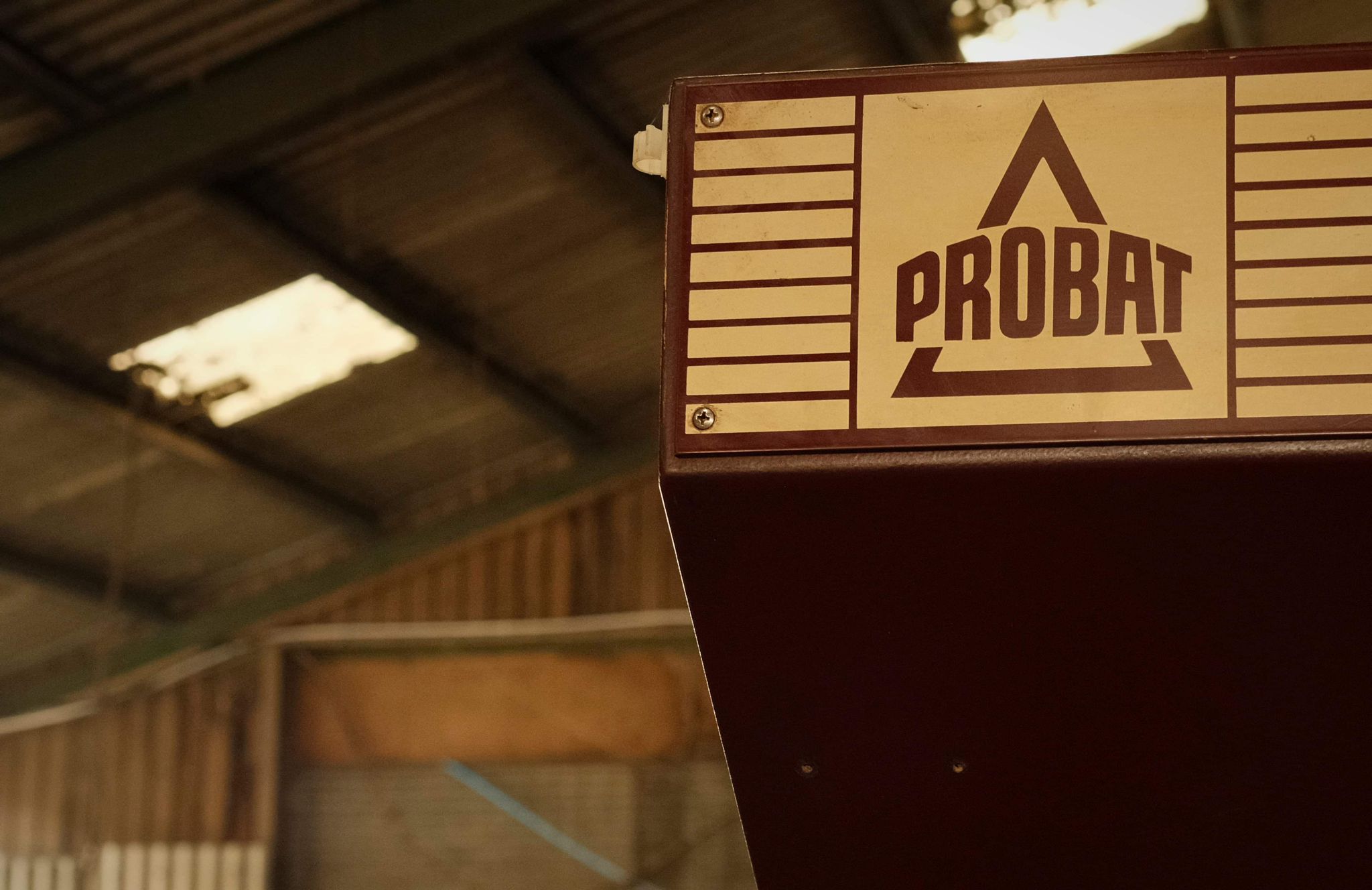
We propose exploring a bespoke logotype that may draw upon the iconic coffee logotypes of the past e.g. Bialetti and Probat. This could be supported by a range of sub logos in different styles and feels to give a more relaxed and cool attitude to the brand. These would need to be underpinned with a strong primary logotype to build brand recognition and trust.
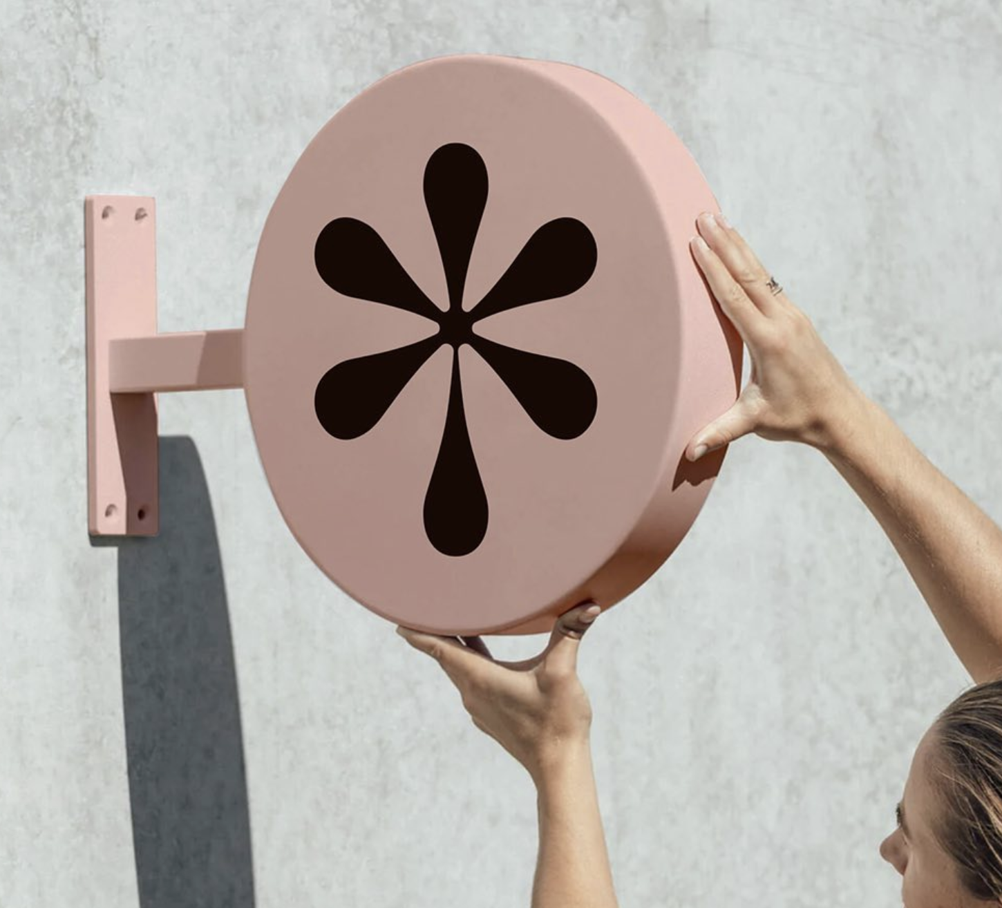
We propose investigating how the key concept of a 'meeting place' could be translated visually in a logo in an abstract way – whether in letterforms or in a supporting logo mark. Some small elements of retro styling could be introduced to bring a sense of nostalgia but done subtly and to keep it modern and fresh.
We propose investigating how the key concept of a 'meeting place' could be translated visually in a logo in an abstract way – whether in letterforms or in a supporting logo mark. Some small elements of retro styling could be introduced to bring a sense of nostalgia but done subtly and to keep it modern and fresh.
%20copy.jpg)

%20copy.jpg)

