
Label Type & COLOUR
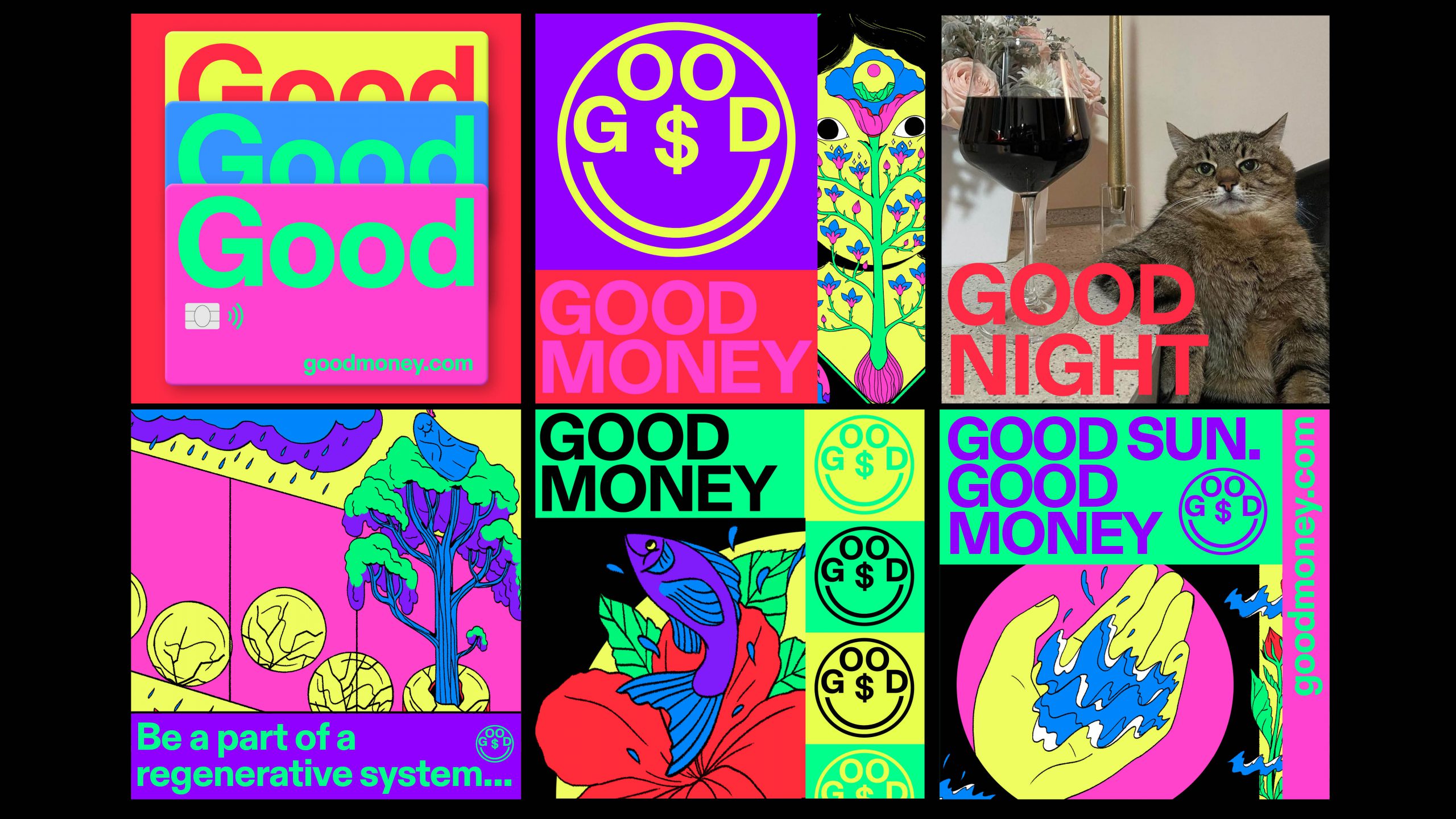
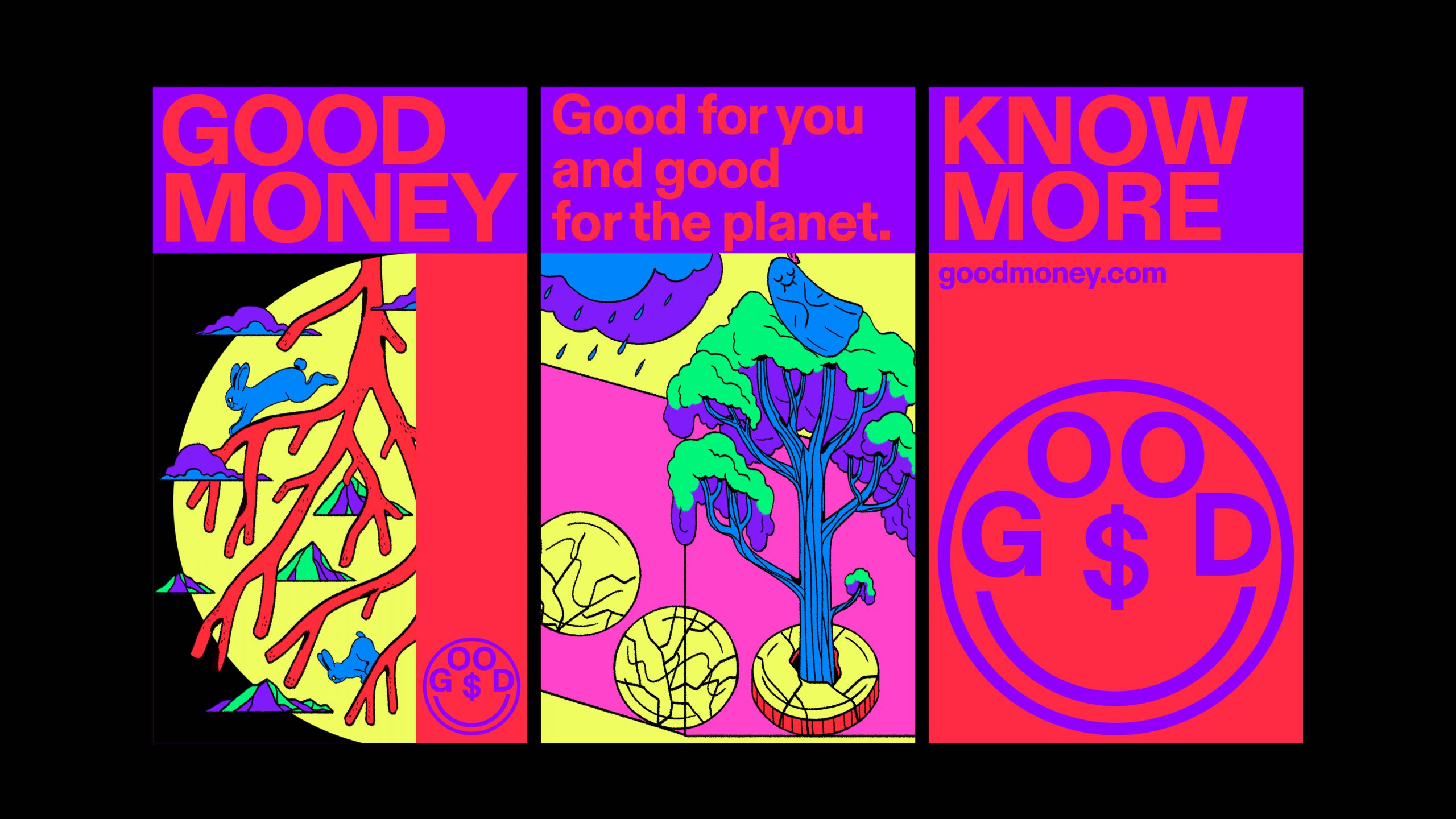
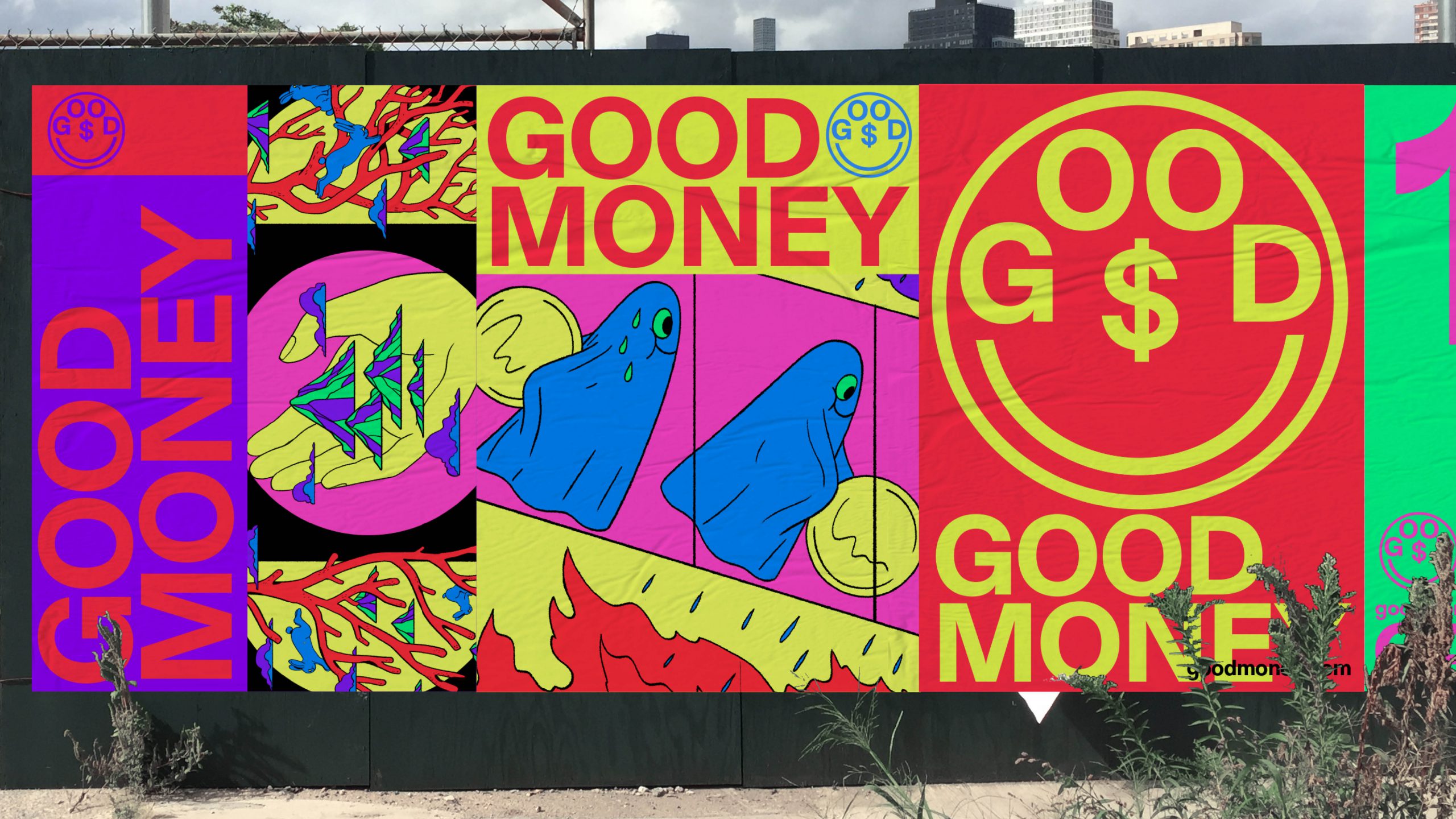
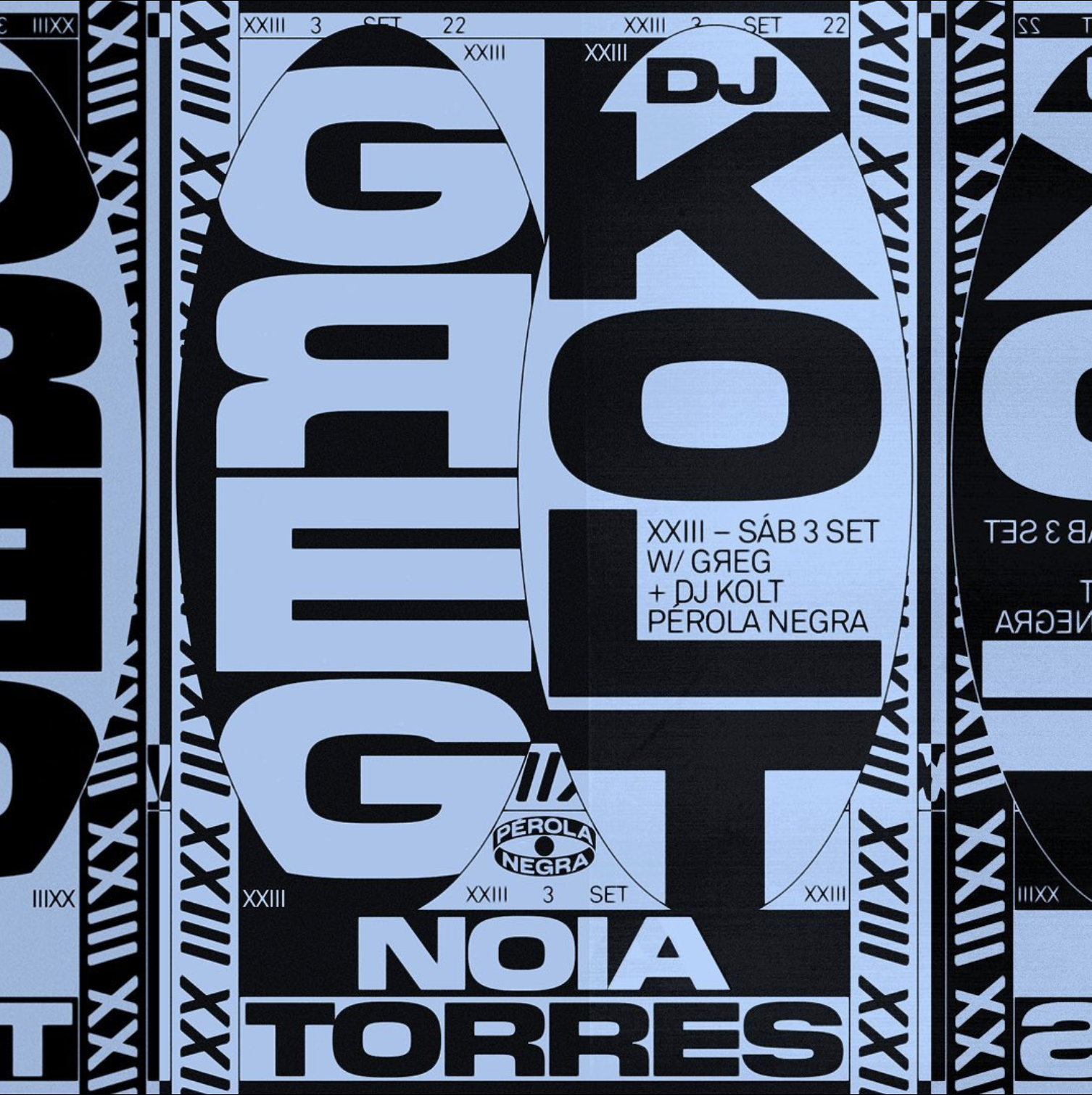
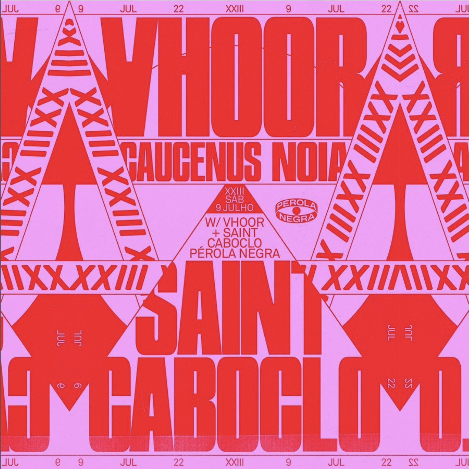
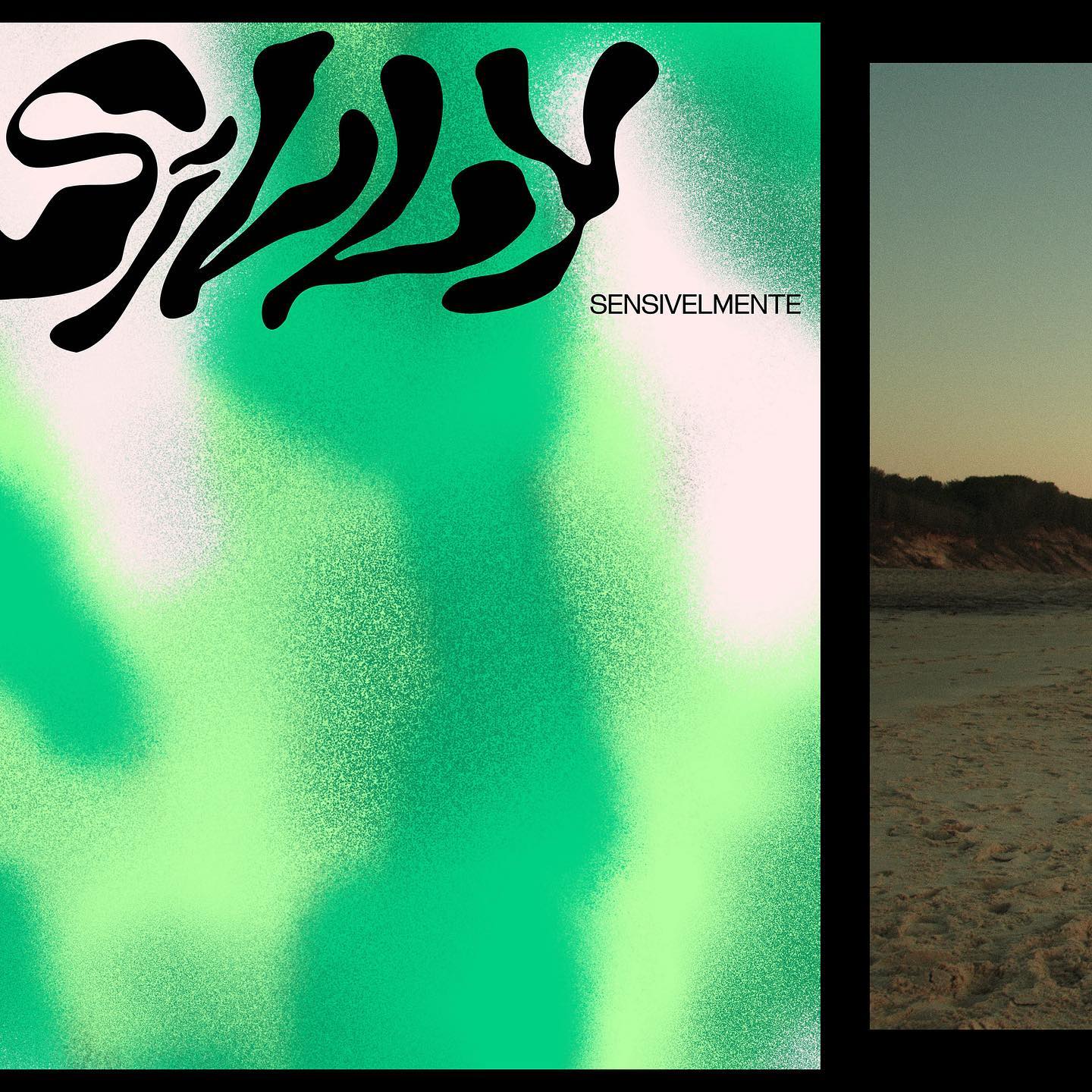
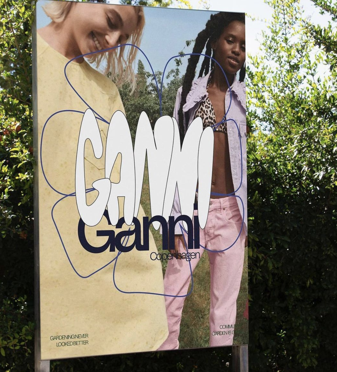
Continuing from the themes of the previous page, these examples show how we could use bright clashing colours in the labels to stand out from all competitors and live up to the brand values. These colours would be used with bold and unexpected typographic treatments for coffee names to create eye-catching and desirable product packaging.
Key products could have labels printed professionally to ensure vibrant colour and fine details.
Each coffee in the product line could be treated almost in the same way as a clothing line has collections, with clear, different visuals that are contained under the main brand to keep things fresh.
Key products could have labels printed professionally to ensure vibrant colour and fine details.
Each coffee in the product line could be treated almost in the same way as a clothing line has collections, with clear, different visuals that are contained under the main brand to keep things fresh.
