
ROUTE 1
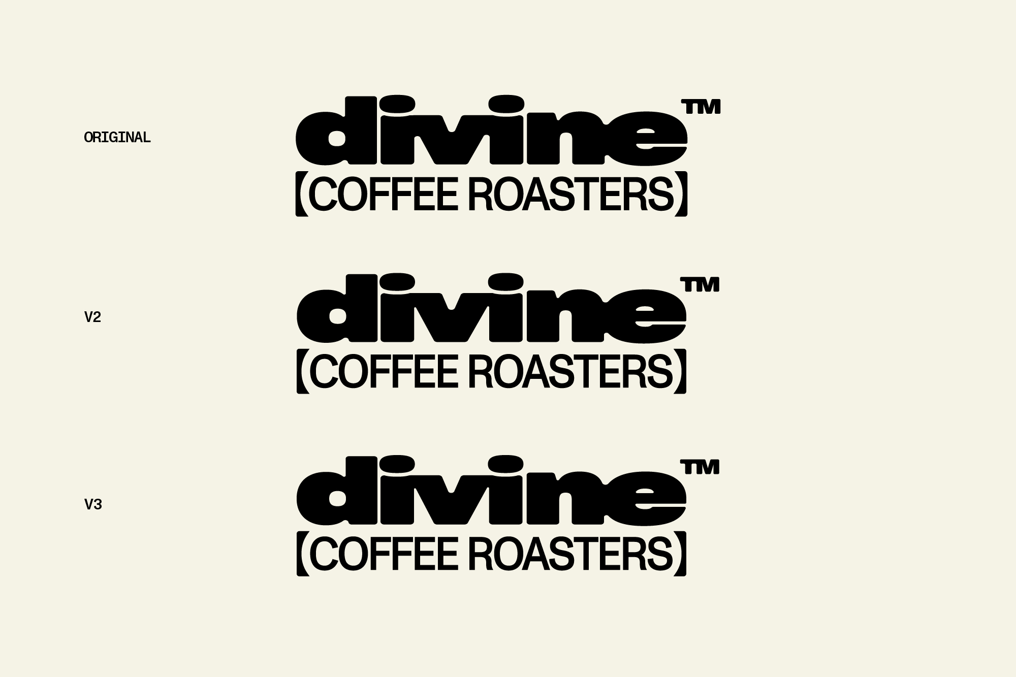
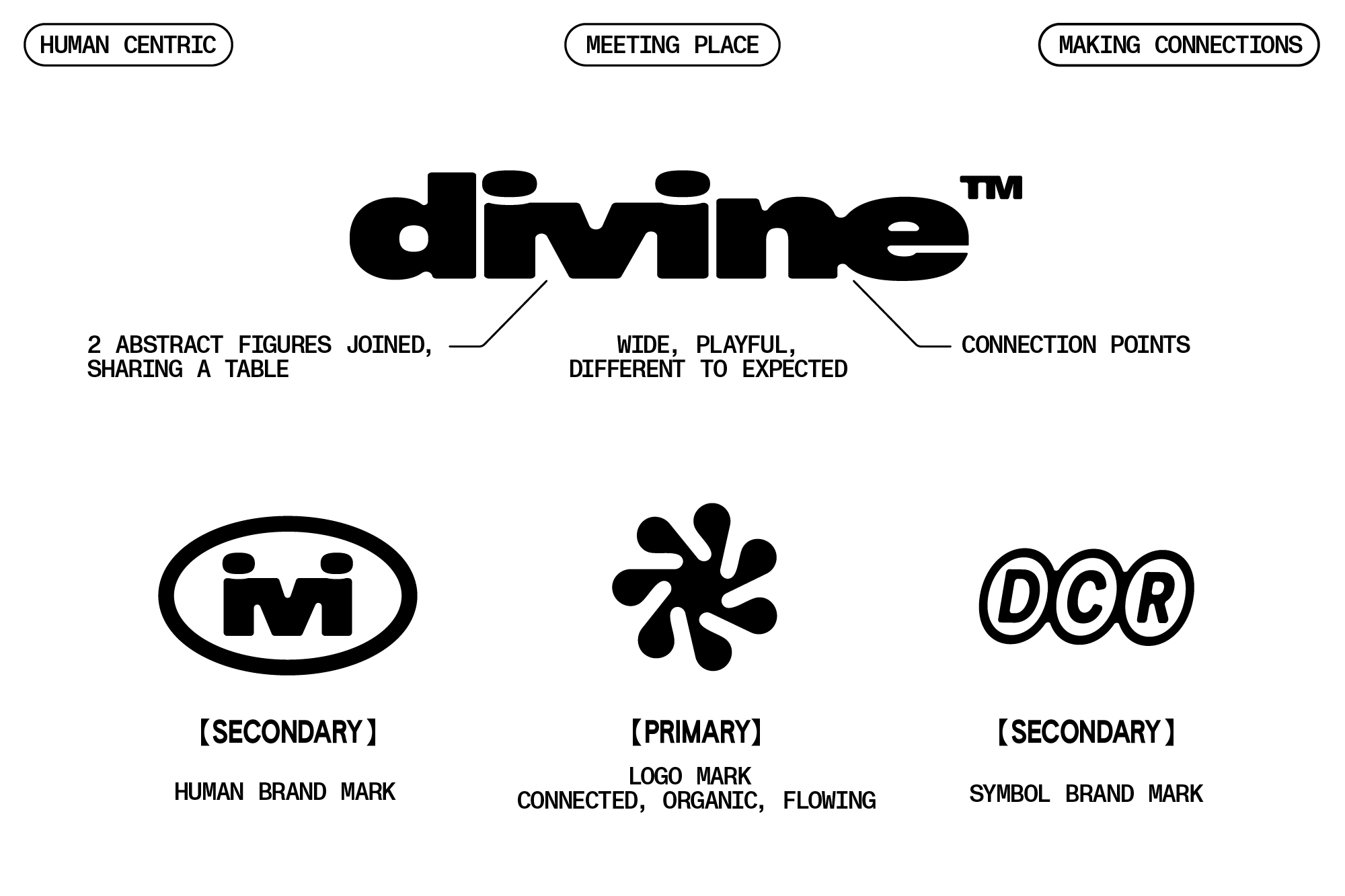
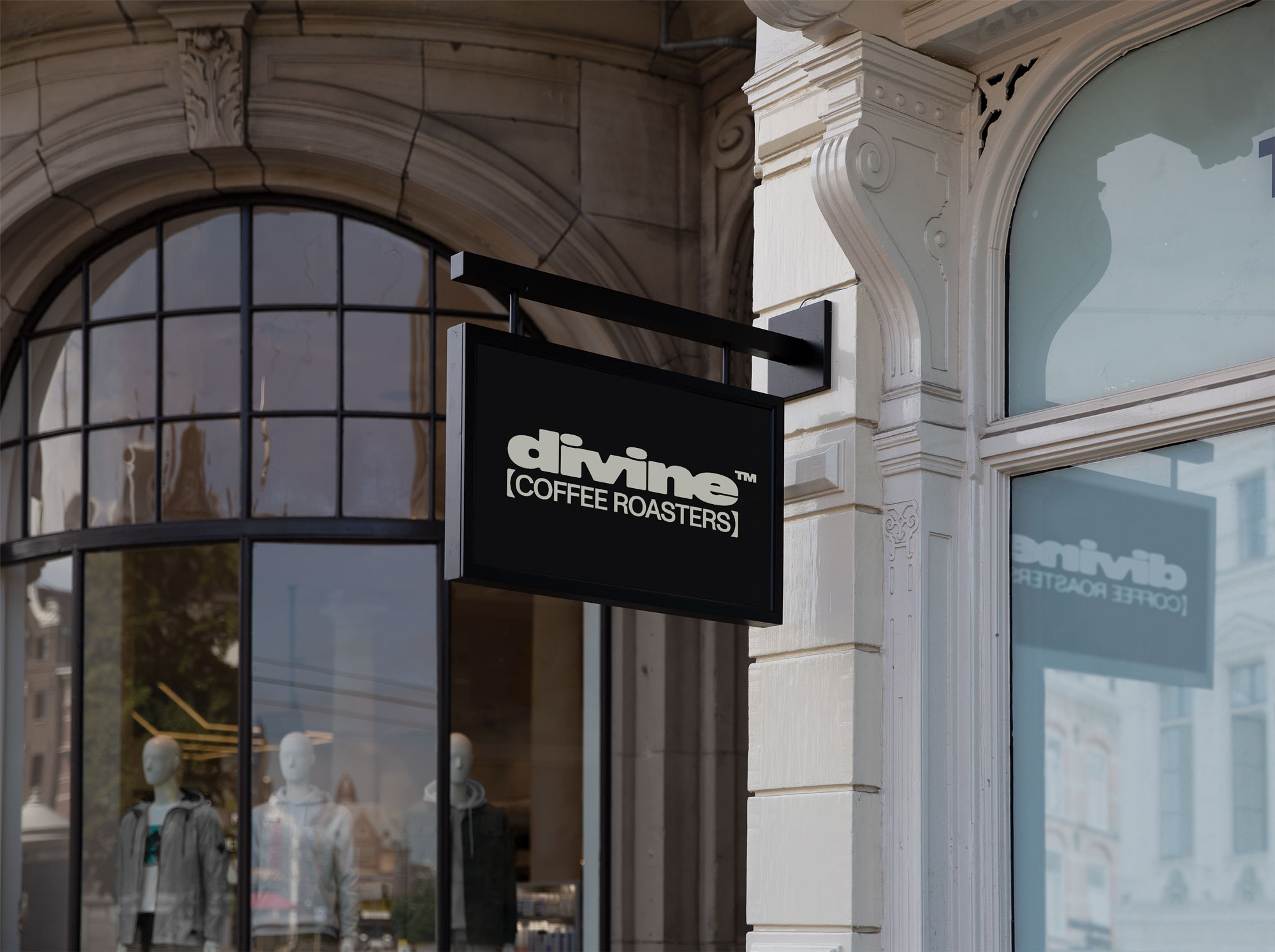
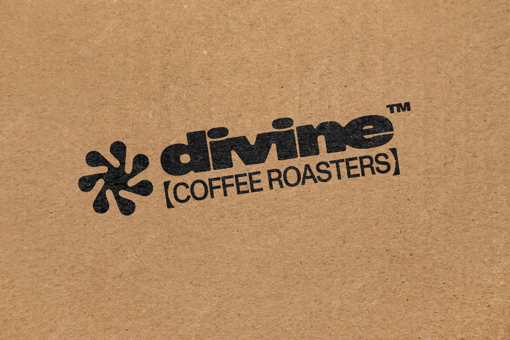
This concept route uses wide, bold letterforms in lowercase to create an impactful but approachable logotype. The idea of coffee being a 'meeting place' is built into the logo by letterforms joining and connecting with the 'ivi' of divine designed to look like 2 abstract people connected and sharing a table.
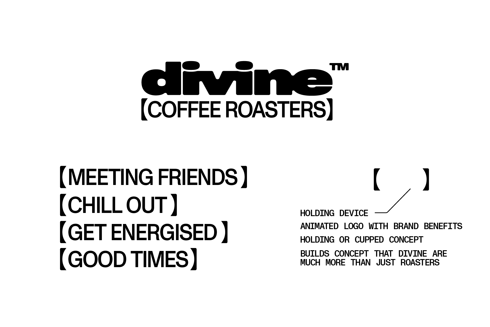
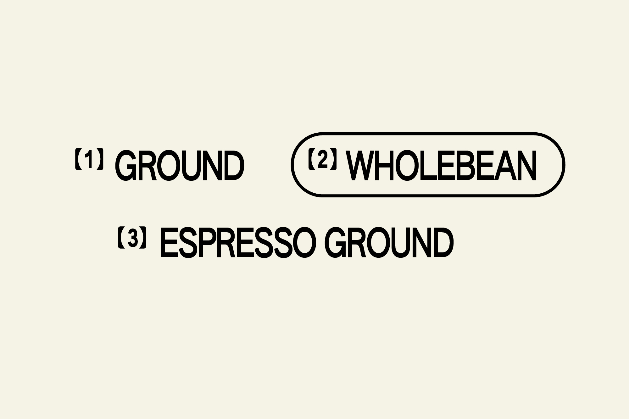
The 'coffee roasters' text is held in 2 rounded and cupped holding device and could be animated to cycle between multiple brand benefits before settling on 'coffee roasters'. This widens the scope of what you do at Divine and gets the point across that you do far more than just roast coffee. It's about a caring and wider picture of the industry.
The main logo icon is built from the same cupped bracket, abstracted and repeated to create a fluid looking icon that is all about individual elements coming together to create multiple connections.
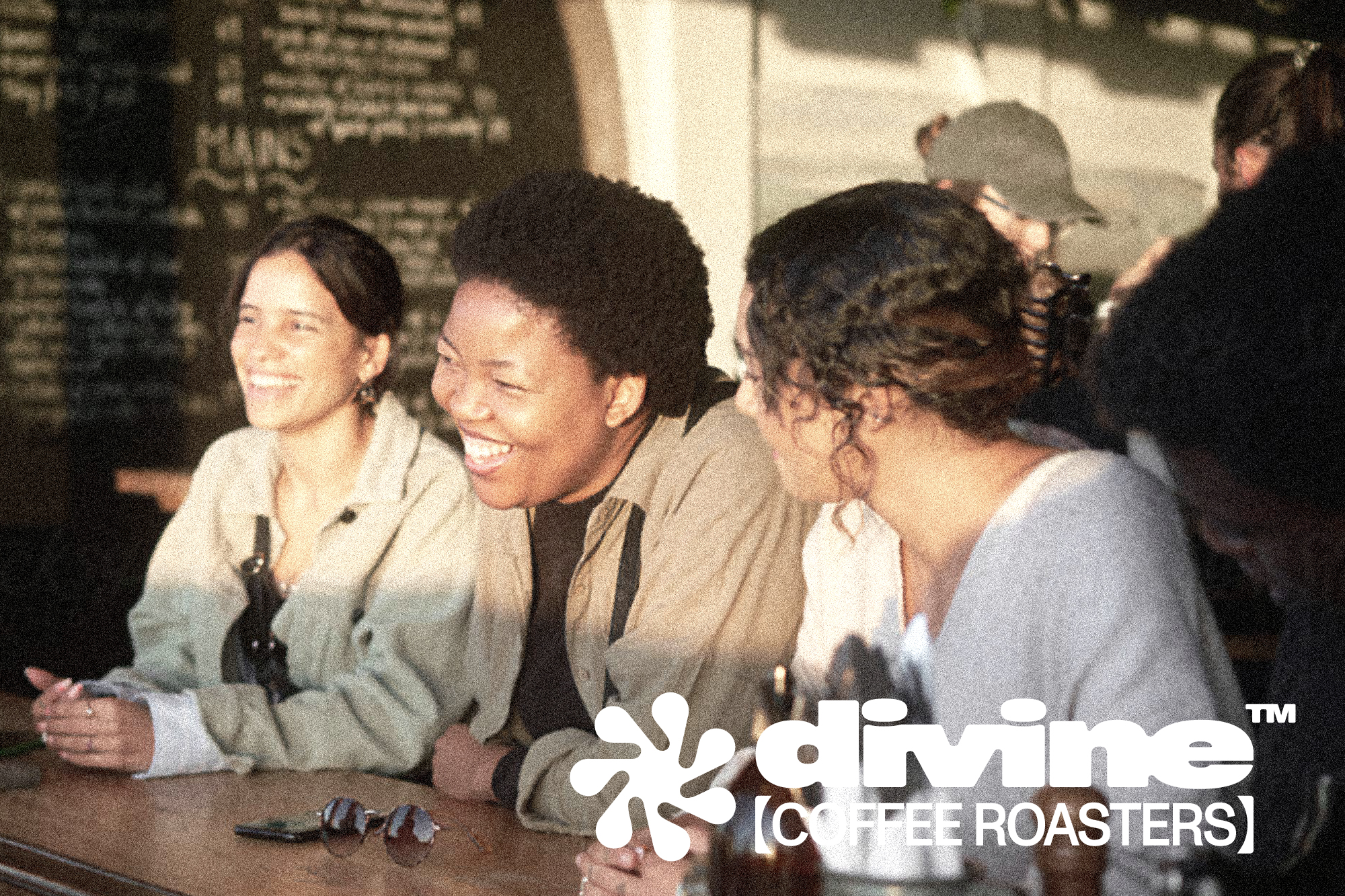
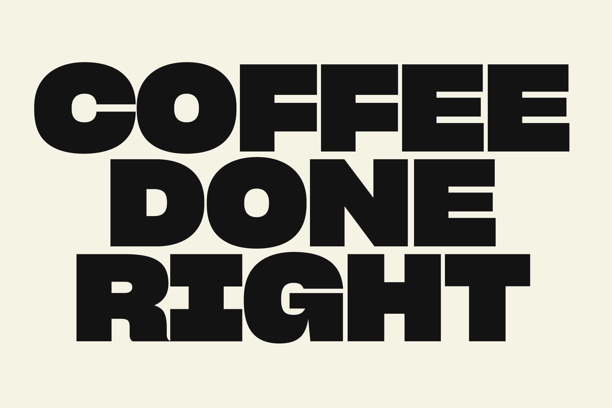
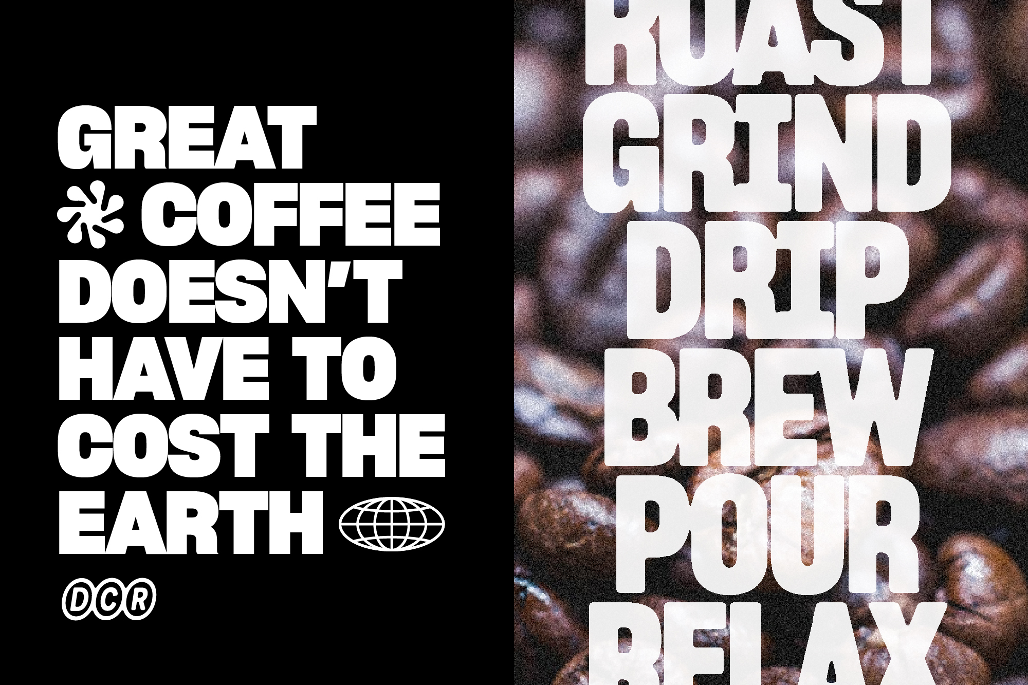
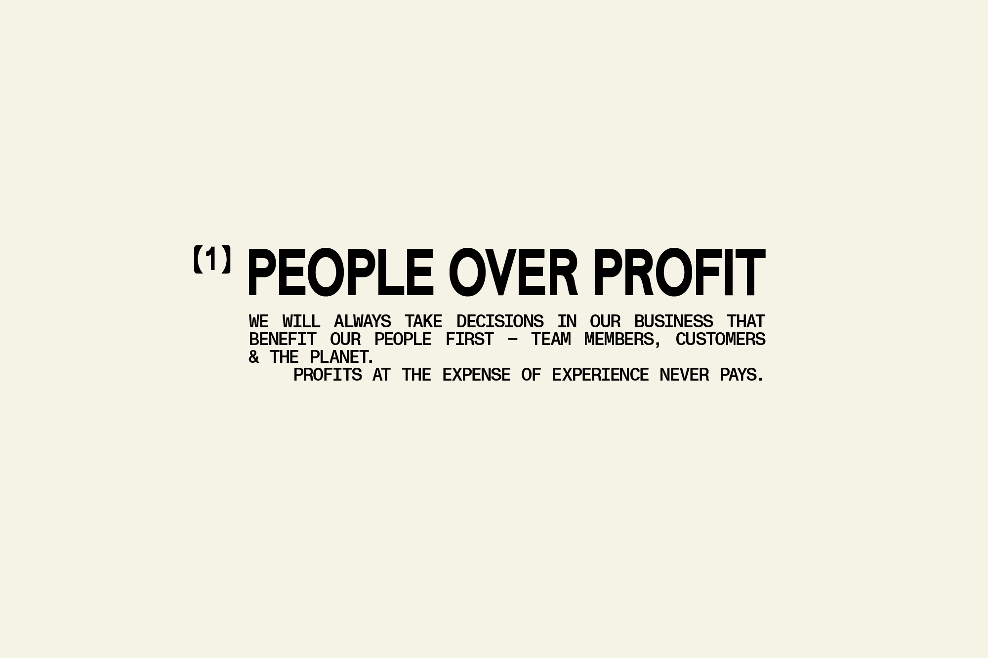
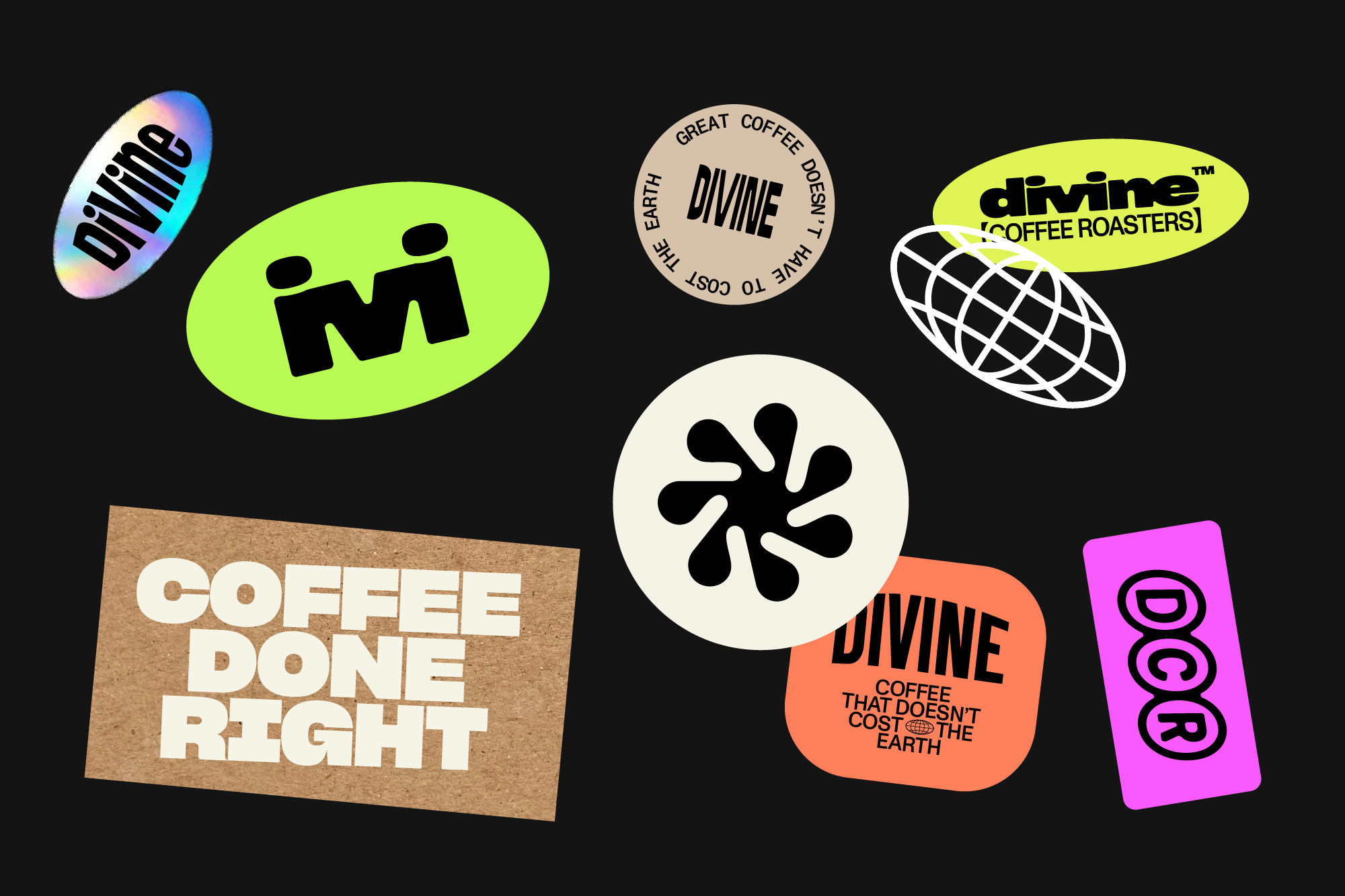
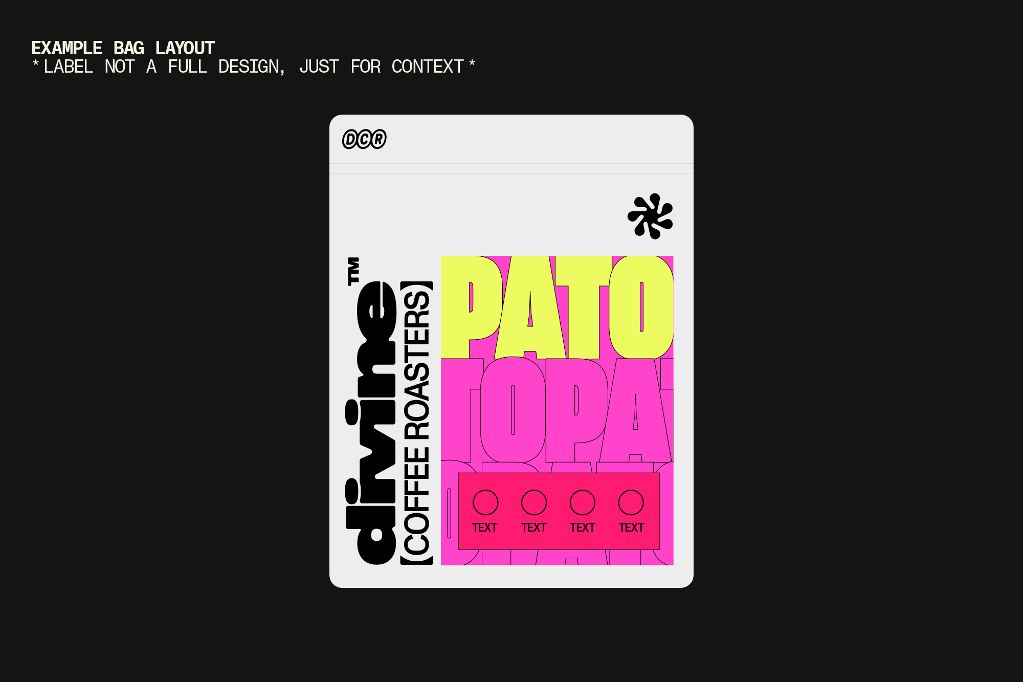
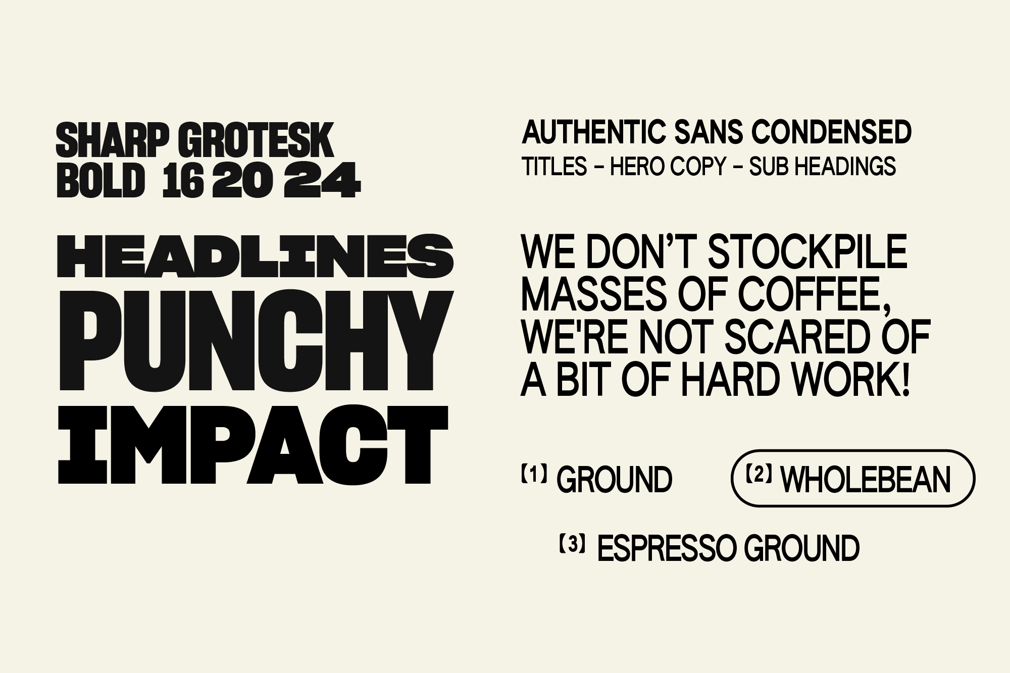
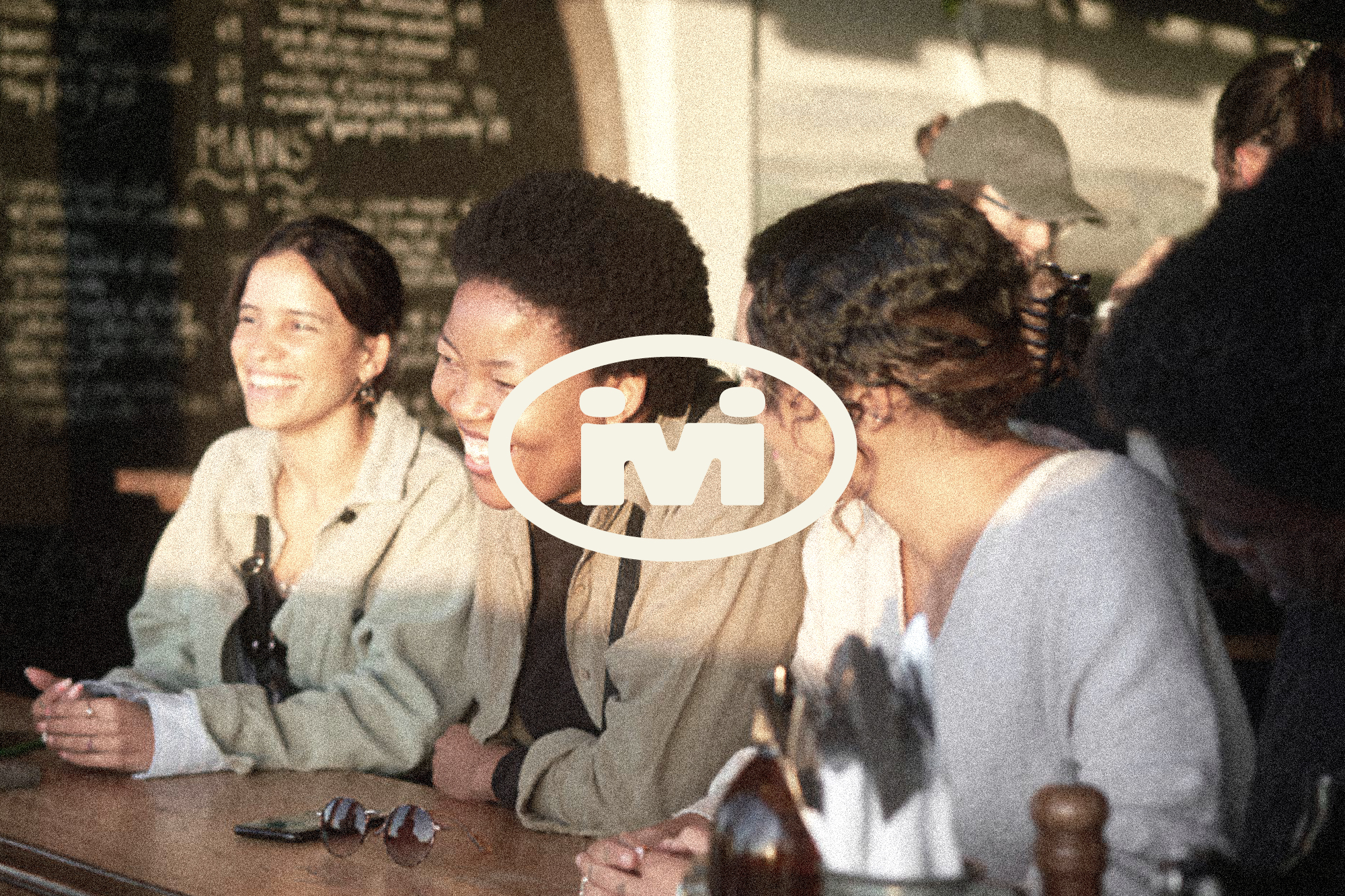
We have also explored the potential wider identity and how the brand could look using type, colour, texture and imagery.
The colour palette would be largely stripped back to white, off white and black for clarity. This then allows us to explore bright colours in the labels without clashing or being stuck with a few brand colours to work around. Bright colours could also be used in small elements such as stickers, clothing and so on.



Tests below trialling the legibility of the 'ivi' characters with more spacing and higher join points.
