CONCEPT 4
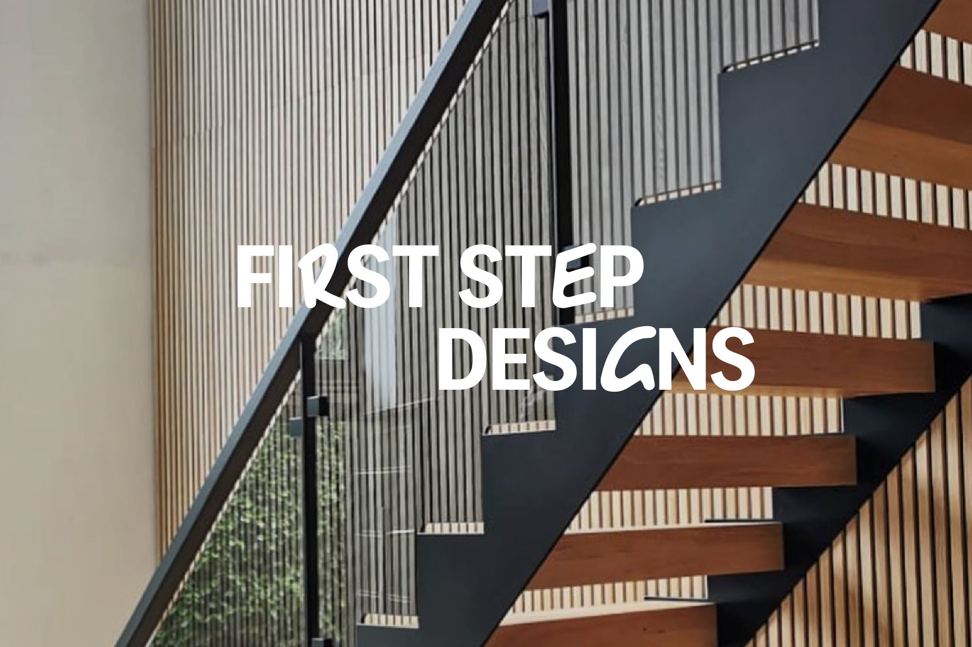
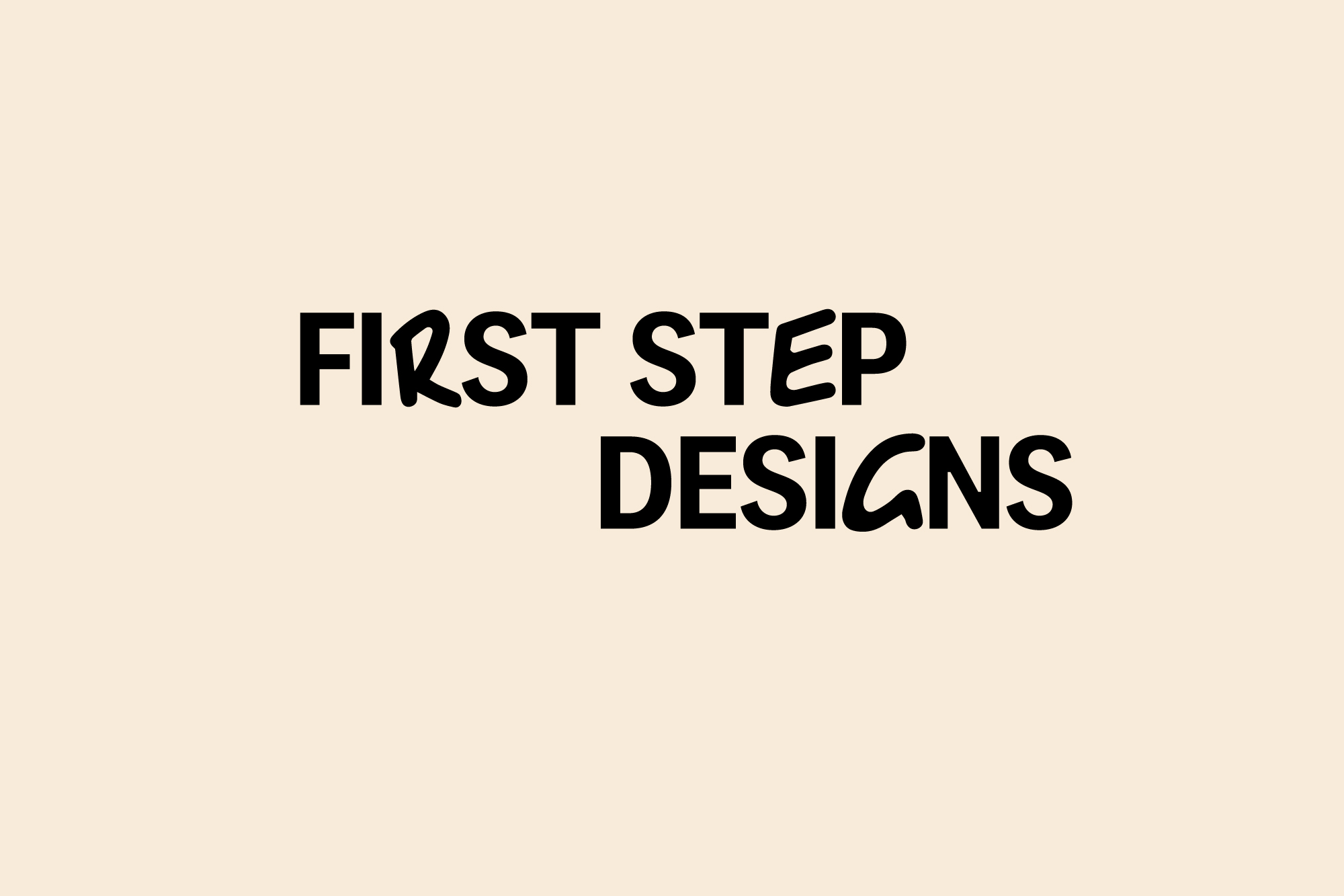
In this final route, the logotype is similarly bold and punchy but has been customised with hand written letterforms to create quirks and individuality. These handwritten letterforms could be animated to cycle between different letters, giving a fun and flexible brand asset.
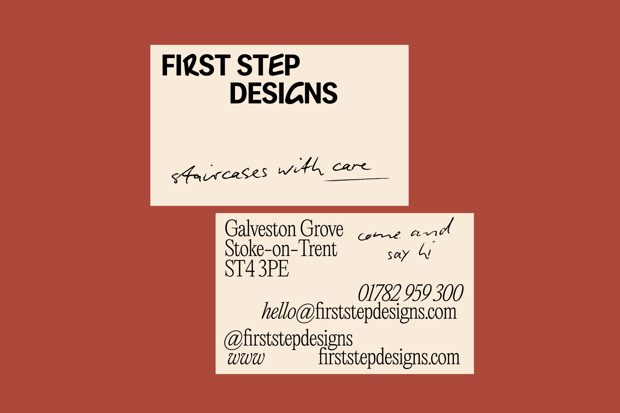
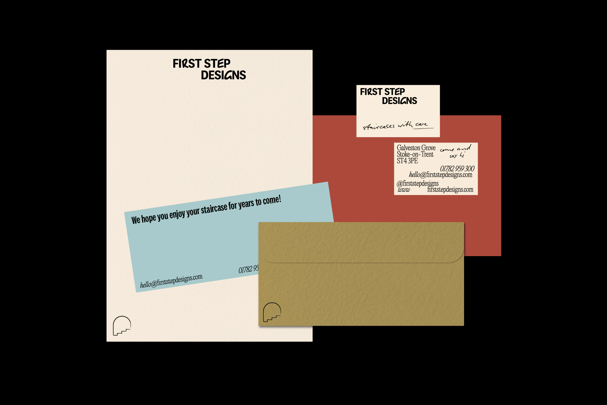
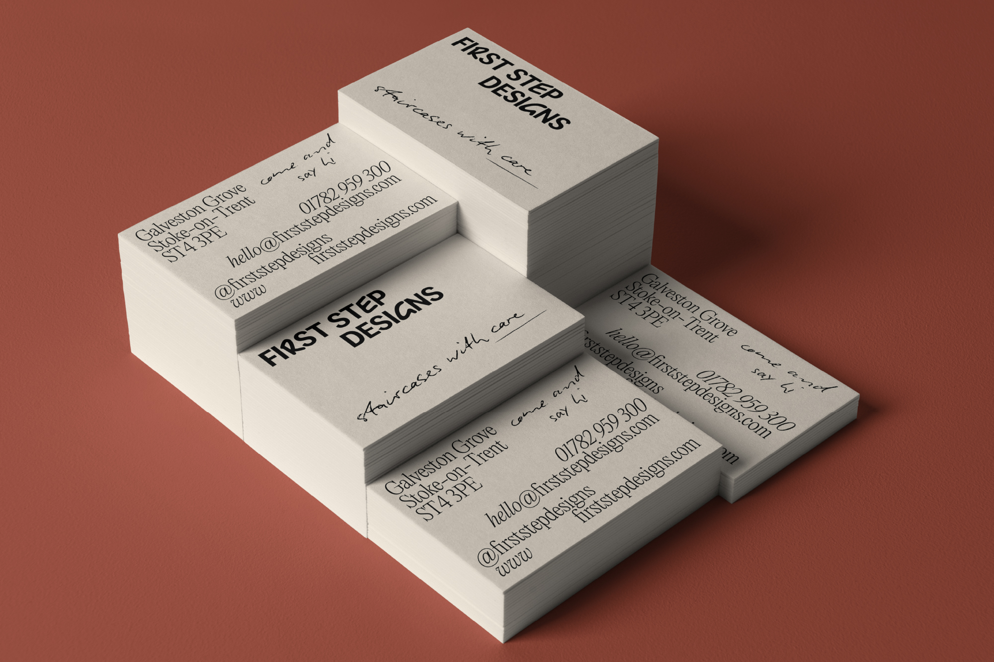
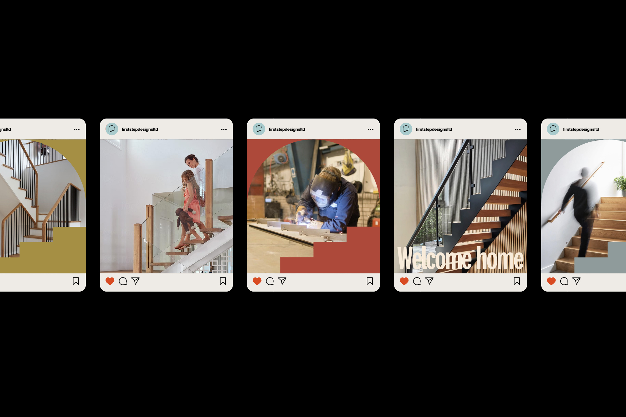
Bold and delicate typefaces complement each other while a sketched, hand drawn typeface is used for certain highlight text. This note style writing comes from the design concepts done in front of clients but also the hand crafted nature of the work done across all disciplines in the journey. It also ties into the hand crafted letterforms in the logotype.
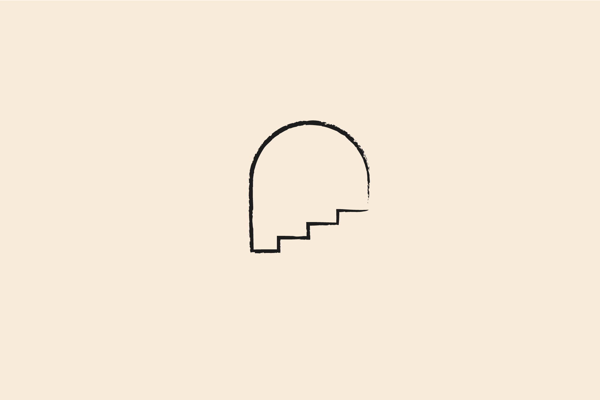
The doorway icon can be crafted in a similarly hand drawn way to build on this concept and gives a 'signature' look. Something you would maybe use to sign off work, communications or plans and can also be used as a seal of approval/ quality.
The palette is similar to the previous concept but with more muted colours for a more understated look.
Bold and delicate typefaces complement each other while a sketched, hand drawn typeface is used for certain highlight text. This note style writing comes from the design concepts done in front of clients but also the hand crafted nature of the work done across all disciplines in the journey. It also ties into the hand crafted letterforms in the logotype.
The doorway icon can be crafted in a similarly hand drawn way to build on this concept and gives a 'signature' look. Something you would maybe use to sign off work, communications or plans and can also be used as a seal of approval/ quality.
The palette is similar to the previous concept but with more muted colours for a more understated look.