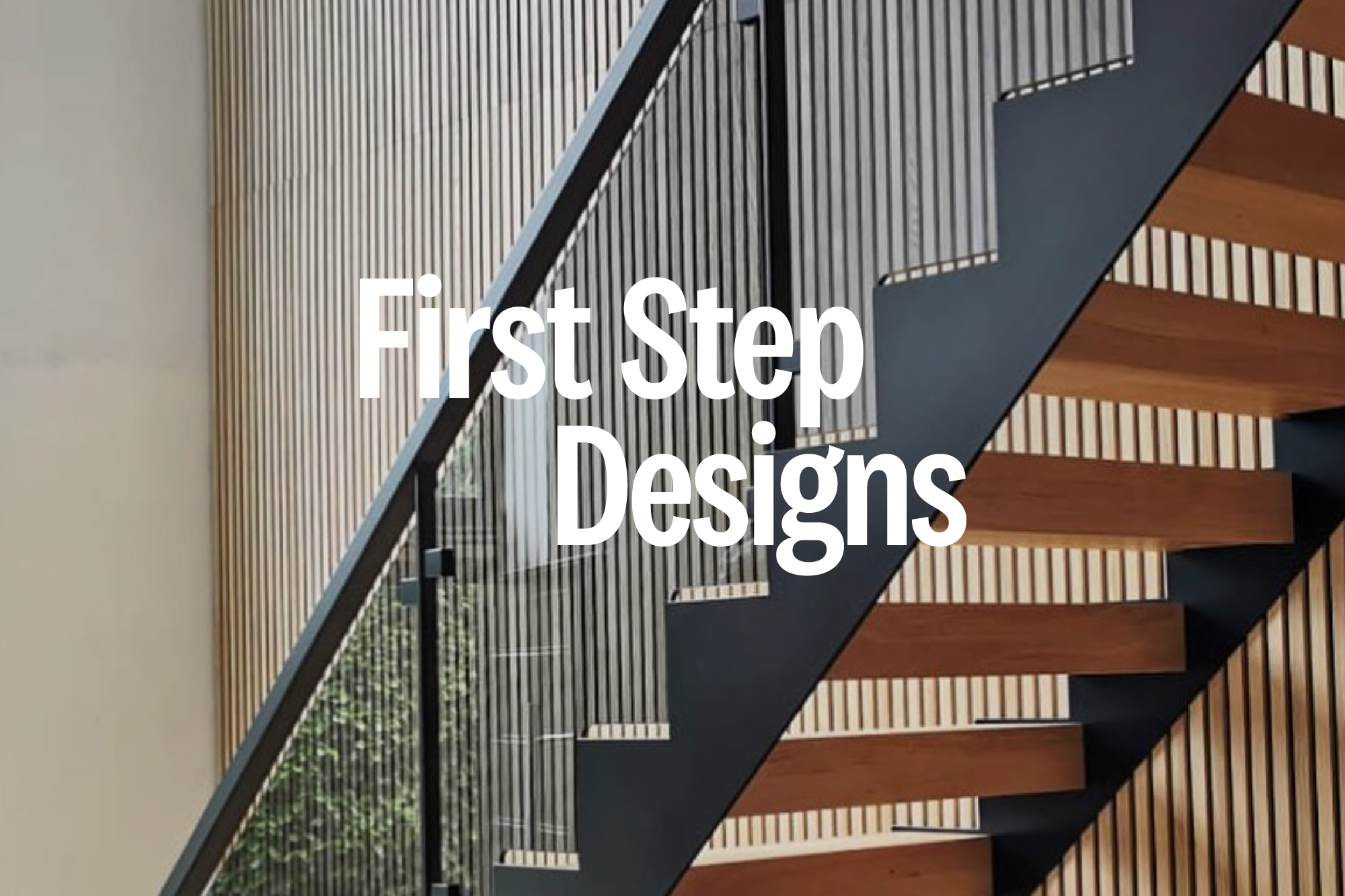
CONCEPT 3
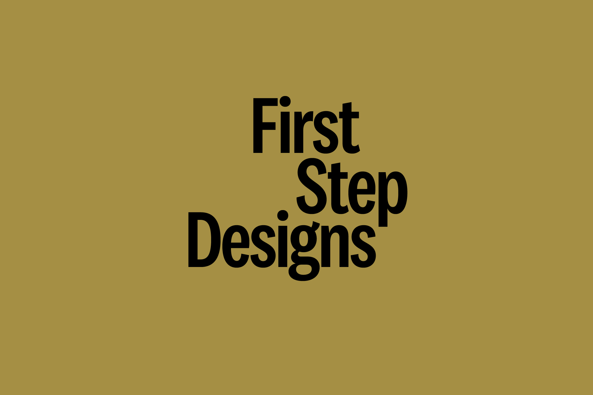
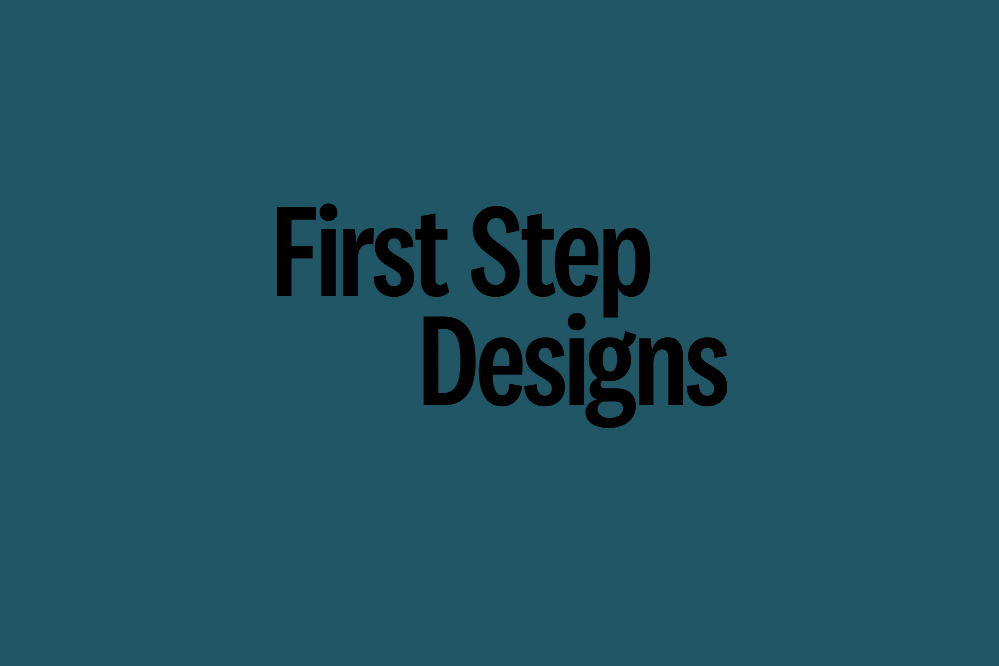
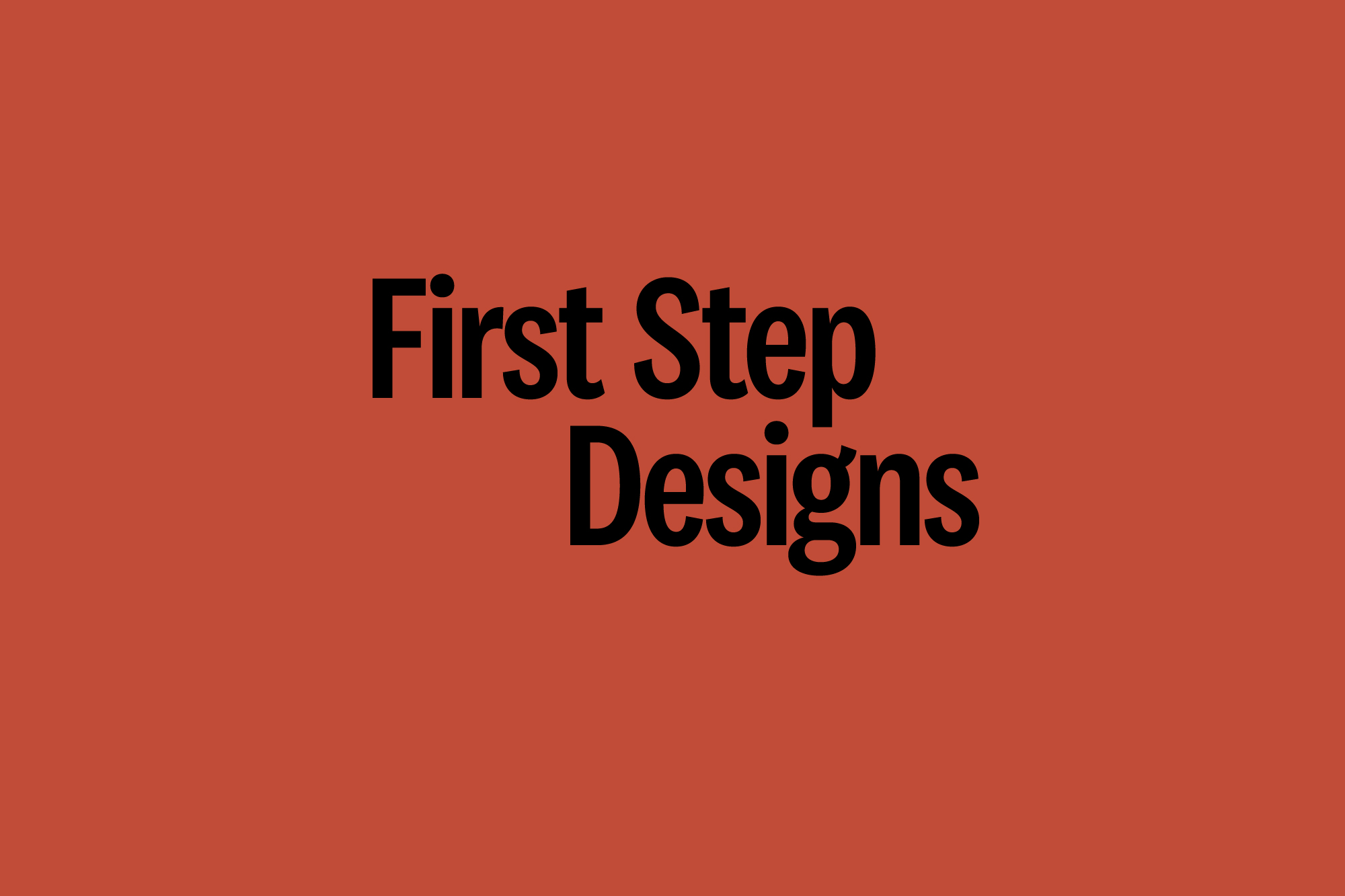
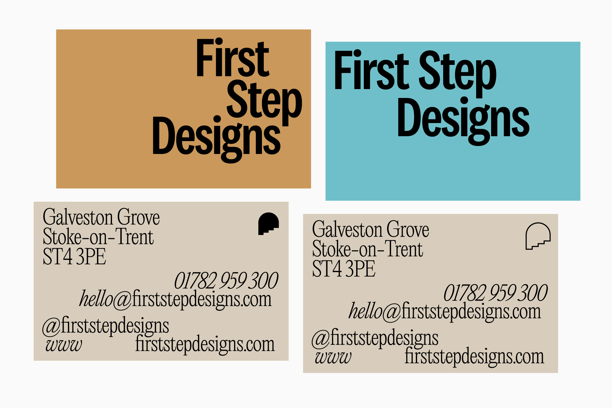
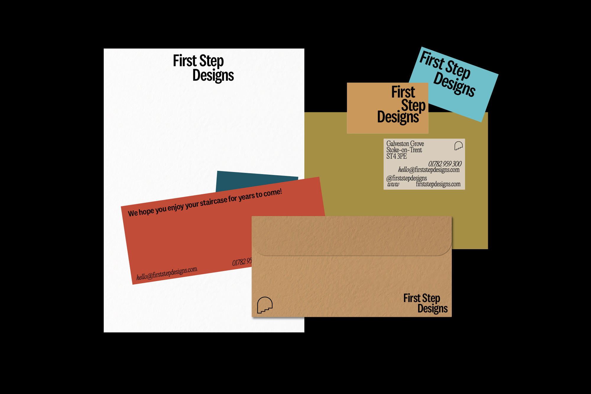
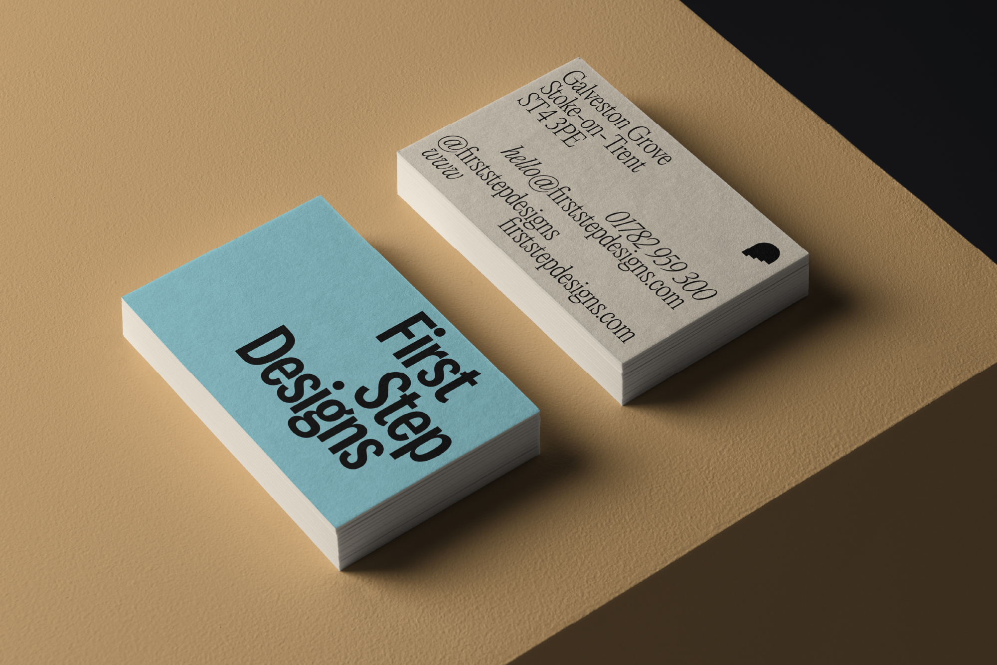
In this route, the logotype is bold and friendly but routed in industry with its narrow letterforms. It features two layouts or stacks of the three words. One stepped across two lines, one creating steps over three lines. These can be used independently in whichever way fits the context and application best.
The bold punchy logotype is supported by finer, more delicate typefaces for body copy and similar bold fonts for impact text.
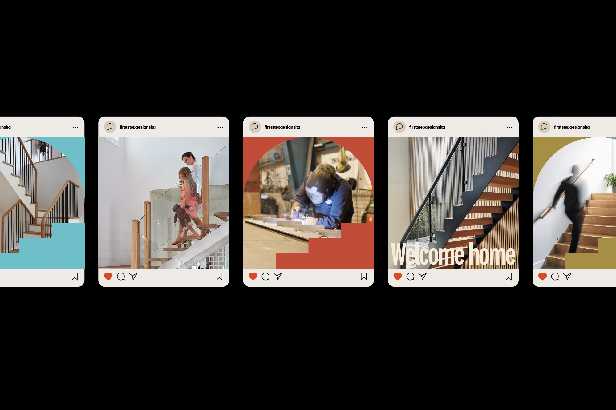
This palette is more eclectic and mixes warm and natural tones with cooler, fresher colours for an artistic and unique feel. The doorway/ steps icon can be used as an outline or solid as is necessary in the context or application.
The bold punchy logotype is supported by finer, more delicate typefaces for body copy and similar bold fonts for impact text.
This palette is more eclectic and mixes warm and natural tones with cooler, fresher colours for an artistic and unique feel. The doorway/ steps icon can be used as an outline or solid as is necessary in the context or application.