CONCEPT 2
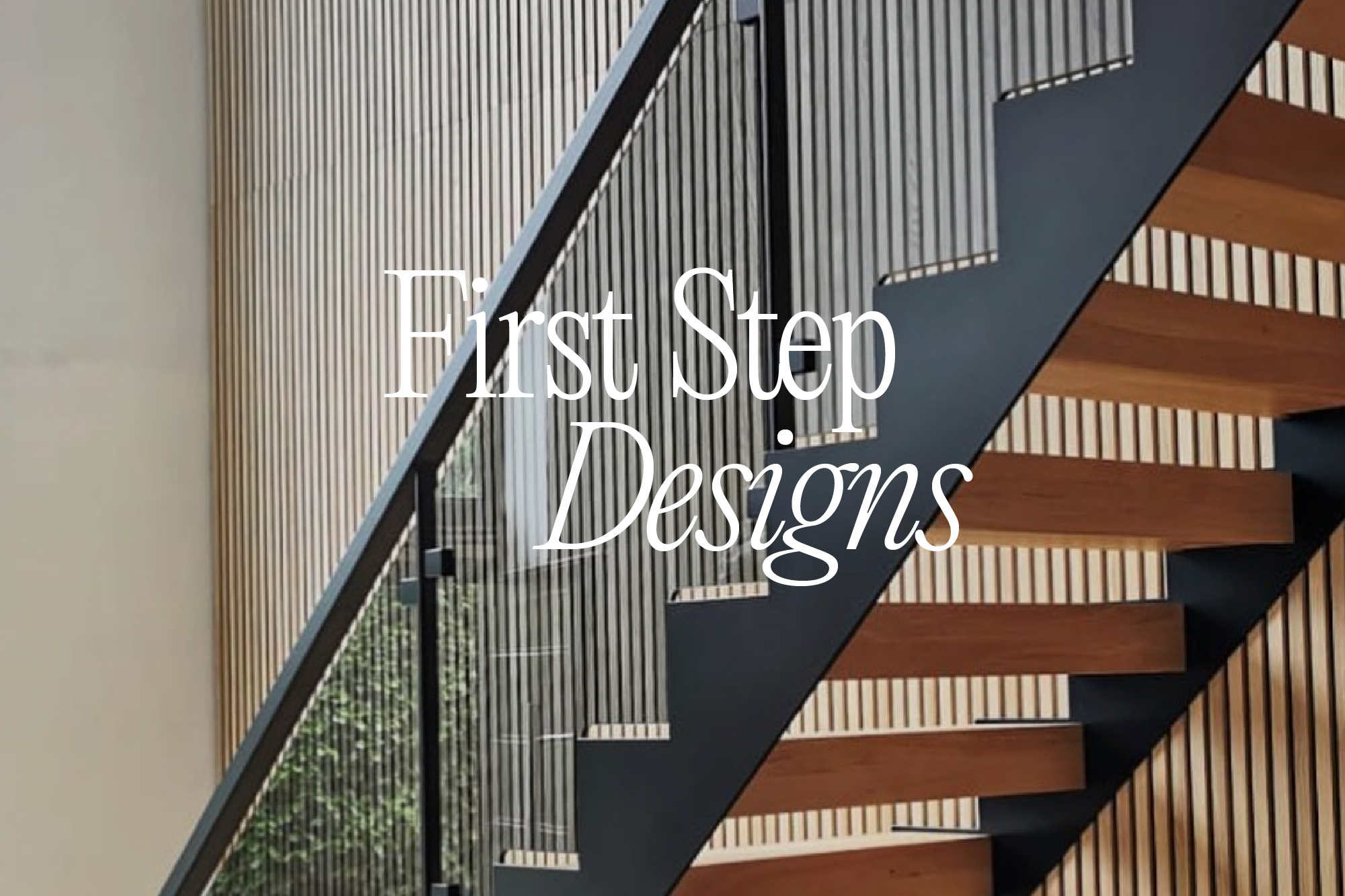
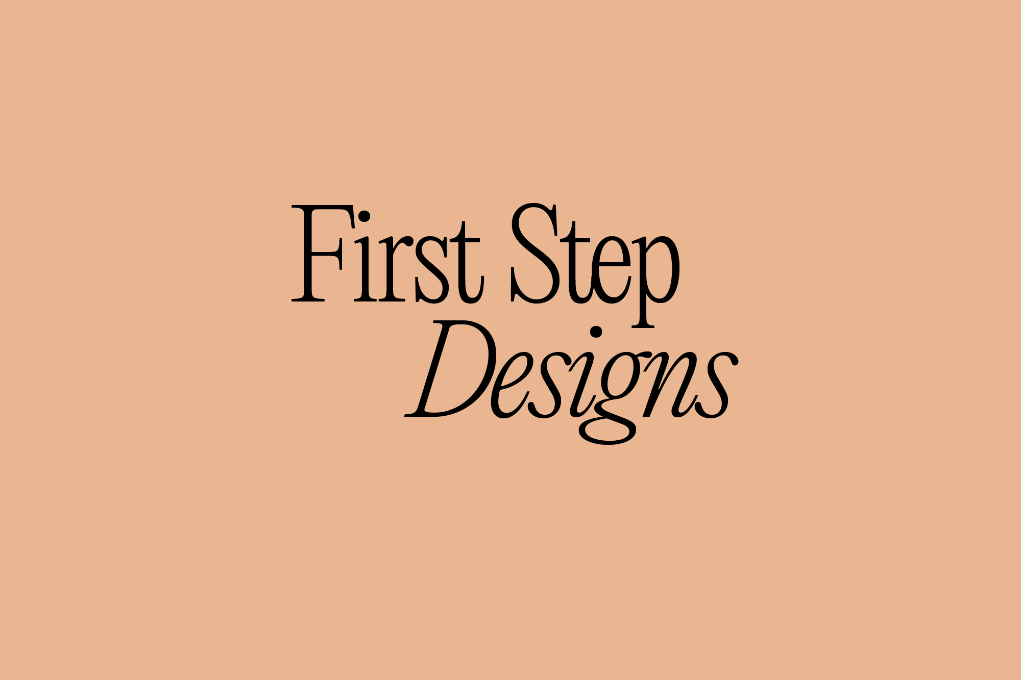
In this route, the logotype is similarly quirky, friendly and professional but in a thinner weight, designed to be used at larger scale for more impact but also being more delicate and detail orientated.
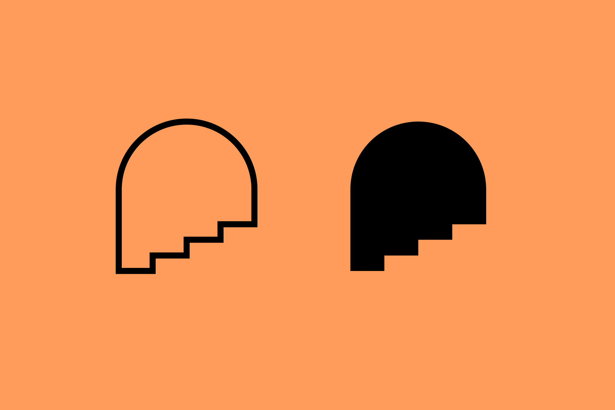
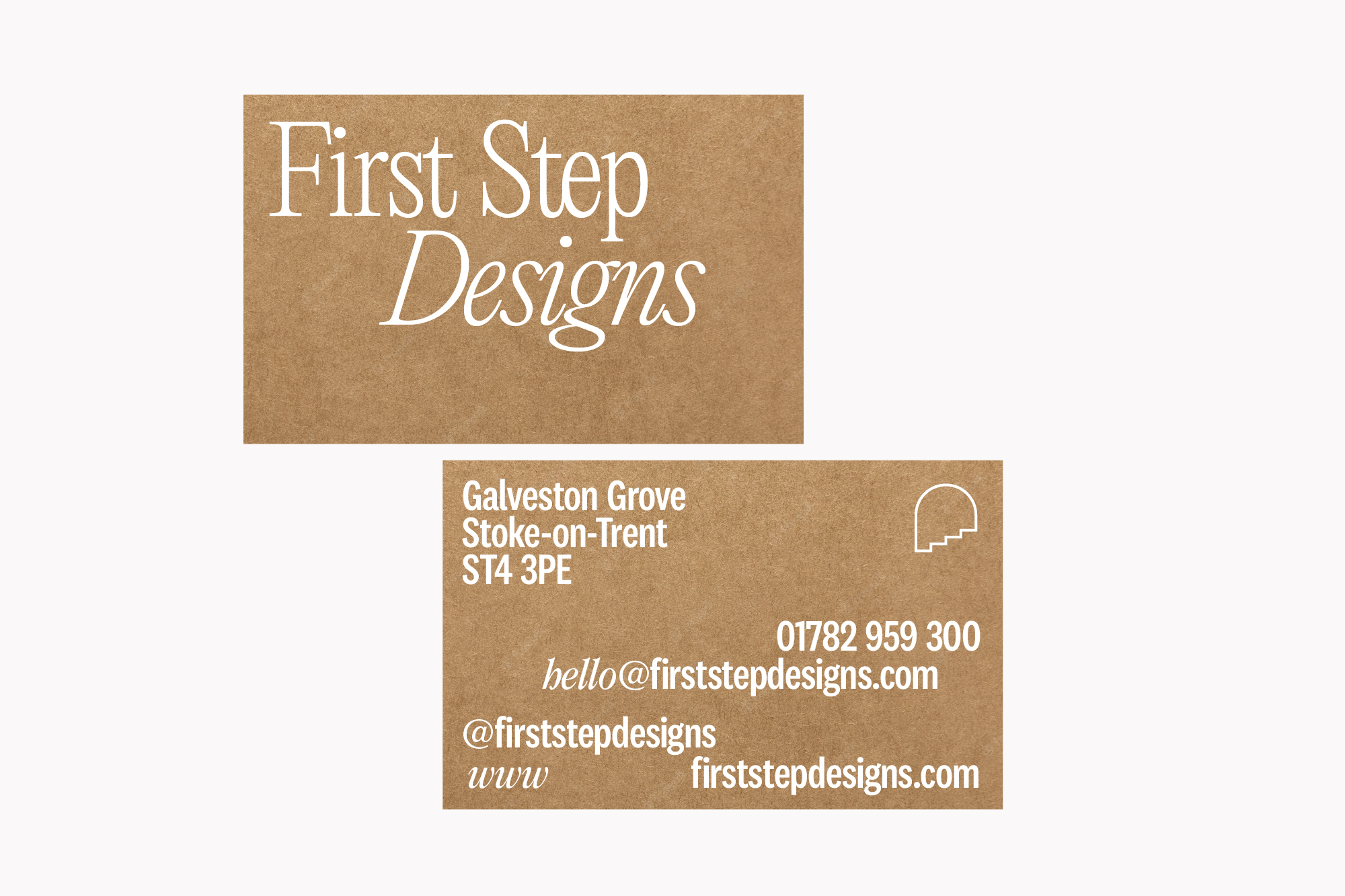
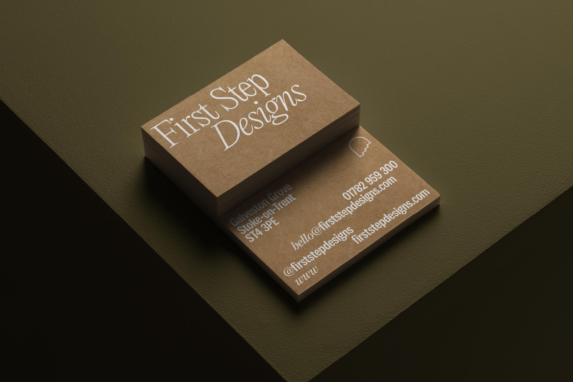
Instead of the sketching concept paired with the FSD icon, we have created a brand mark that hints at steps disappearing into an arch or doorway. This gives a feeling of an 'open door' which is to reference the friendly and contactable customer service and brand ethos. It initially came from investigating the abstract letter shapes of FSD combined in different ways but in the main it references the opening of your front door to your new statement staircase.
This icon can be used as a secondary mark and is for small spaces and branding physical products where simplicity and clarity is key for replicating across all materials and processes.
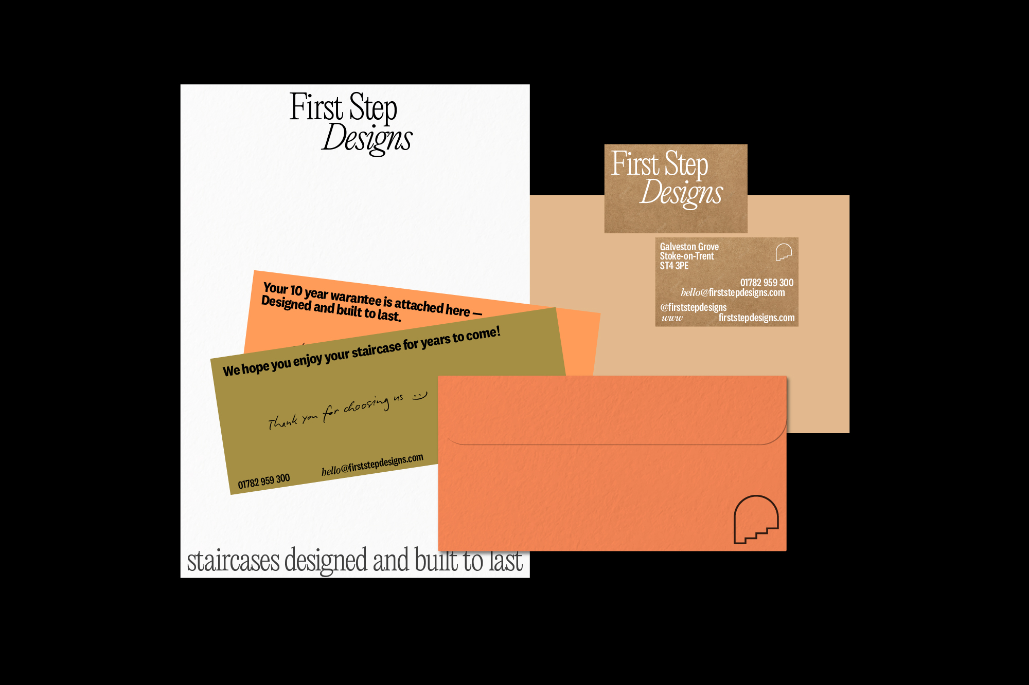
A warm, friendly and fresh palette brings an accessible feel that is grounded in nature and is complemented with recycled craft board with organic white ink. Deeper greens and material tones offset the brighter, lighter palette.
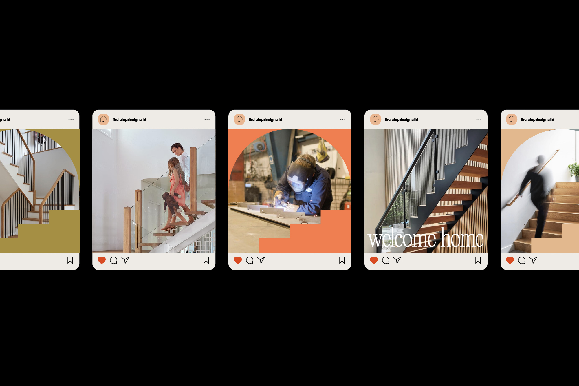
Large scale type overlaid on imagery mixed with the doorway/ steps icon used as a holding device creates engaging and branded social media posts and adverts.
Instead of the sketching concept paired with the FSD icon, we have created a brand mark that hints at steps disappearing into an arch or doorway. This gives a feeling of an 'open door' which is to reference the friendly and contactable customer service and brand ethos. It initially came from investigating the abstract letter shapes of FSD combined in different ways but in the main it references the opening of your front door to your new statement staircase.
This icon can be used as a secondary mark and is for small spaces and branding physical products where simplicity and clarity is key for replicating across all materials and processes.
A warm, friendly and fresh palette brings an accessible feel that is grounded in nature and is complemented with recycled craft board with organic white ink. Deeper greens and material tones offset the brighter, lighter palette.
Large scale type overlaid on imagery mixed with the doorway/ steps icon used as a holding device creates engaging and branded social media posts and adverts.