CONCEPT 1
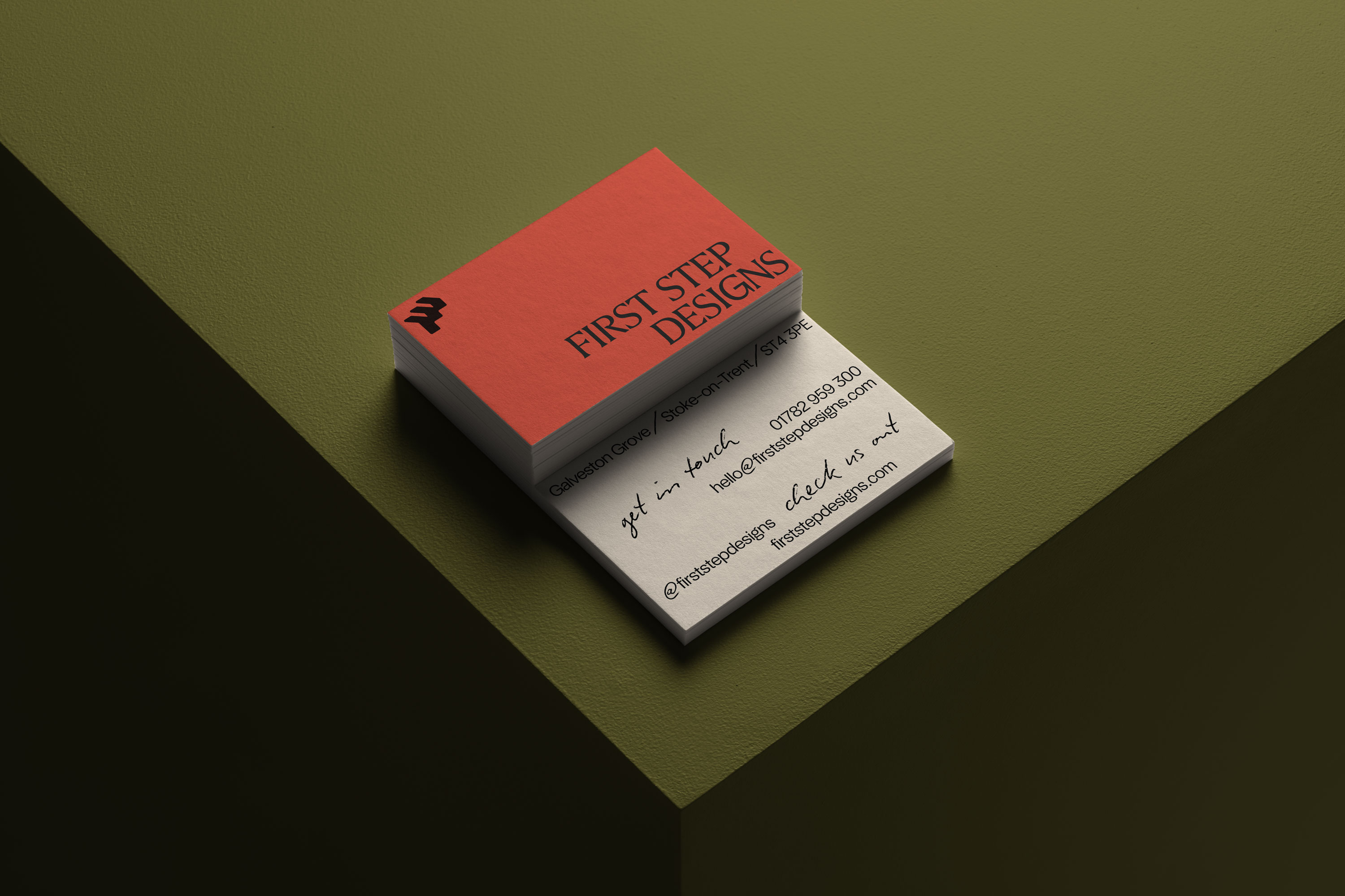
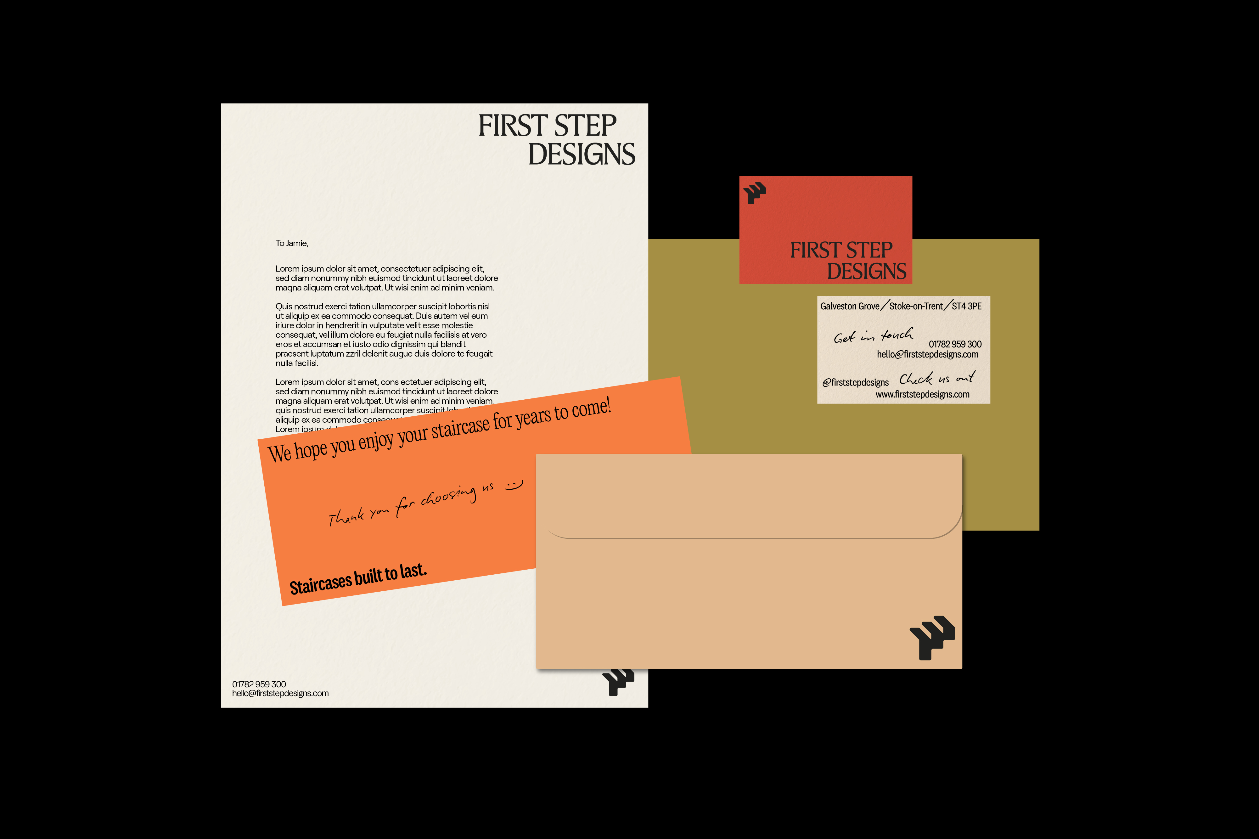
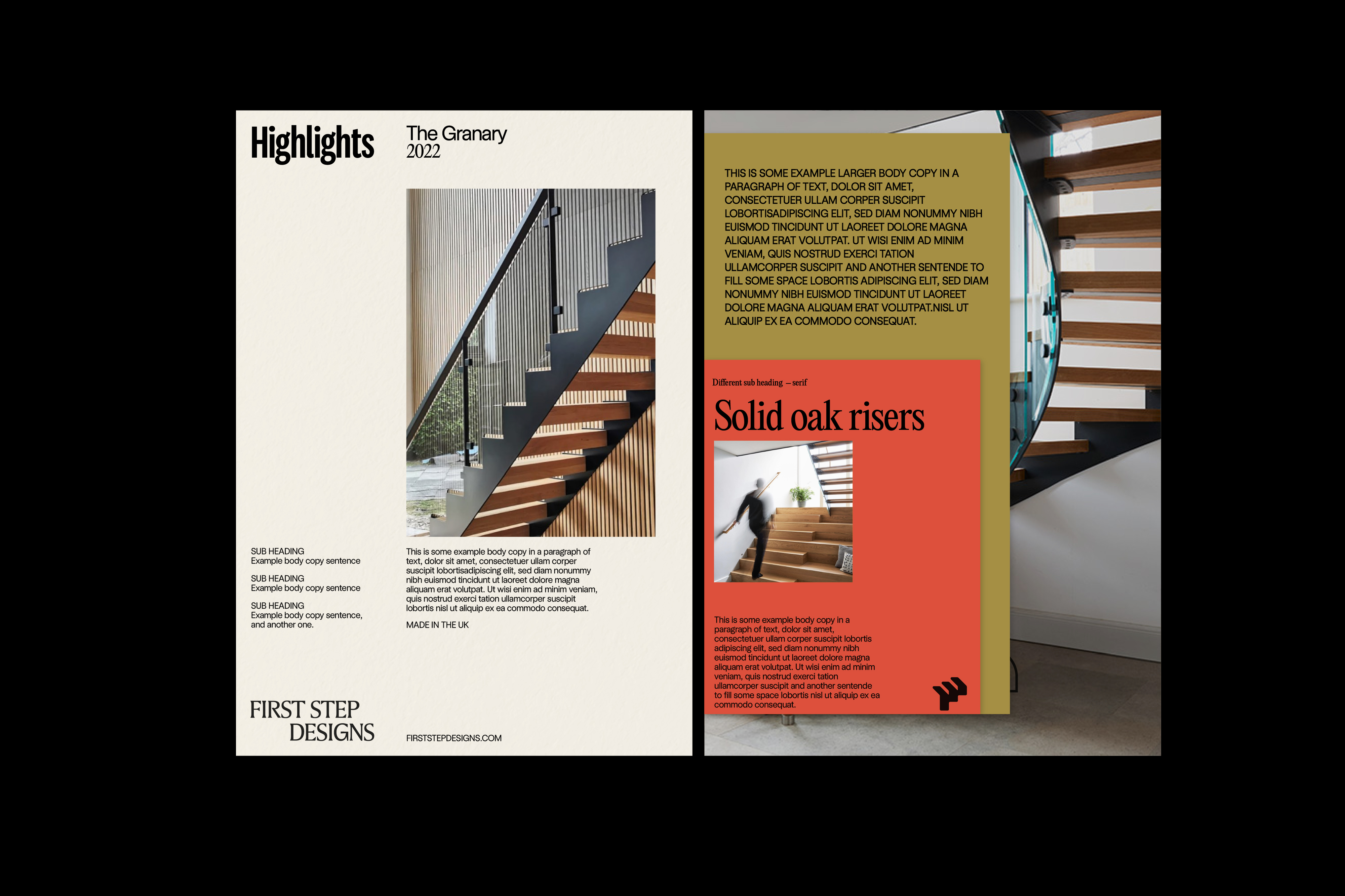
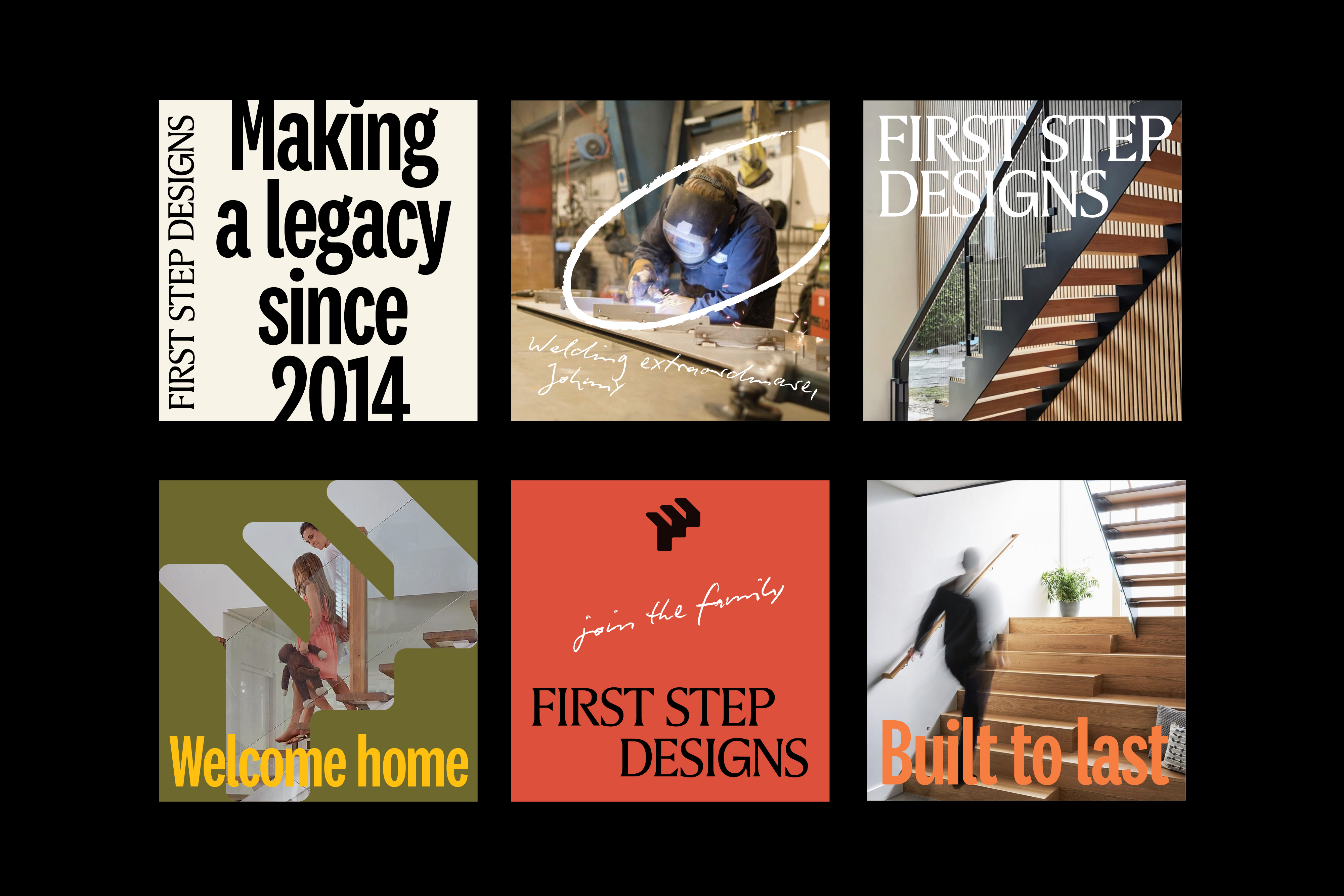
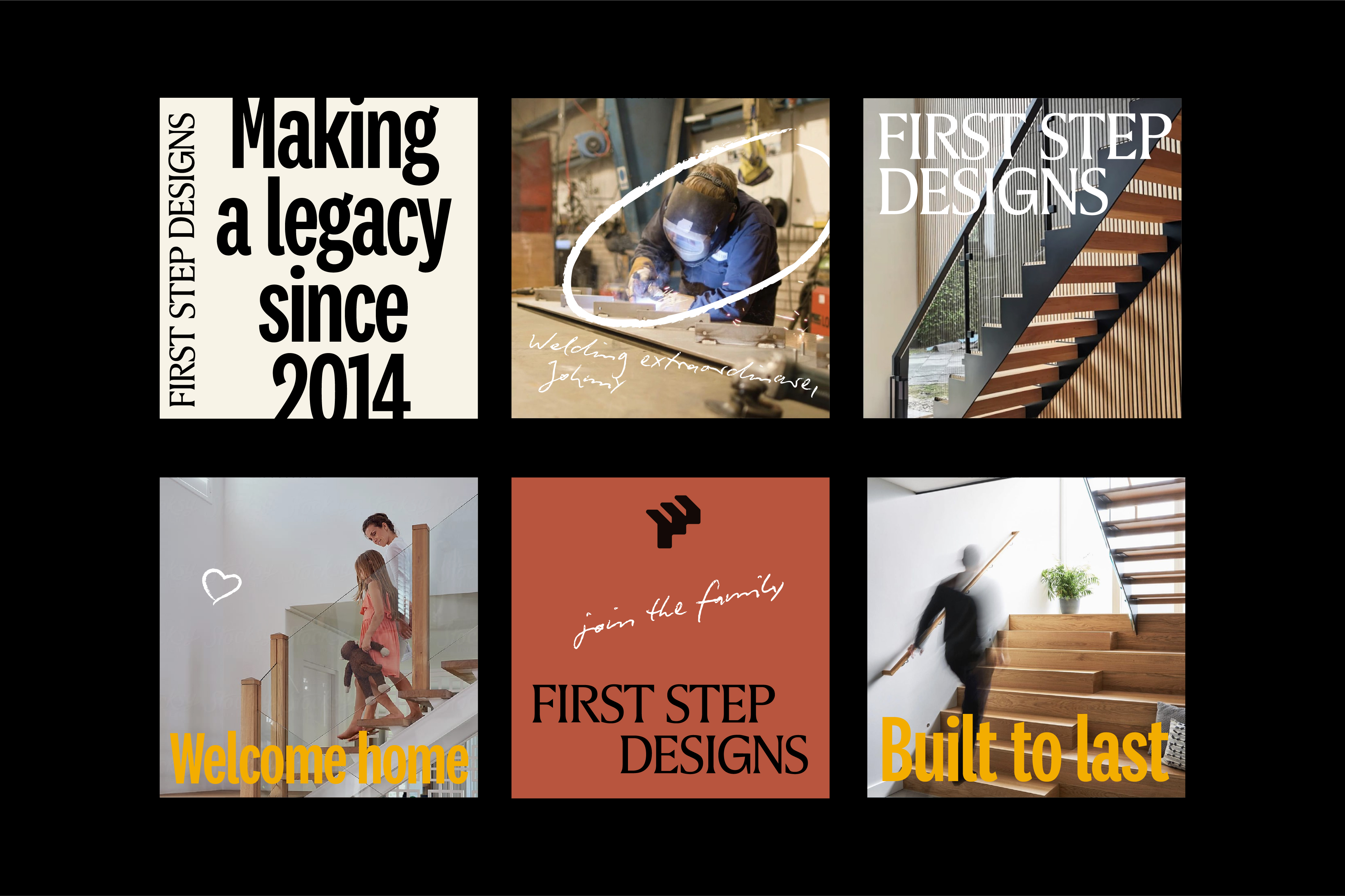
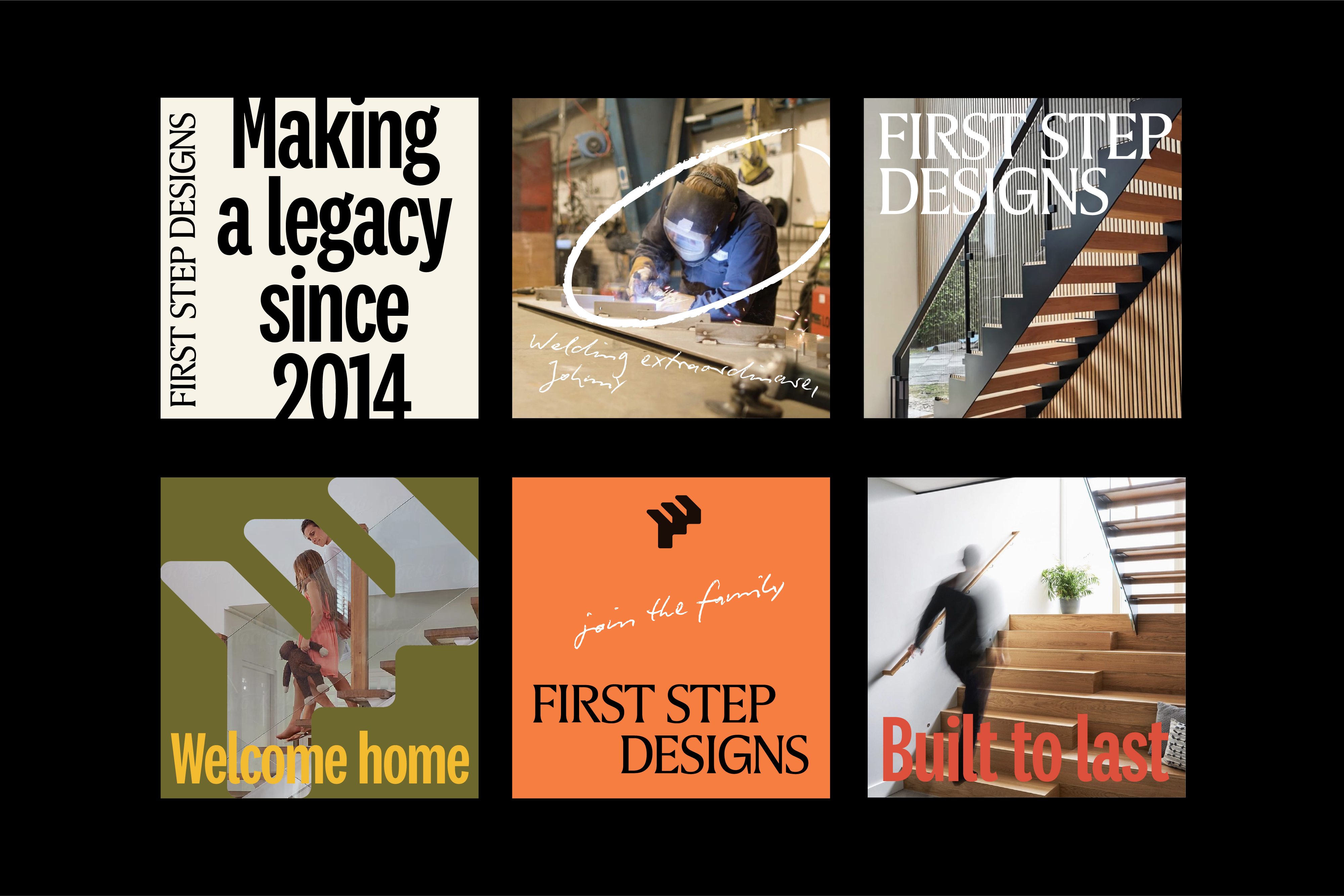
In this first concept, we have presented the developed logotype along with what we feel is the most successful logo icon and palette.
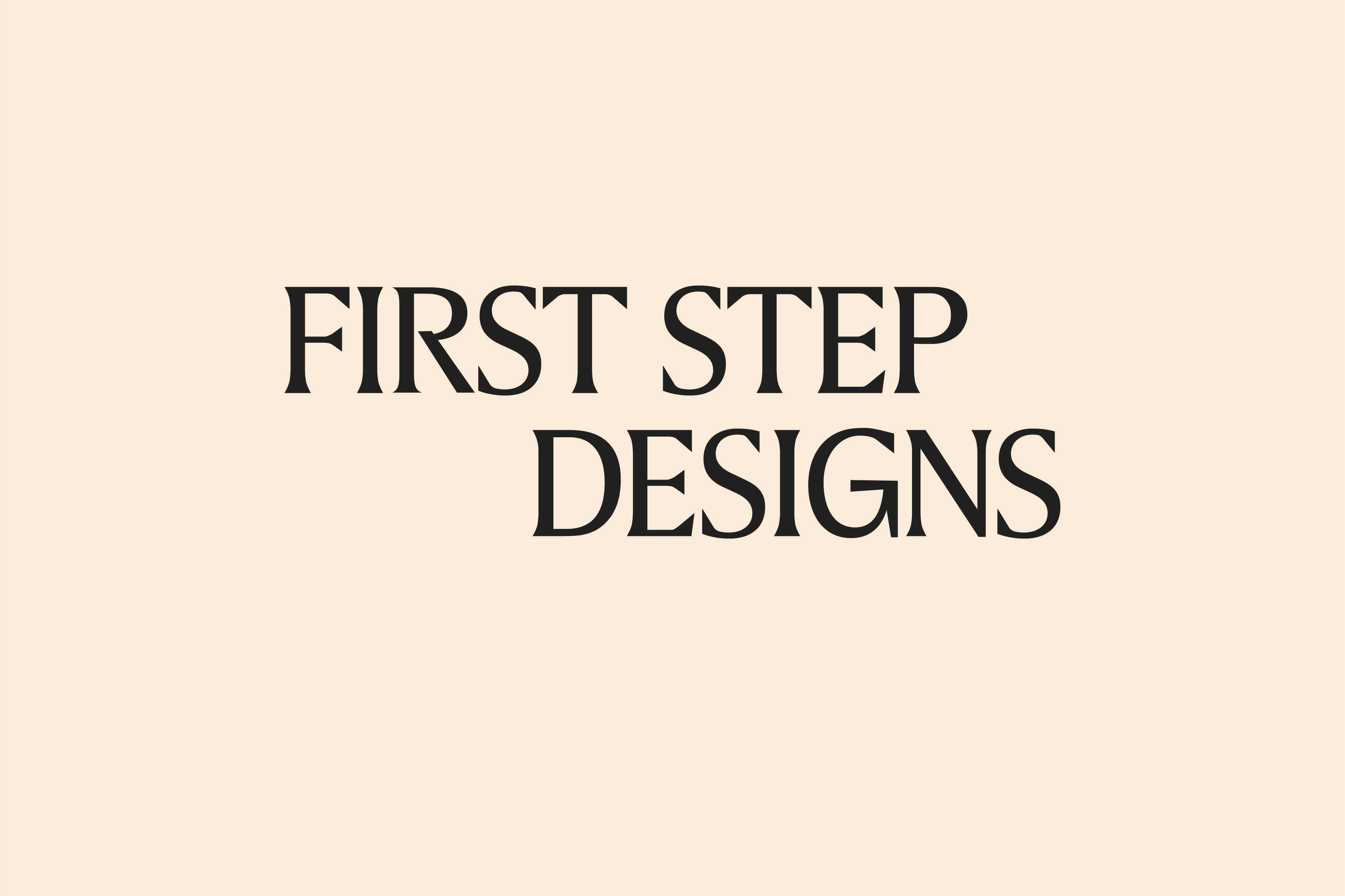
The logotype is entirely bespoke with each letterform being customised to add character along with a constructed and more traditional feel which can then be balanced with more fun details in the rest of the brand assets. We have designed it so it can be used in a stack across 2 lines with a 'stepped' layout which gives a more dynamic feel and saves horizontal space. There is also a version on a single line for when it is more appropriate.
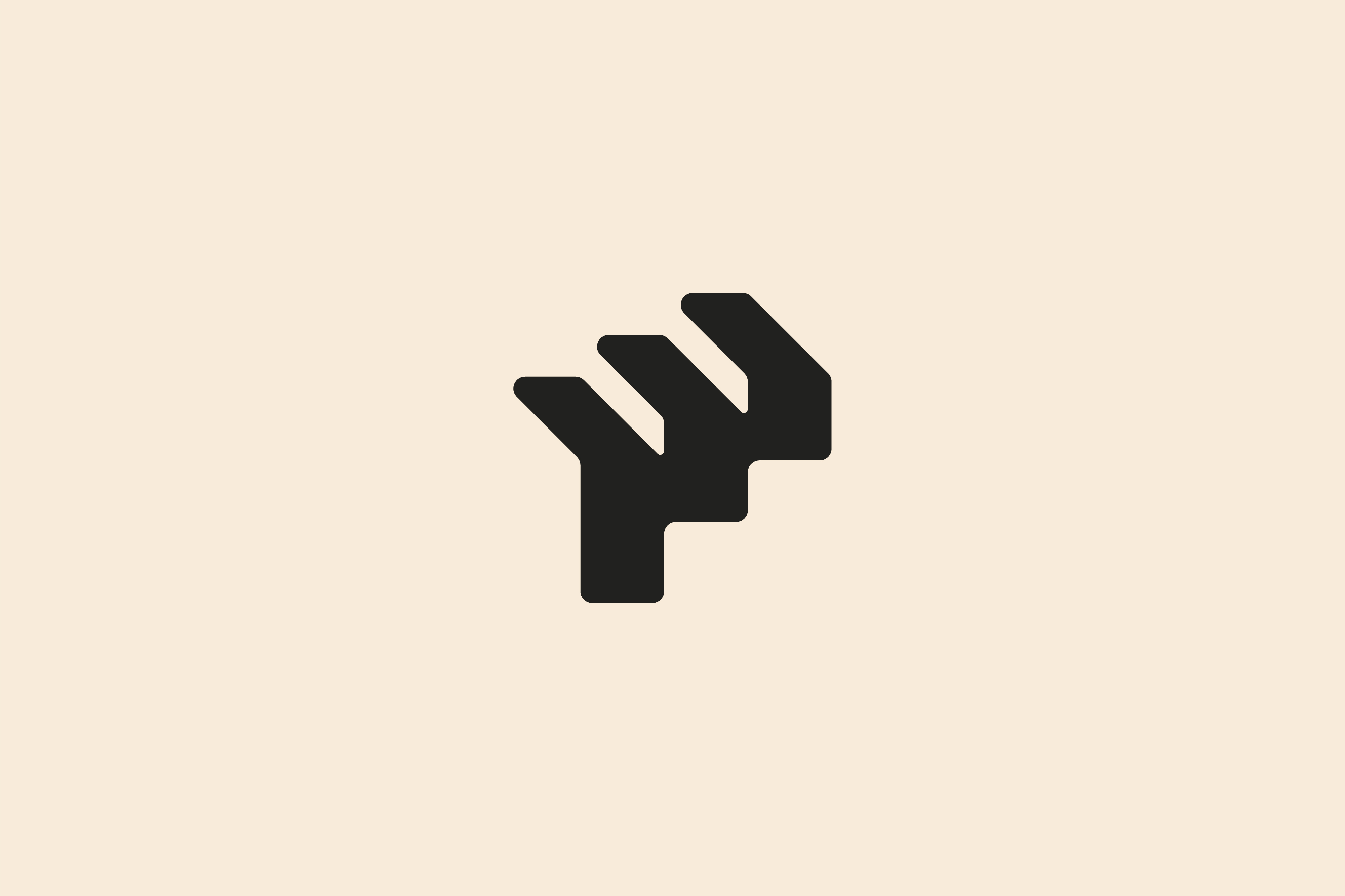
The logotype is balanced with a bold, abstract and impactful logo icon which is drawn from an isometric 3D staircase but also is in the form of an 'F'. The 3 steps that create the F represent the 3 equal arms of the business that is your USP — equal parts Designers, Makers and Installers.
The corners are rounded to make it more friendly to match the business personality and to soften the strong shape giving a more approachable feel.
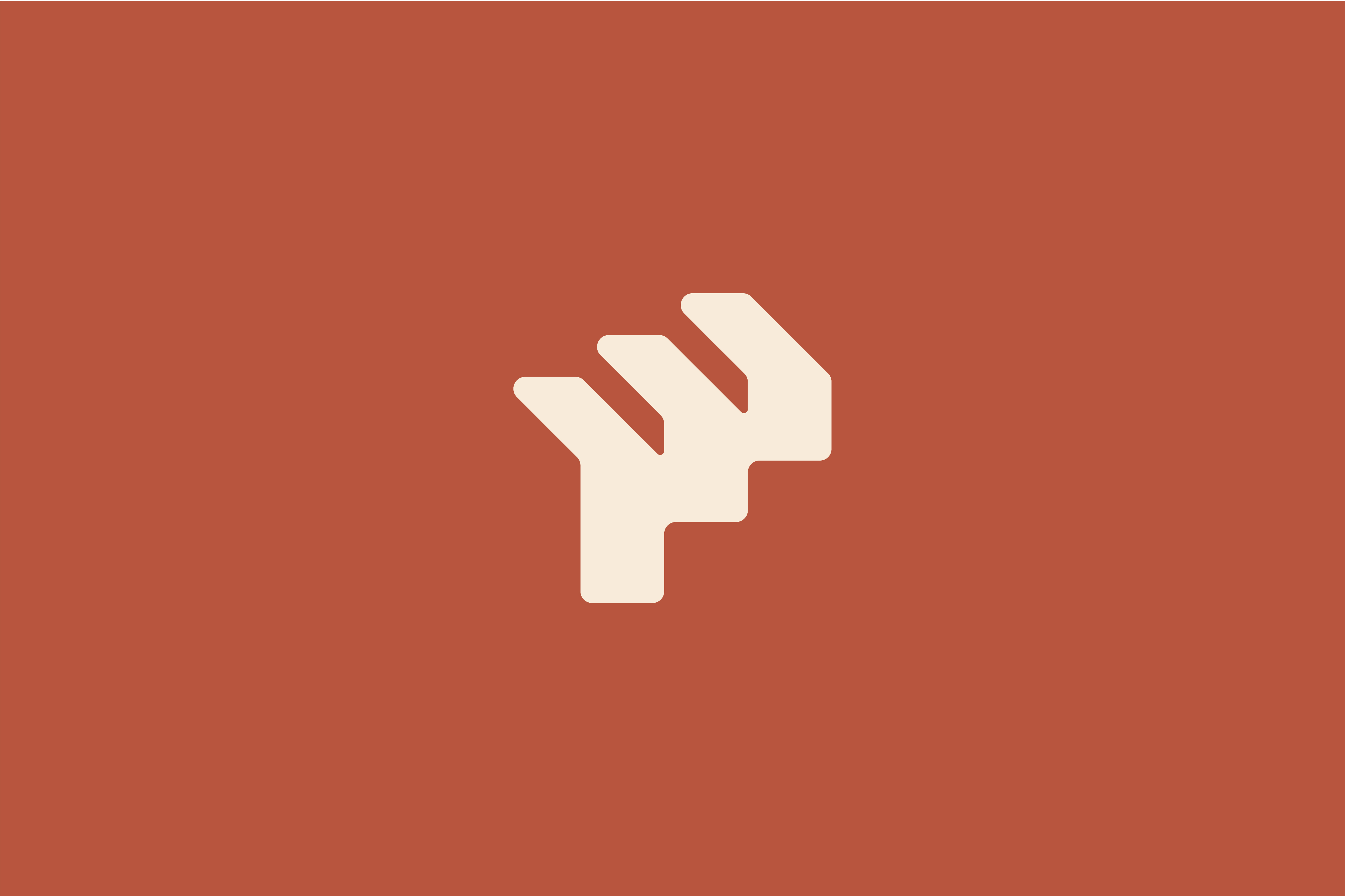
A warm and natural toned palette enhances the approachable but professional feel and is varied enough that it can be used in a number of different ways to achieve different looks. The final few images on this page outline a few different combinations and uses of colour on social media posts to give an idea of how the feeling can be changed.
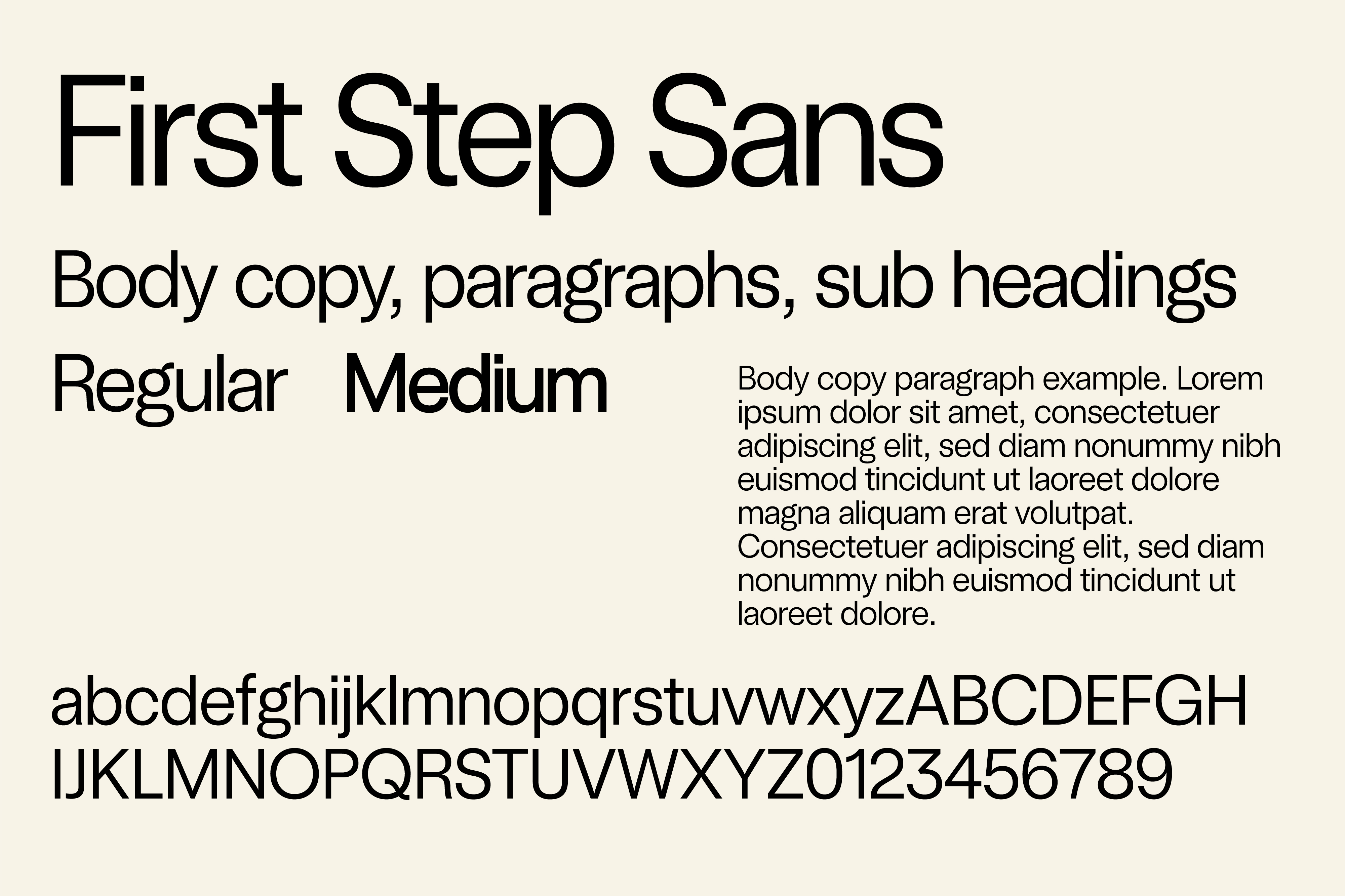
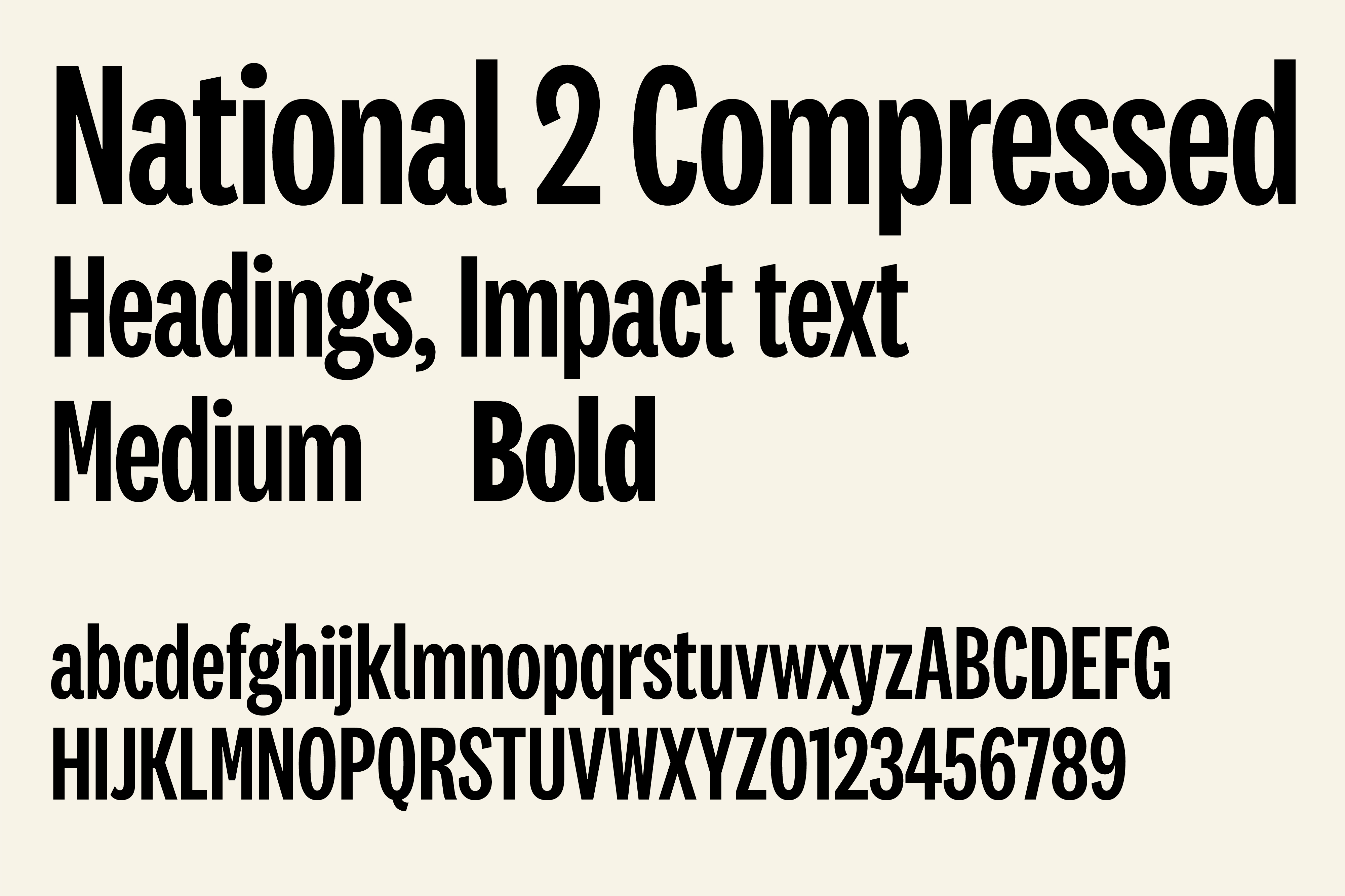
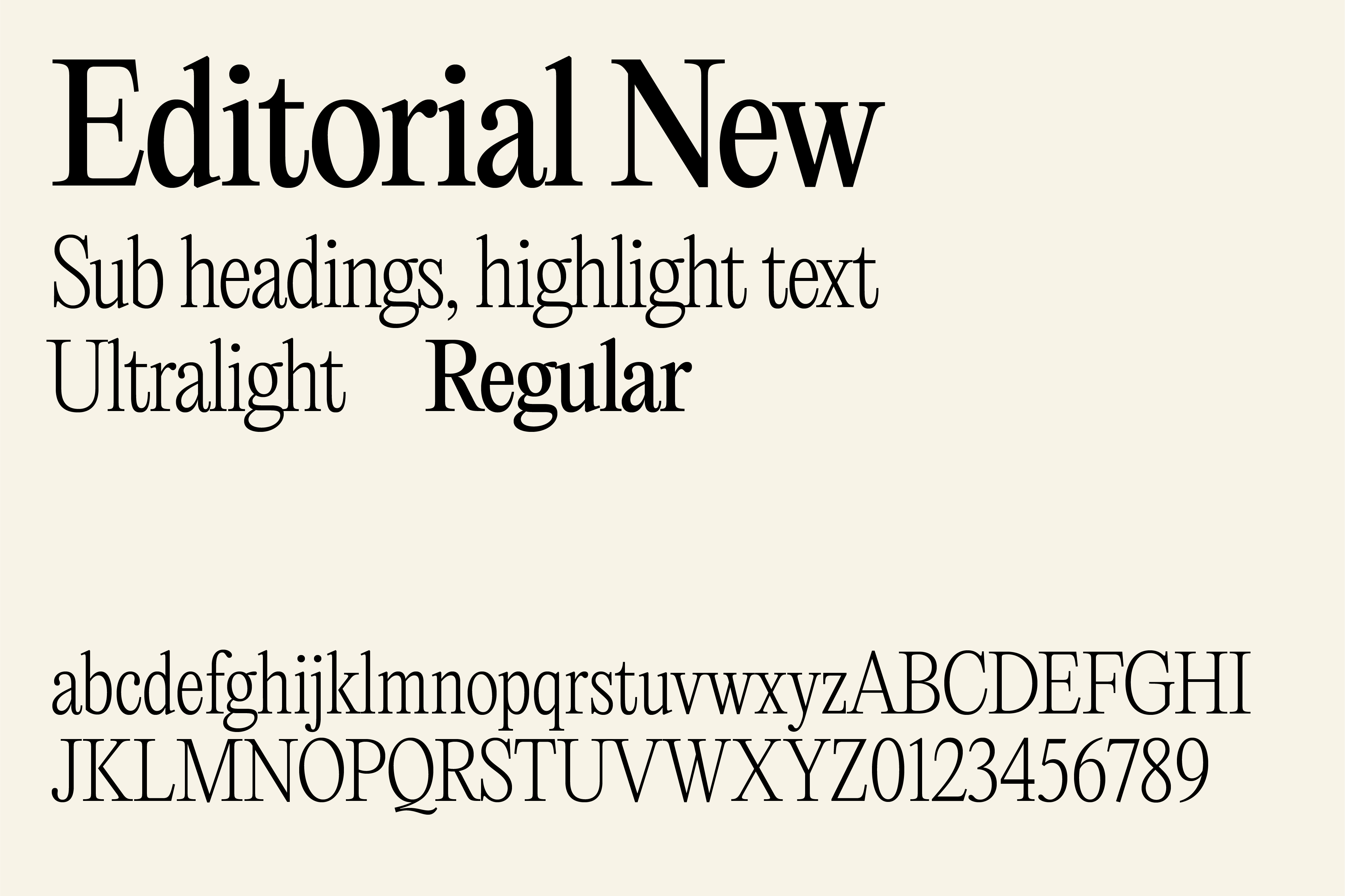
Finally, the assets are pulled together by the choice of typefaces. The key typeface is based on Universal Sans, however, we have customised it in a number of ways to give more personality and a sense of friendliness making it unique to your brand– we can create this with the font foundry and have named it First Step Sans. This is used as the main typeface and is mainly for body copy. To support this we have a bold, condensed font for punchy, impact text and a fine serif font for highlight copy.
The logotype is entirely bespoke with each letterform being customised to add character along with a constructed and more traditional feel which can then be balanced with more fun details in the rest of the brand assets. We have designed it so it can be used in a stack across 2 lines with a 'stepped' layout which gives a more dynamic feel and saves horizontal space. There is also a version on a single line for when it is more appropriate.
The logotype is balanced with a bold, abstract and impactful logo icon which is drawn from an isometric 3D staircase but also is in the form of an 'F'. The 3 steps that create the F represent the 3 equal arms of the business that is your USP — equal parts Designers, Makers and Installers.
The corners are rounded to make it more friendly to match the business personality and to soften the strong shape giving a more approachable feel.
A warm and natural toned palette enhances the approachable but professional feel and is varied enough that it can be used in a number of different ways to achieve different looks. The final few images on this page outline a few different combinations and uses of colour on social media posts to give an idea of how the feeling can be changed.
Finally, the assets are pulled together by the choice of typefaces. The key typeface is based on Universal Sans, however, we have customised it in a number of ways to give more personality and a sense of friendliness making it unique to your brand– we can create this with the font foundry and have named it First Step Sans. This is used as the main typeface and is mainly for body copy. To support this we have a bold, condensed font for punchy, impact text and a fine serif font for highlight copy.