CONCEPT 1
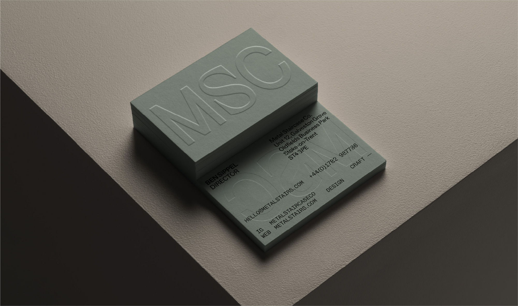
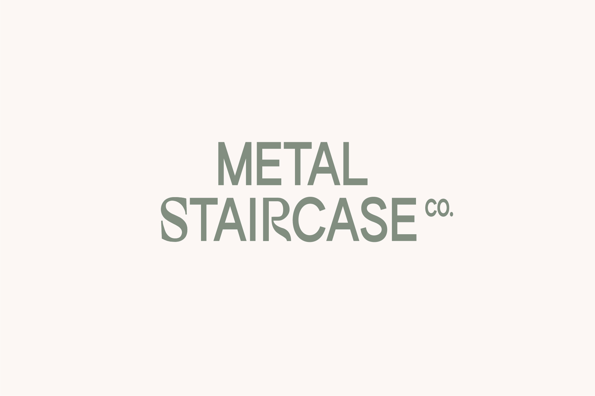
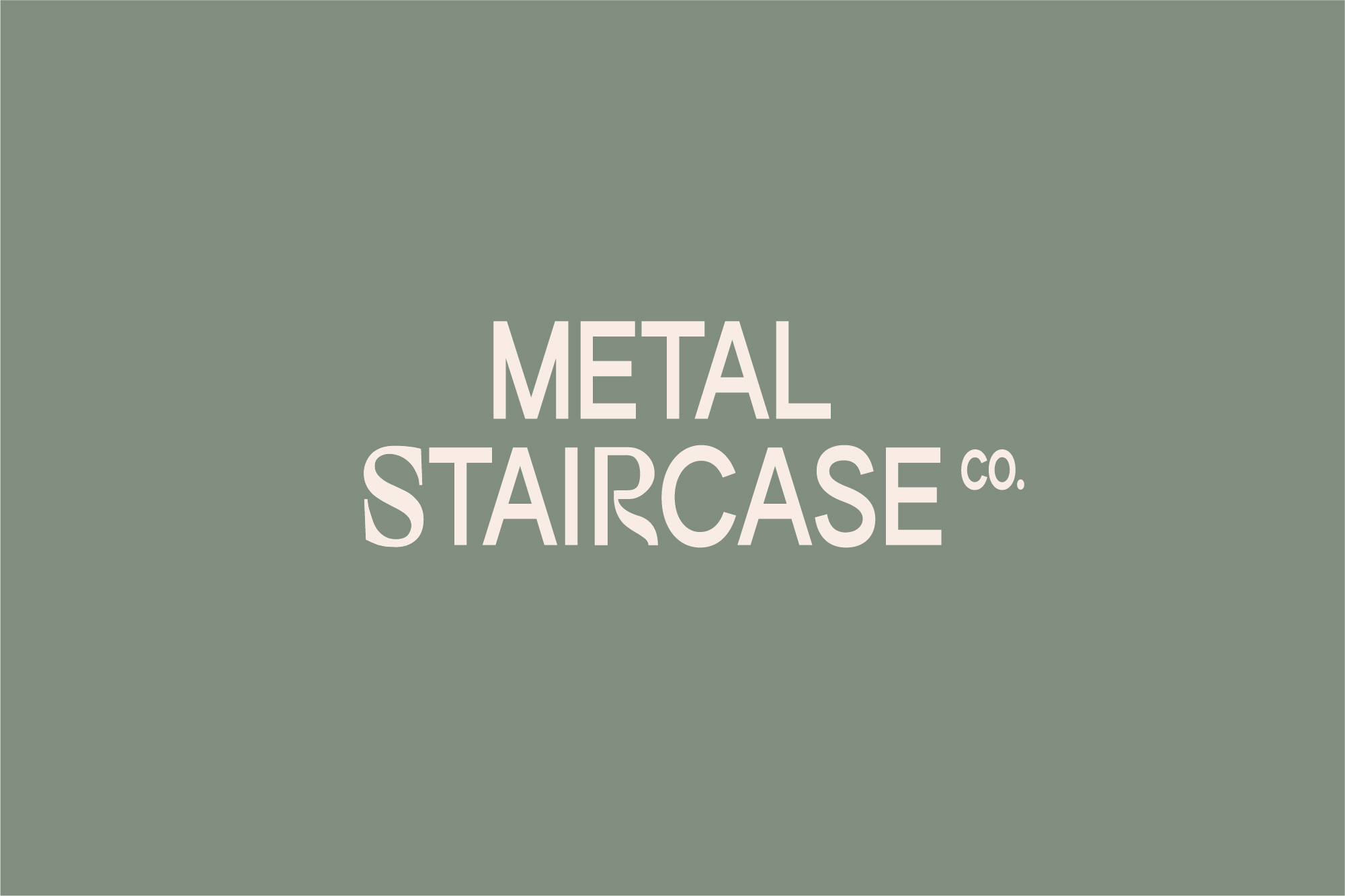
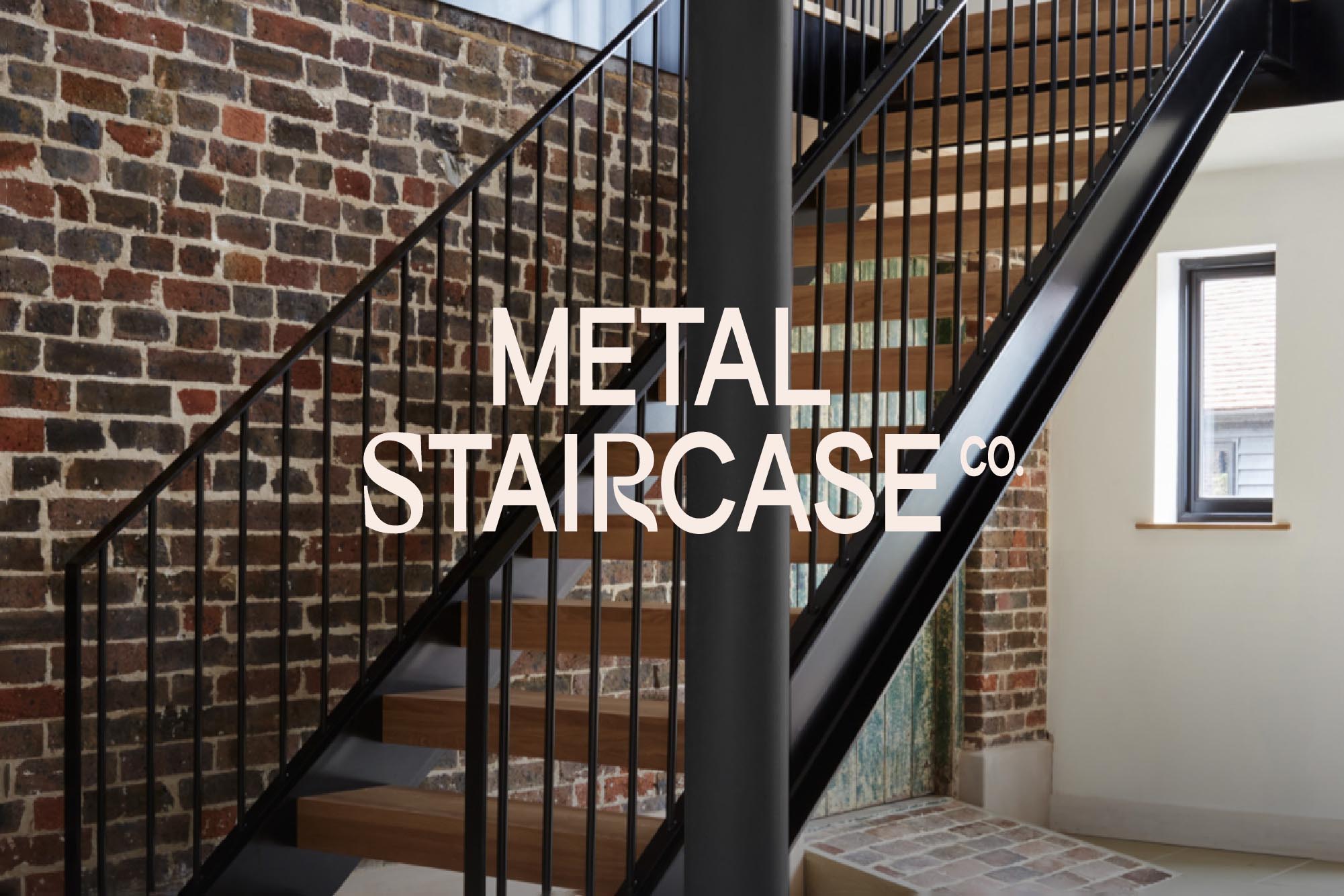
We have designed a bespoke logotype as the main brand asset. Combining a modern, slightly condensed typeface with crafted letterforms of the 'S' and 'R' serve to show the dual elements of the brand – technical + beautiful, design + craft, handmade + machined.
The logotype can be represented in a number of layouts with the three words coming together in different forms to create a stepped effect and to illustrate the flexible 'kit' style design of the staircases.
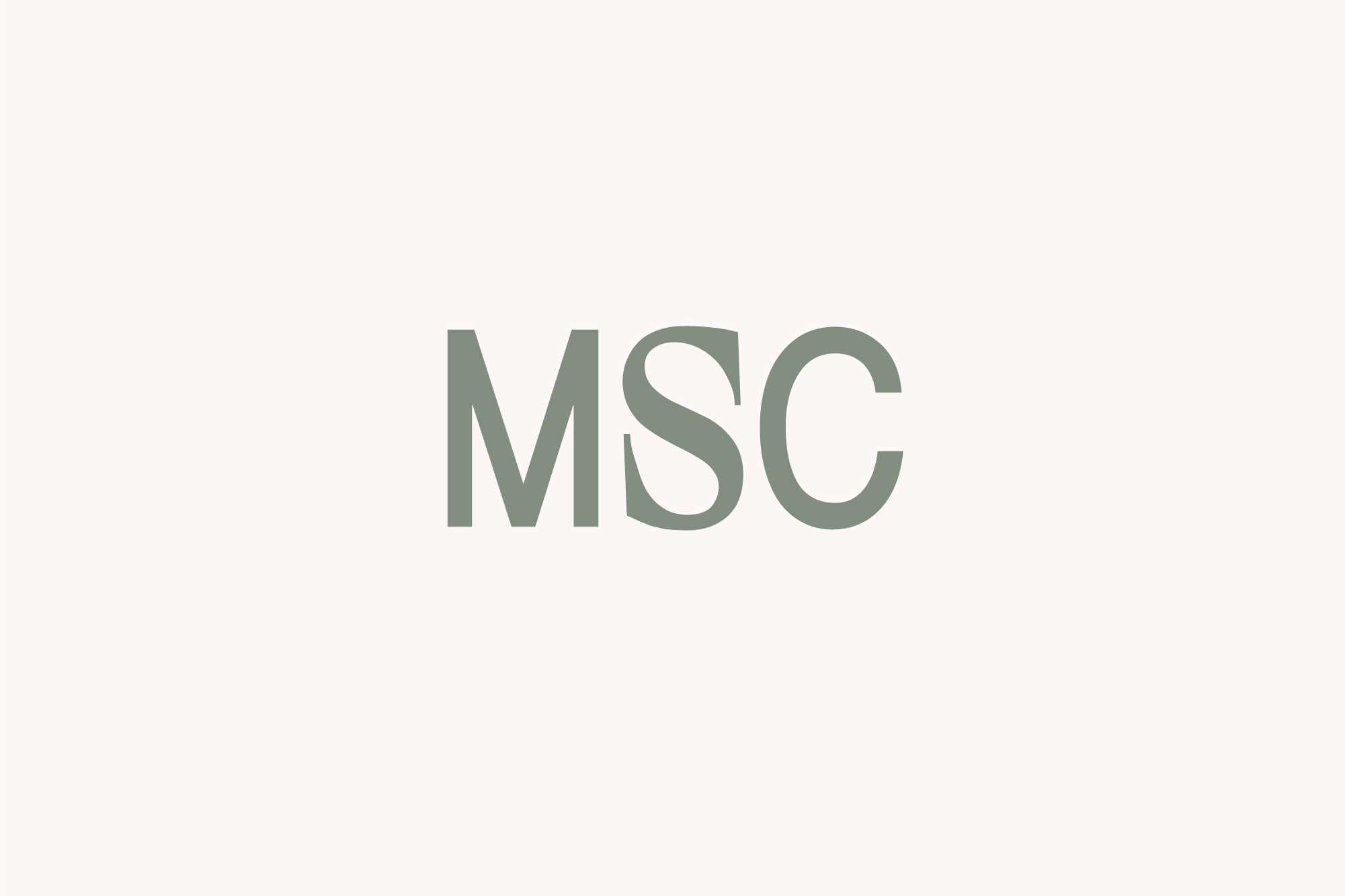
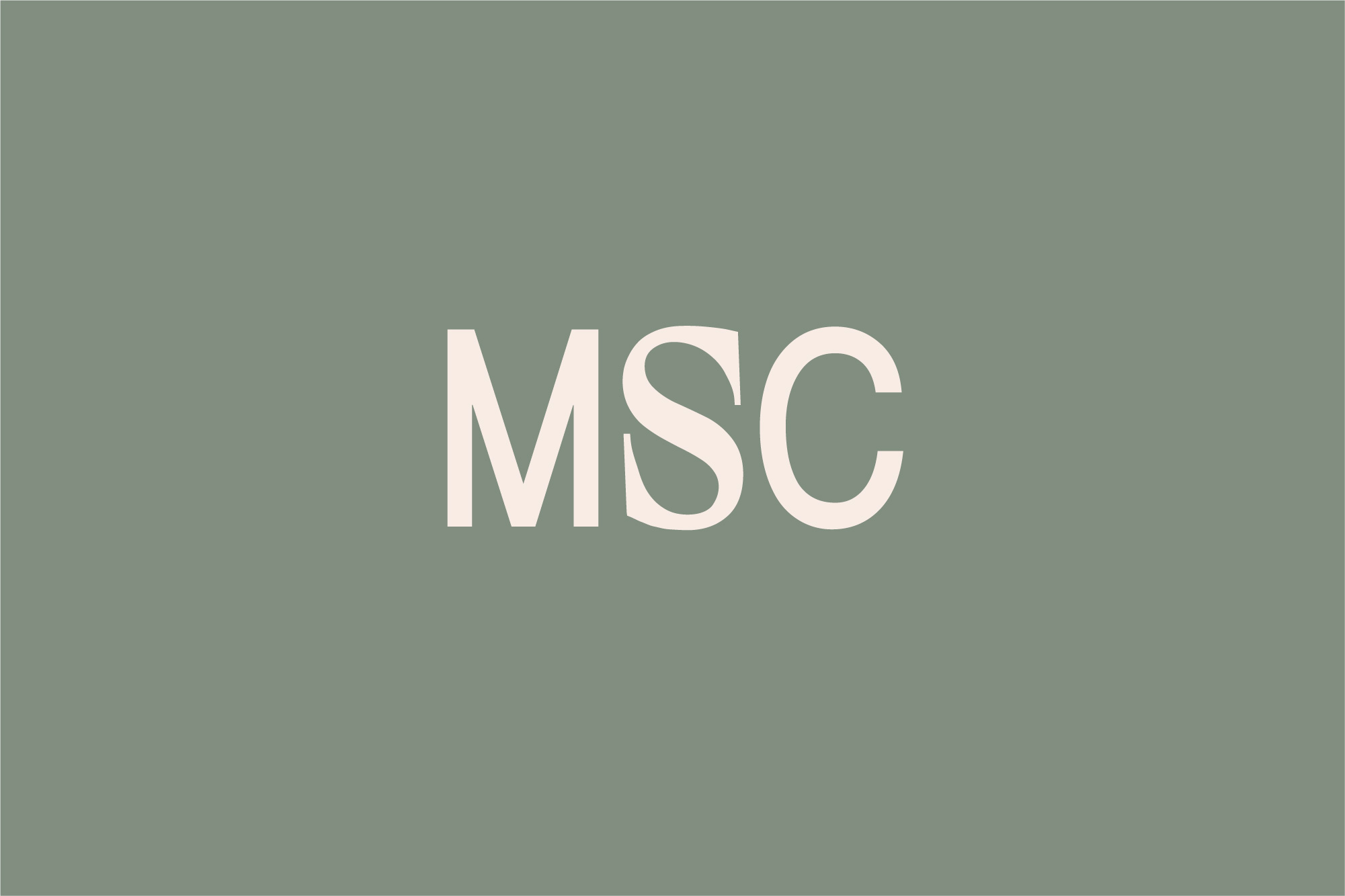
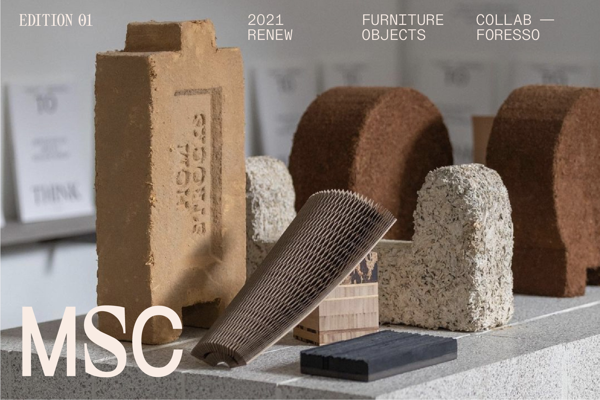
Reducing down to MSC when needed, the logo retains the more curved and crafted 'S' of staircase to create some visual tension and interest.
This is supported by modular style layout of text using a range of typefaces, from a clean sans serif font for body copy to a mono-spaced font for technical information.
We've started to expand the colour palette to include some more earthy and natural colours – a full exploration of colour and pattern will come in stage 2.
The logotype can be represented in a number of layouts with the three words coming together in different forms to create a stepped effect and to illustrate the flexible 'kit' style design of the staircases.
Reducing down to MSC when needed, the logo retains the more curved and crafted 'S' of staircase to create some visual tension and interest.
This is supported by modular style layout of text using a range of typefaces, from a clean sans serif font for body copy to a mono-spaced font for technical information.
We've started to expand the colour palette to include some more earthy and natural colours – a full exploration of colour and pattern will come in stage 2.