CONCEPT 2
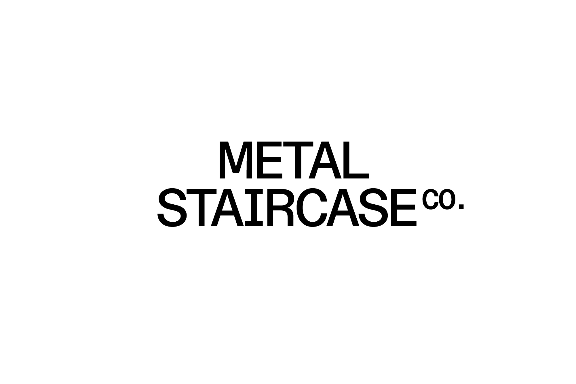
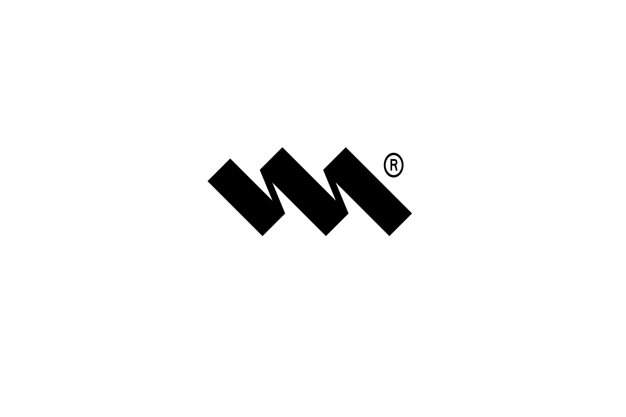
In this concept we have designed the logotype using a more mono-spaced feeling font for a technical and innovative look. This combines with a logo icon that has been designed to look at the same time like three steps ascending but also a calligraphic or signature 'M'.
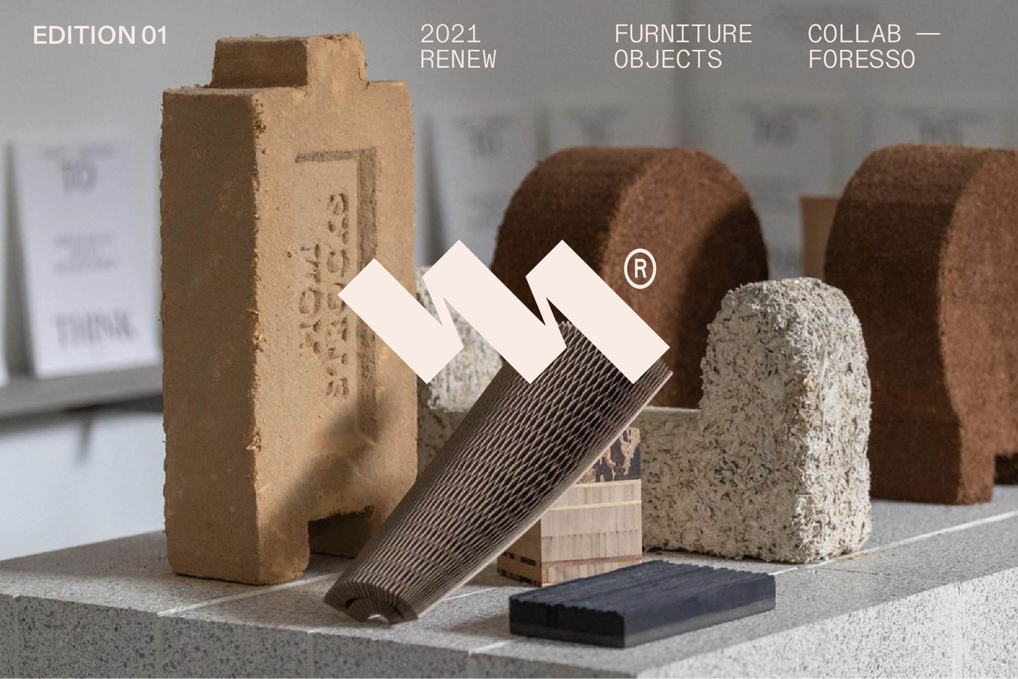
This logo icon serves as a recognisable brand asset that is not solely based on your name – which then opens a path to use easily if you expanded you product range into furniture for example.
It would also be useful for instances like social media icons and could be easily animated. I think could easily be combined with any of the concepts as part of the brand and is not exclusive to this concept.
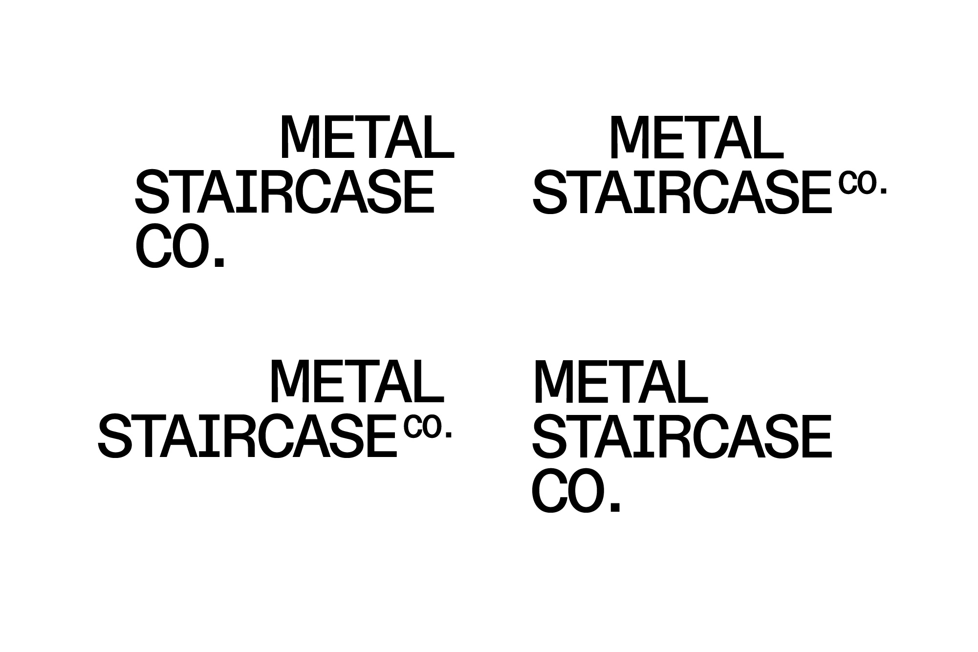
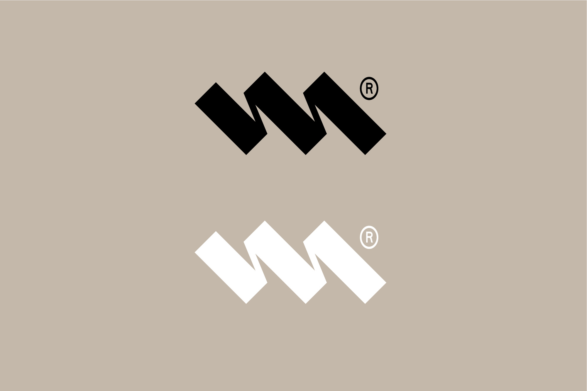
The logotype is designed to be flexible and modular, in some ways like your staircase 'kit' style. Different potential iterations are shown in the fourth image with the three components fixing together in different ways, keeping a stepped style but also using a visual cantilever effect.
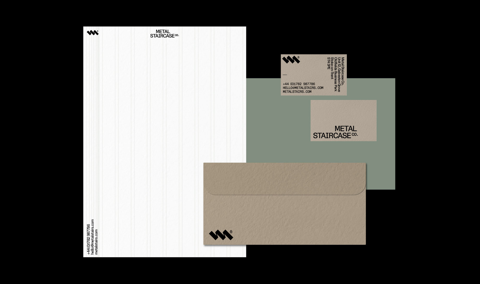
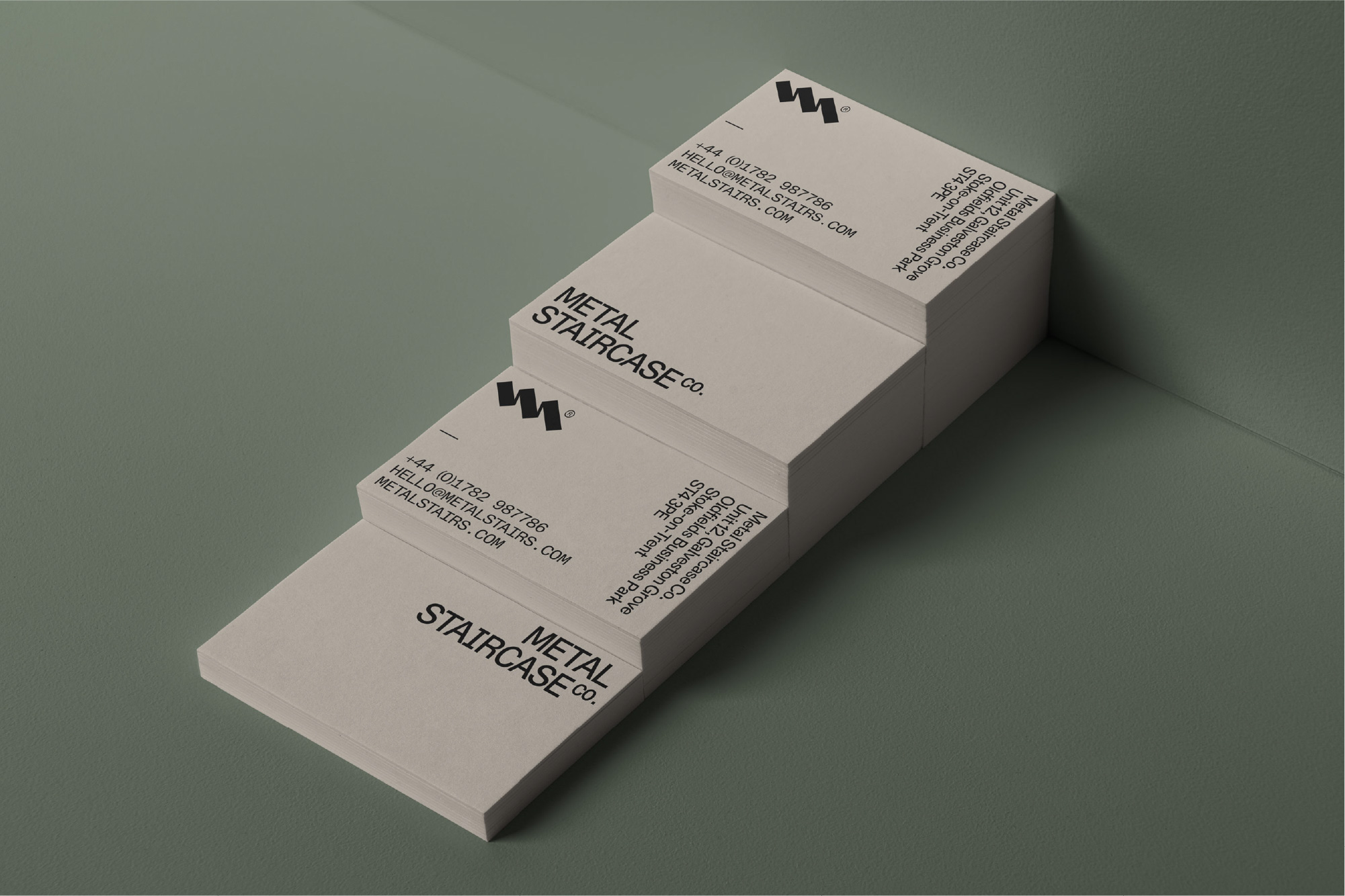
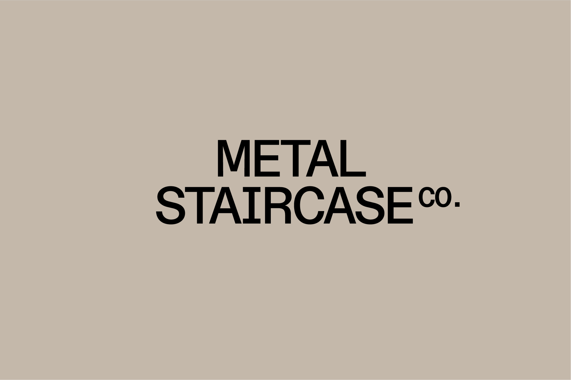
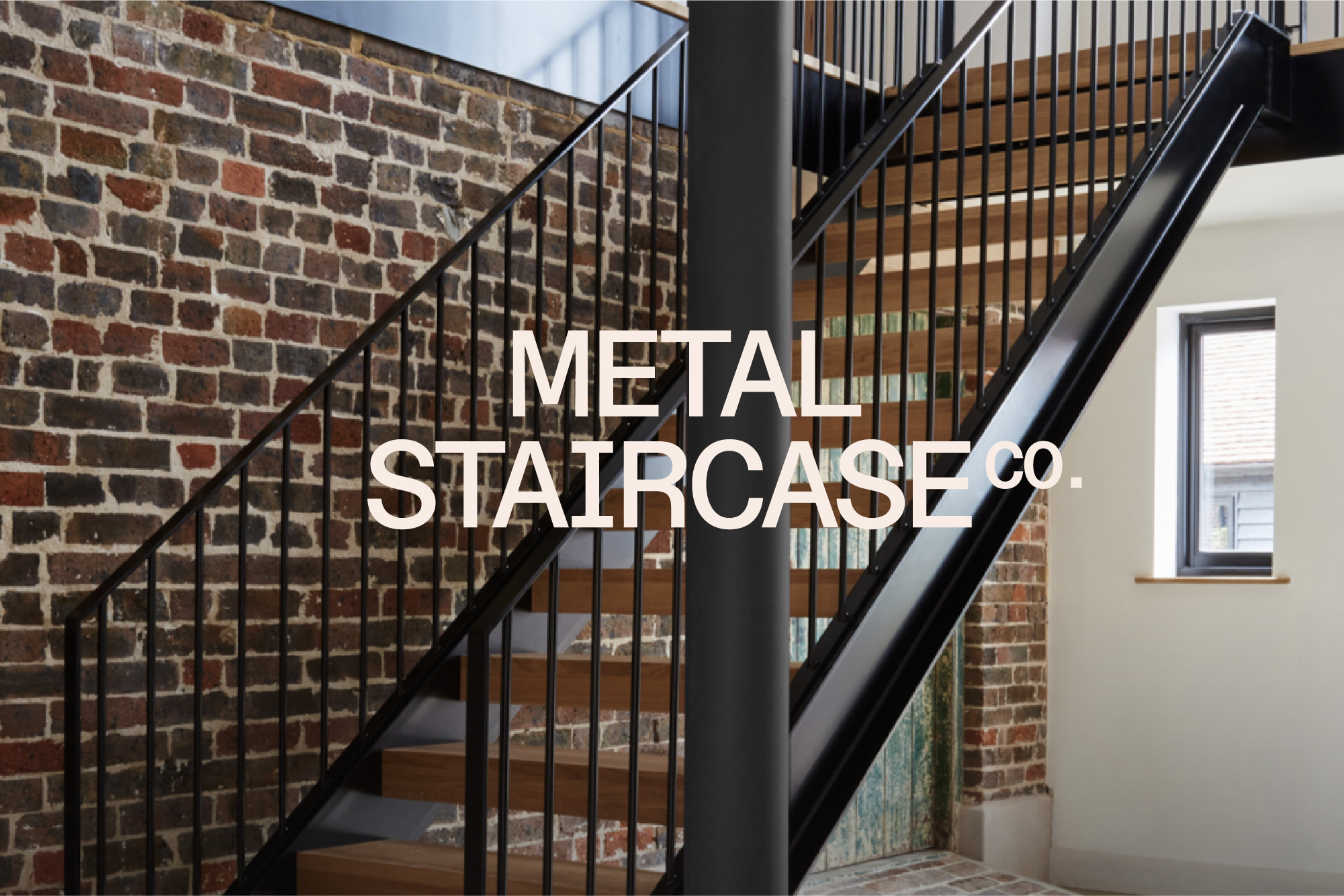
This concept uses a modular grid system to layout text and imagery to give visual structure to a minimal layout. This could be visible as shown on the letterhead mockup — which combines with a left margin 'step' pattern — or it could be an underlying system to layout text e.g. business cards.
This logo icon serves as a recognisable brand asset that is not solely based on your name – which then opens a path to use easily if you expanded you product range into furniture for example.
It would also be useful for instances like social media icons and could be easily animated. I think could easily be combined with any of the concepts as part of the brand and is not exclusive to this concept.
The logotype is designed to be flexible and modular, in some ways like your staircase 'kit' style. Different potential iterations are shown in the fourth image with the three components fixing together in different ways, keeping a stepped style but also using a visual cantilever effect.
This concept uses a modular grid system to layout text and imagery to give visual structure to a minimal layout. This could be visible as shown on the letterhead mockup — which combines with a left margin 'step' pattern — or it could be an underlying system to layout text e.g. business cards.