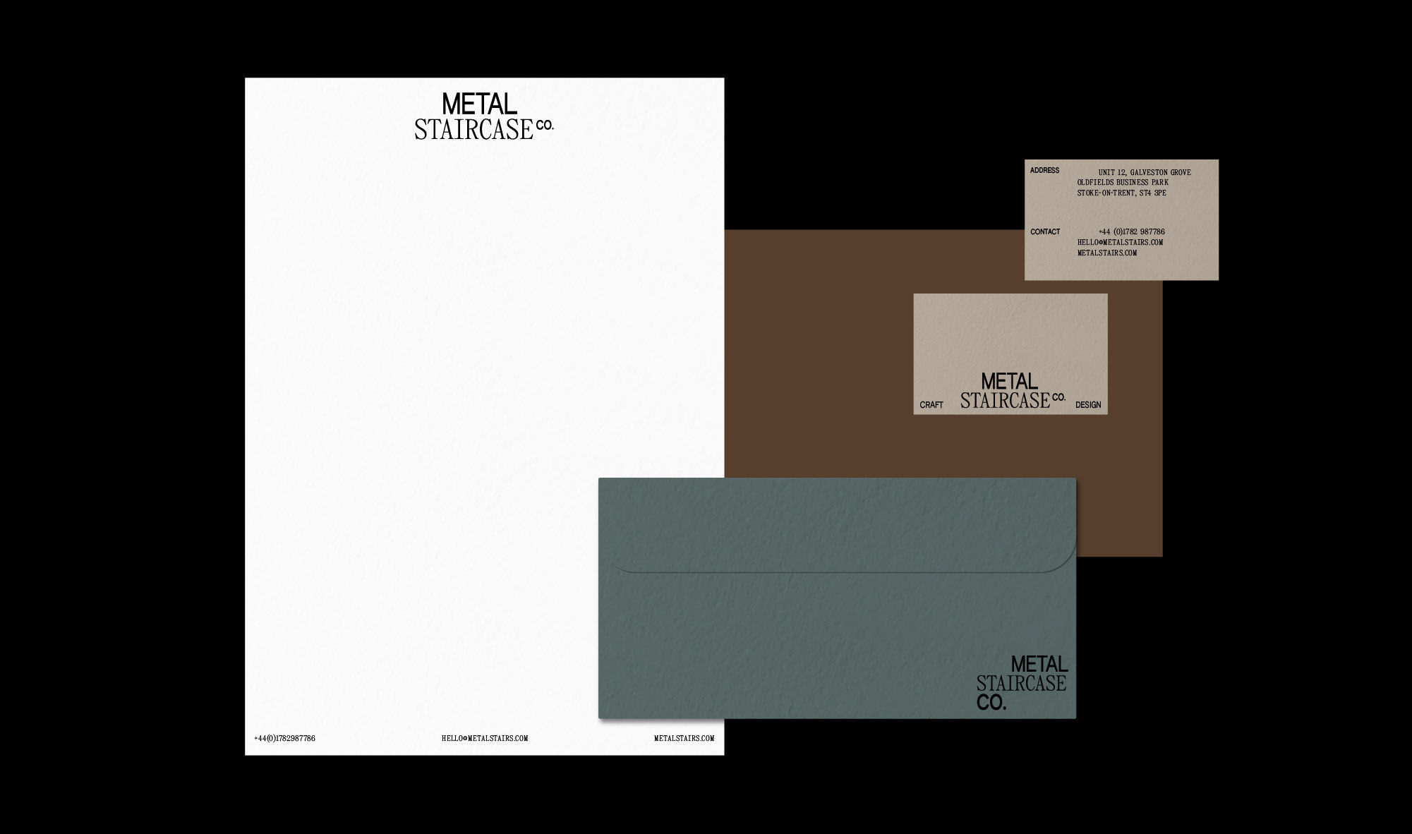
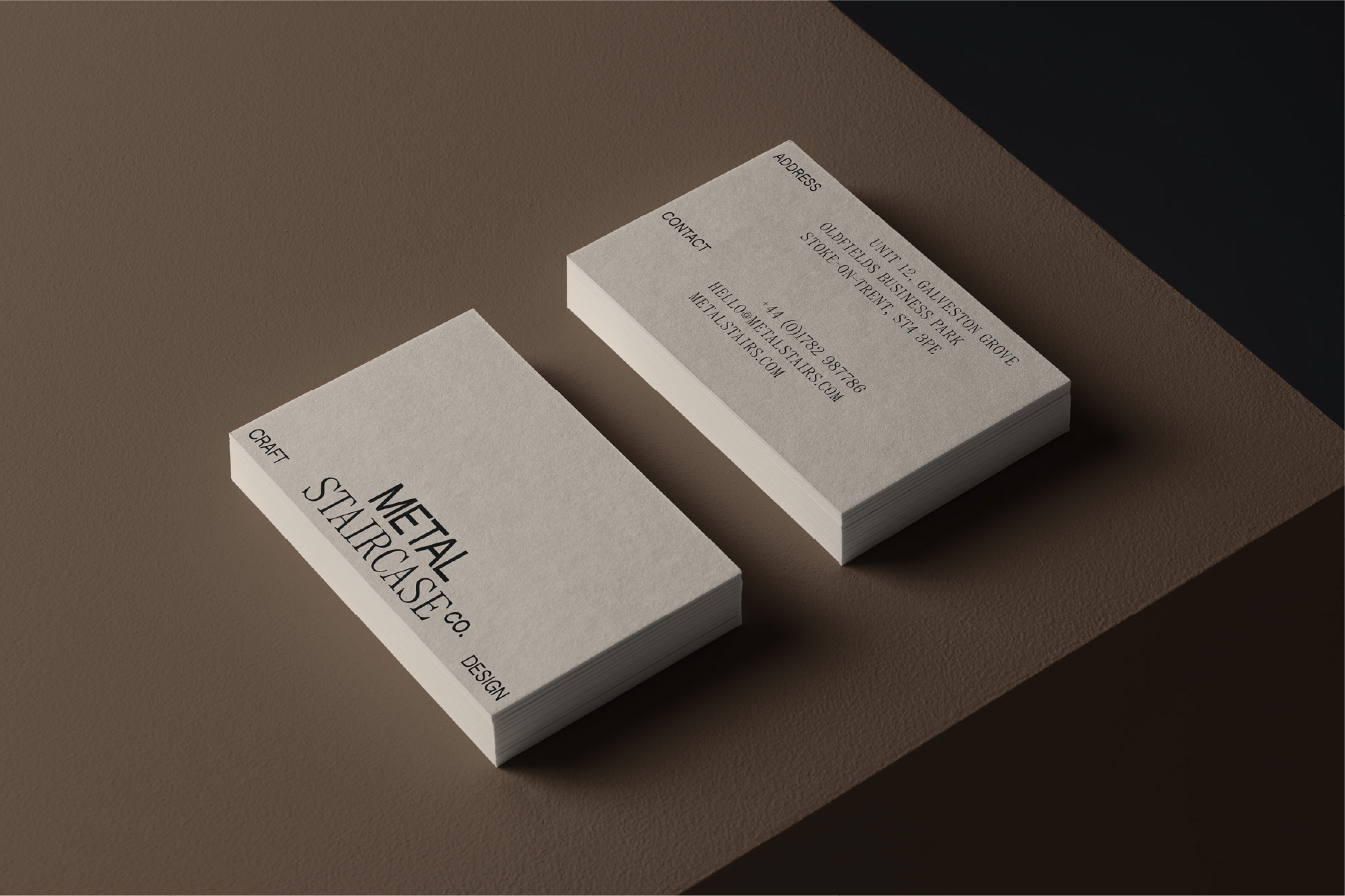
CONCEPT 3
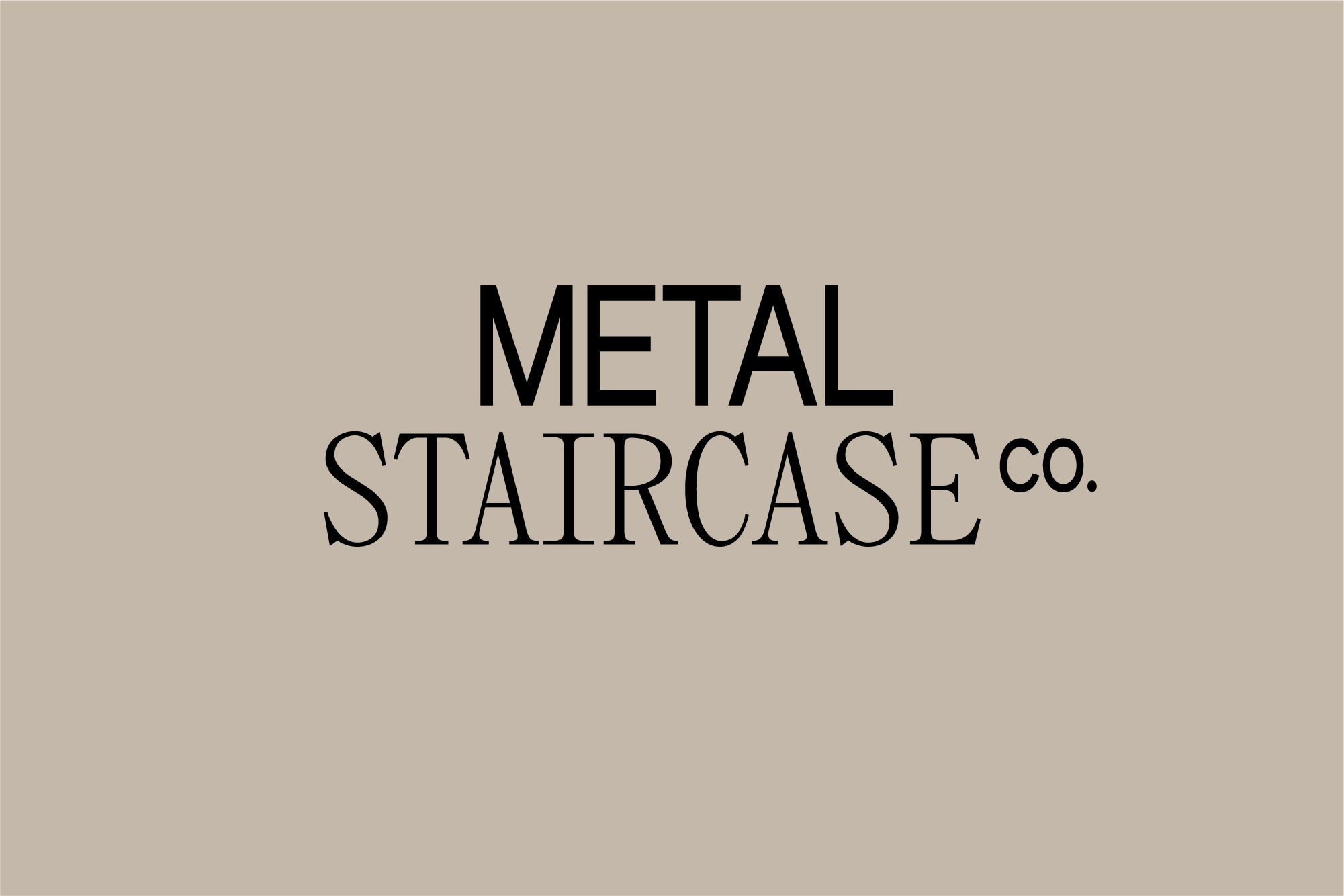
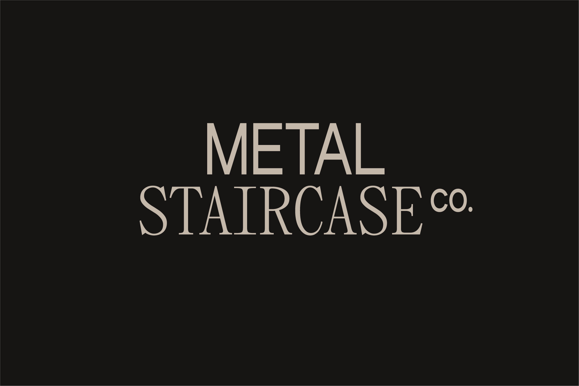
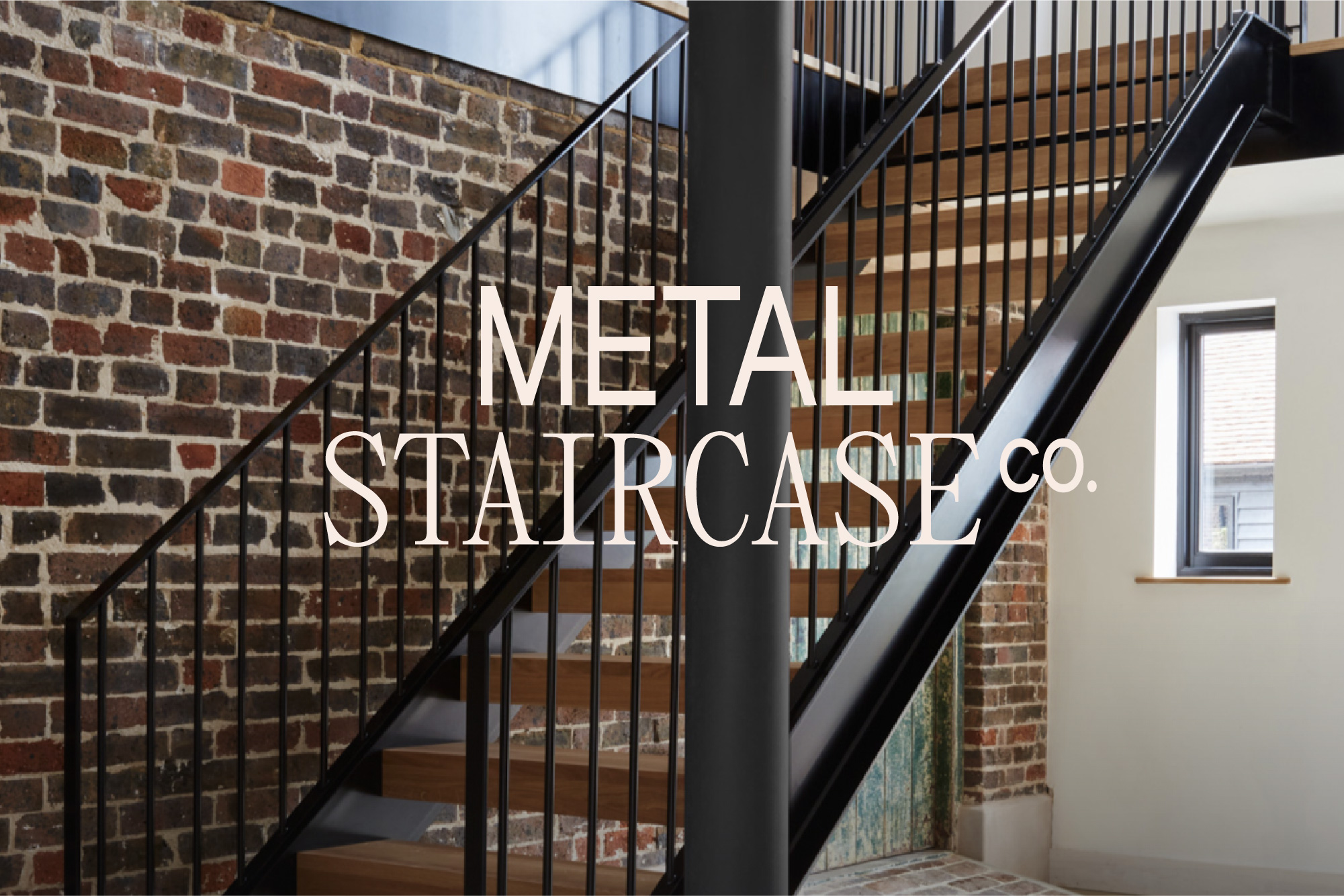
In this concept we have combined a condensed sans serif with a serif typestyle to form the logotype. Again, this serves to illustrate the dual focus of your staircase designs — the technical combining with the beautiful to create a bespoke outcome for your clients. The difference in type weight and style is intentional to create visual tension in the same way your staircases use a combination of metal, wood and glass to create a perfectly balanced design.
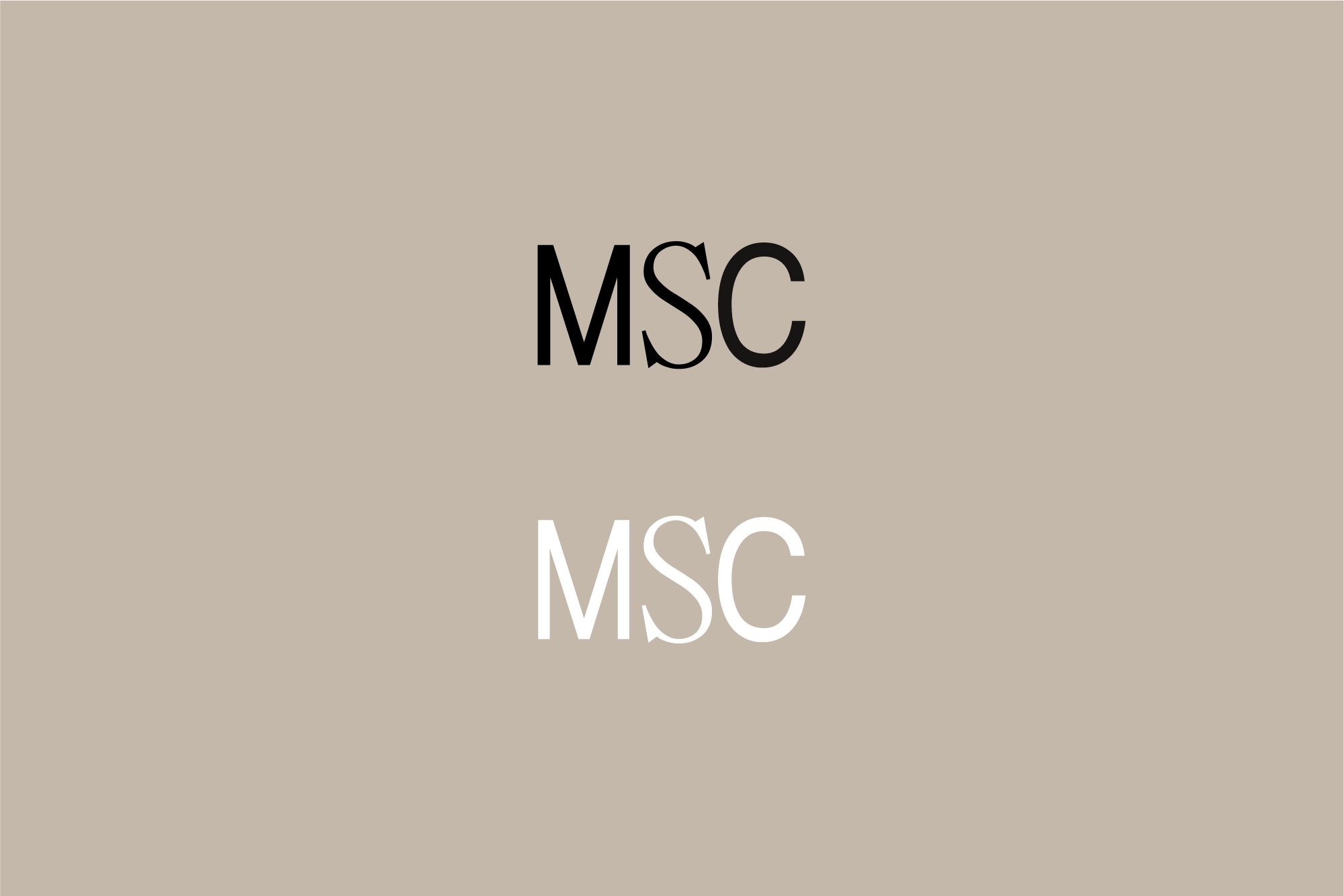
The typefaces are used throughout in body copy and supporting technical information and are flexible enough to combine in different ways to create a different feel when needed.
The typefaces are used throughout in body copy and supporting technical information and are flexible enough to combine in different ways to create a different feel when needed.