CONCEPT 4
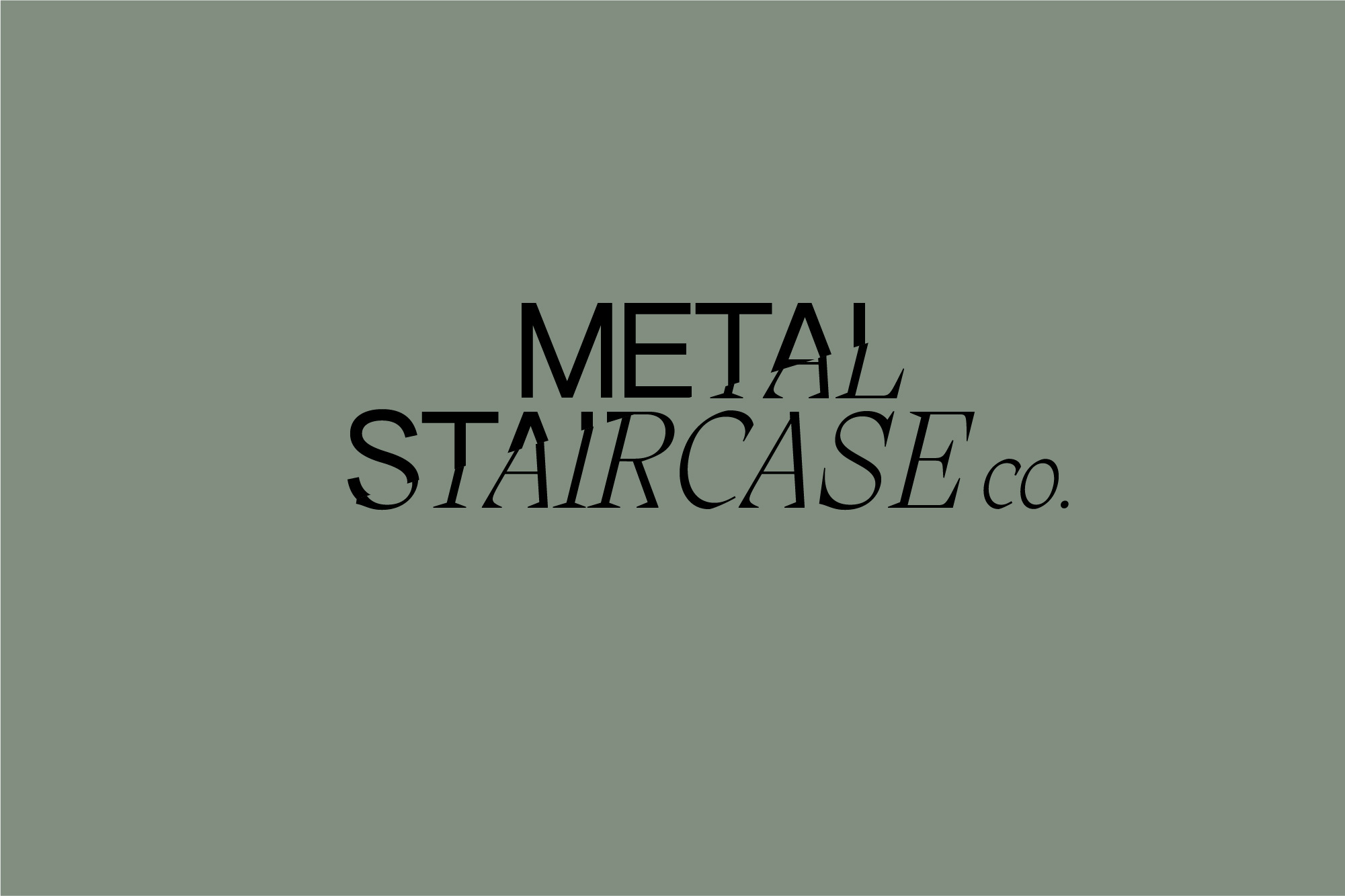
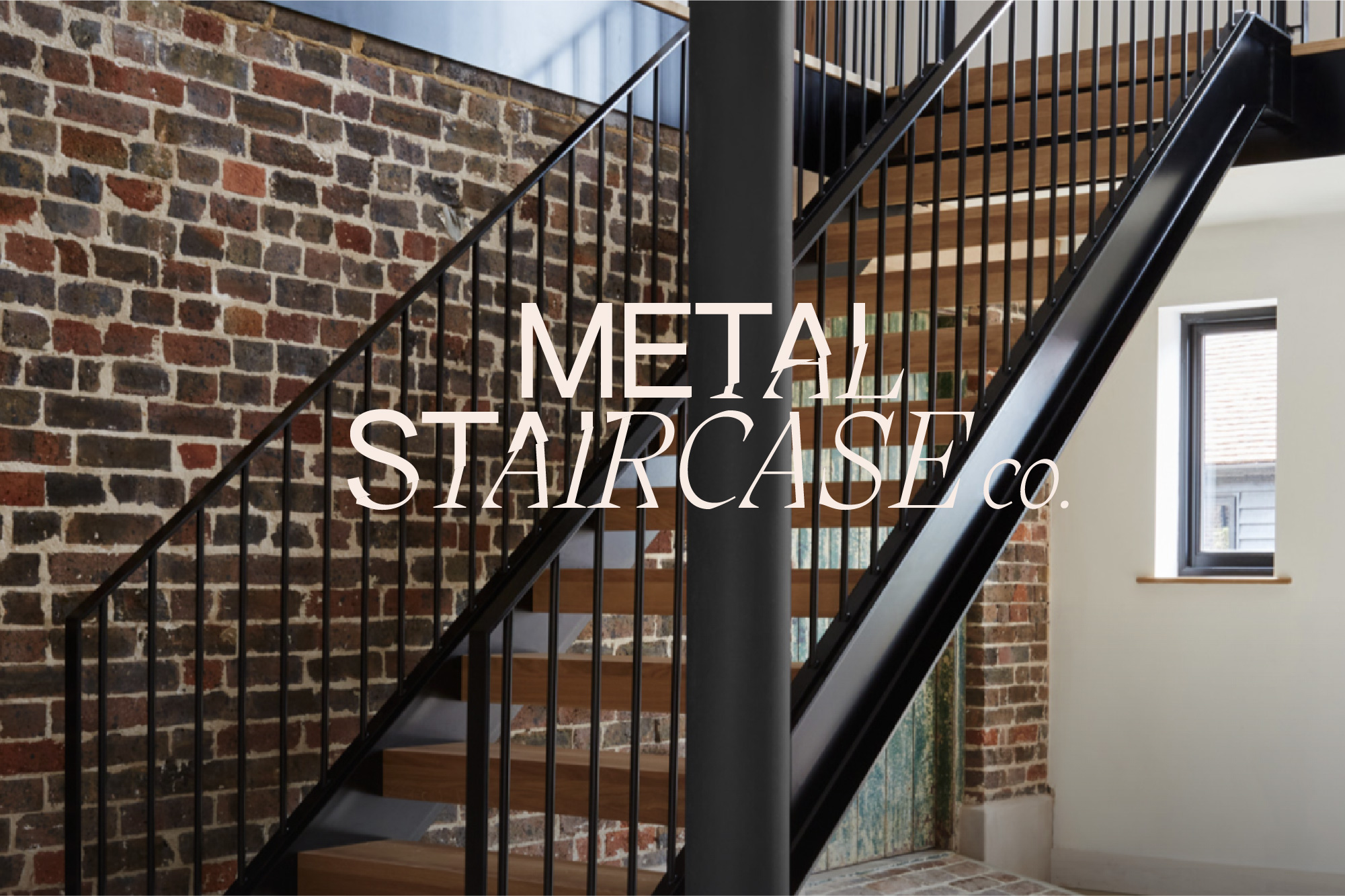
This concept explores the dual elements of the brand in a slightly different way of combining two type styles to create a logotype. The two styles are joined and yet visually separate – in the same way as oak treads combine with a glass balustrade. They join in the upward diagonal direction of a staircase and purposely don't meld together perfectly to show the join and reflection effect.
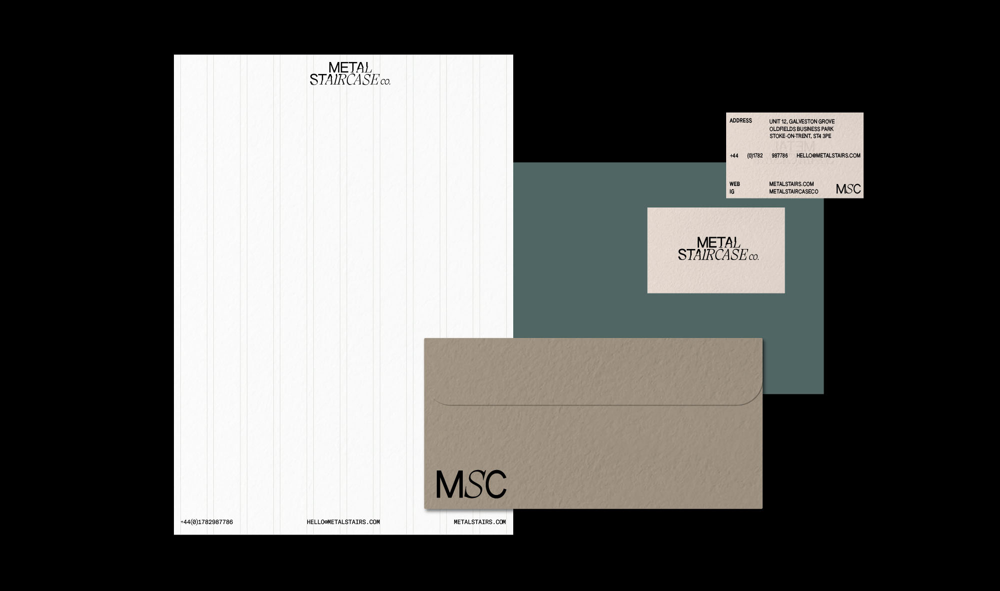
This concept also uses a modular grid system to layout text and imagery to give visual structure to a minimal layout.
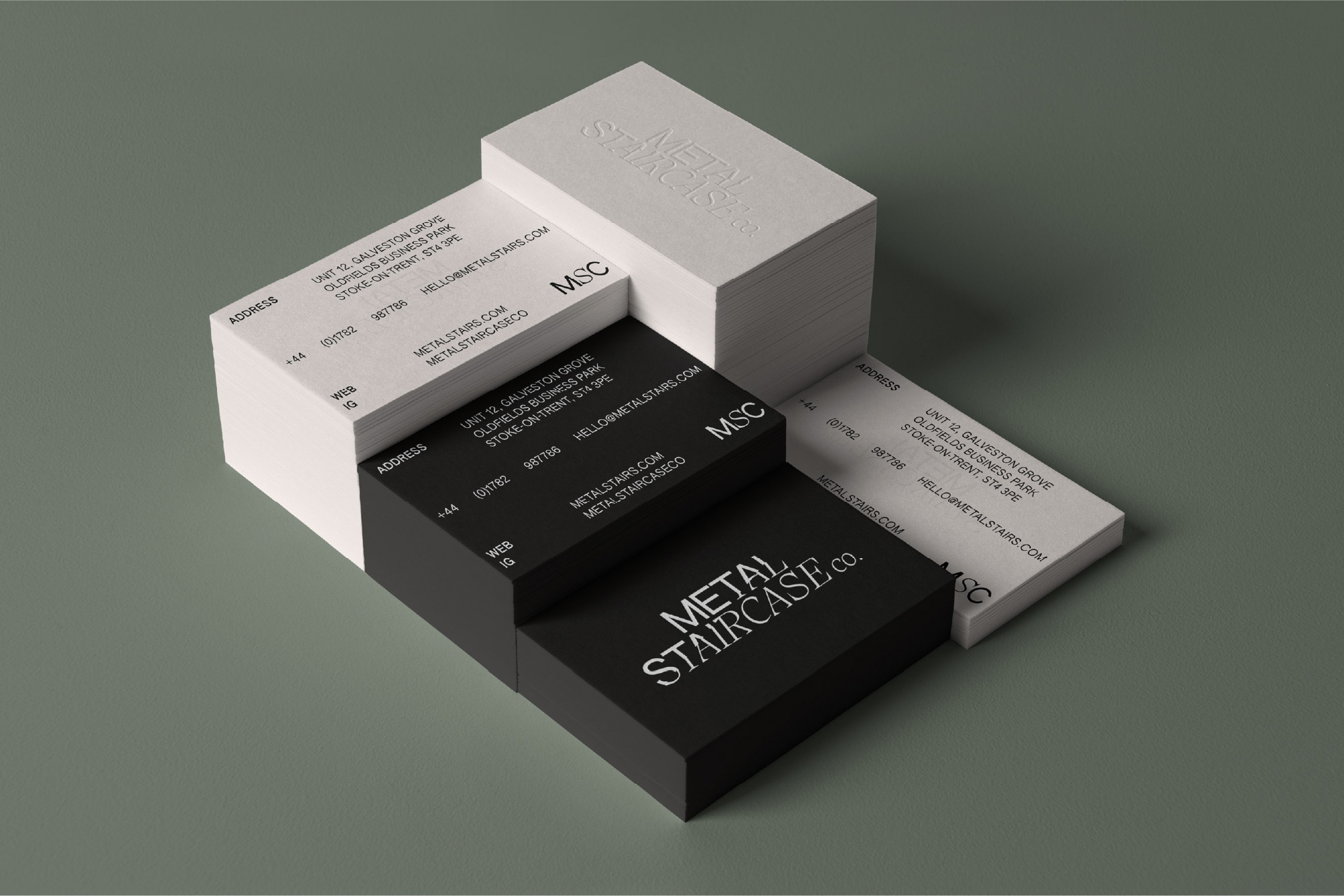
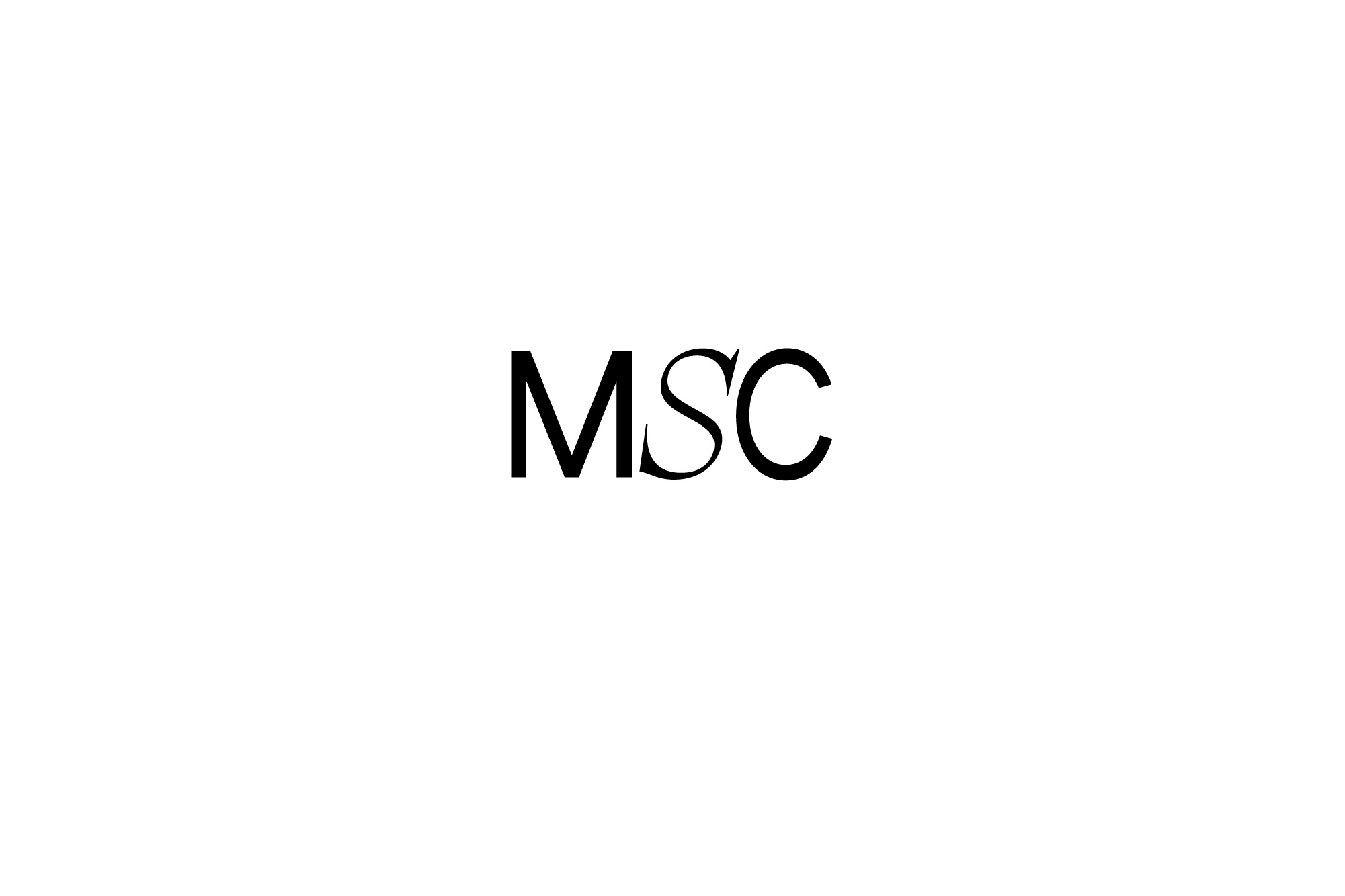
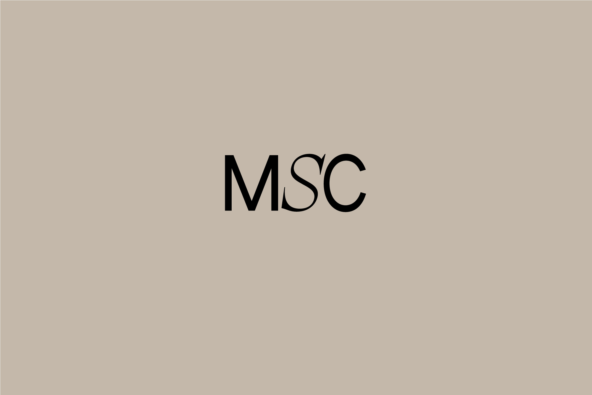
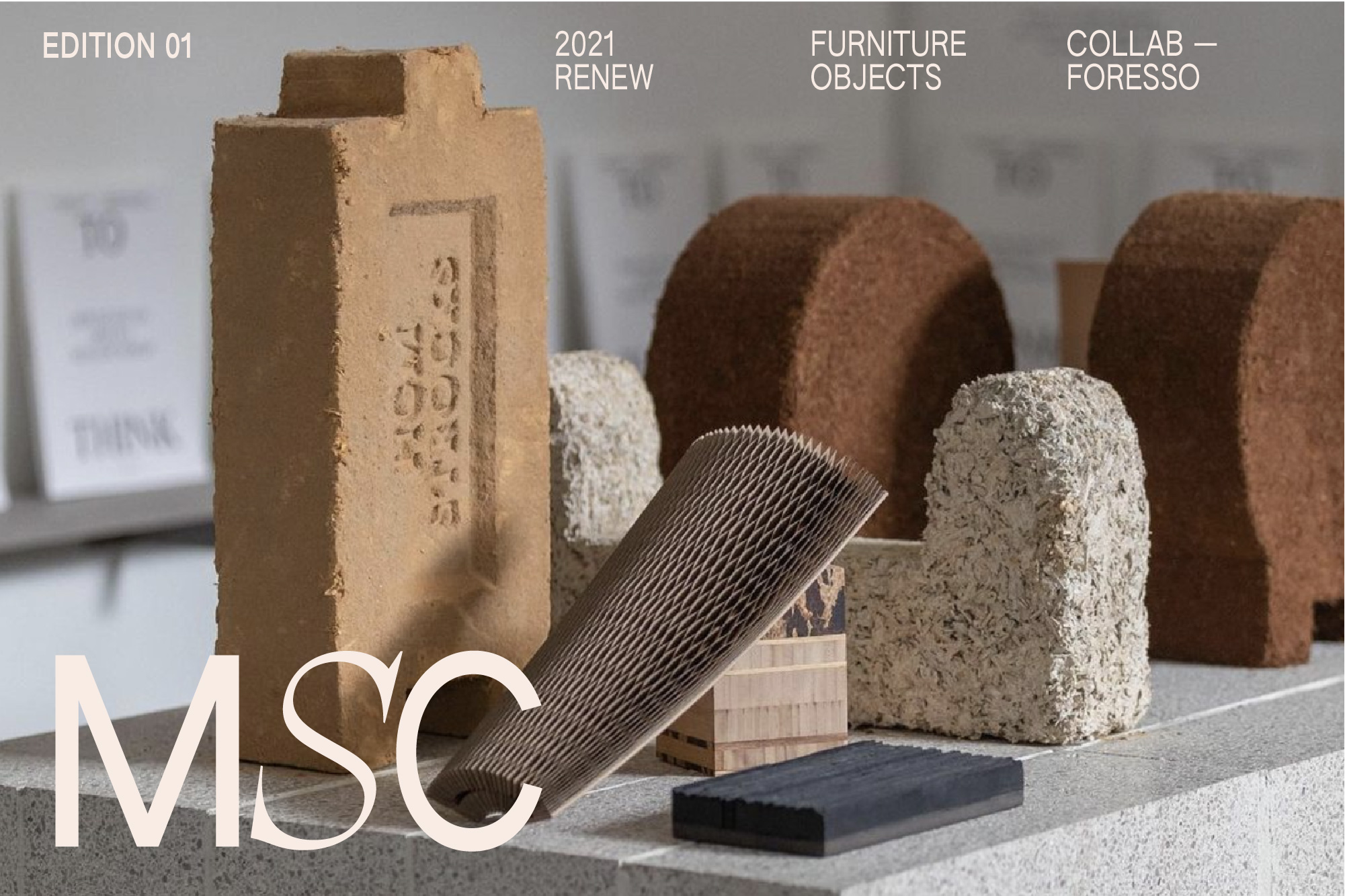
With each of the MSC logo icons, the 'S' is visually different, paving the way for it to be animated to interchange with other graphic elements to introduce other product offerings if the range is expanded.
This concept also uses a modular grid system to layout text and imagery to give visual structure to a minimal layout.
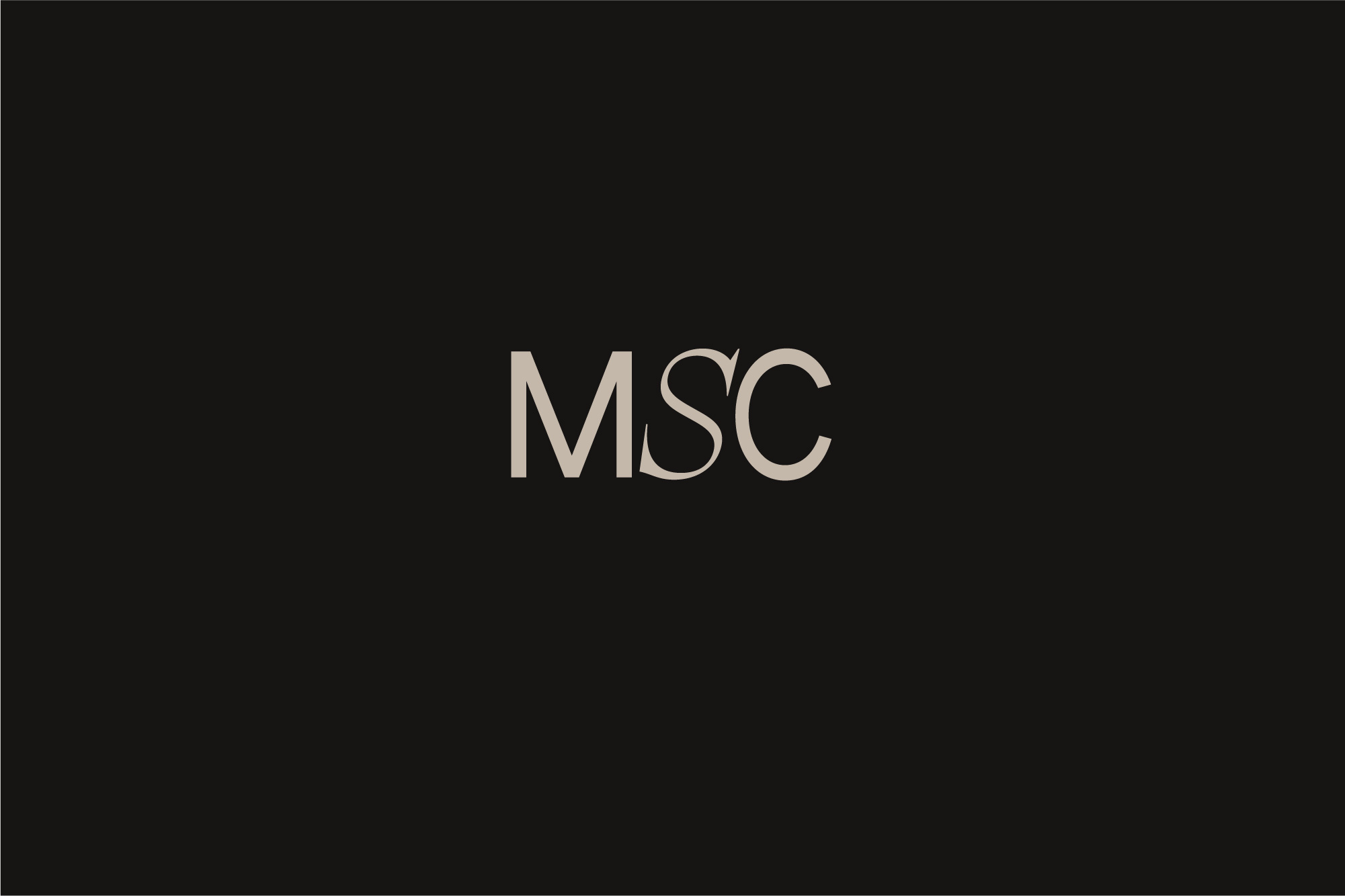
With each of the MSC logo icons, the 'S' is visually different, paving the way for it to be animated to interchange with other graphic elements to introduce other product offerings if the range is expanded.