Typography & graphic shapes
Two key aspects of the Signature Squash identity will be the typography and tone of voice. These both need to enhance the identity concept and be attractive to prospective students, their parents as well as the investment community.
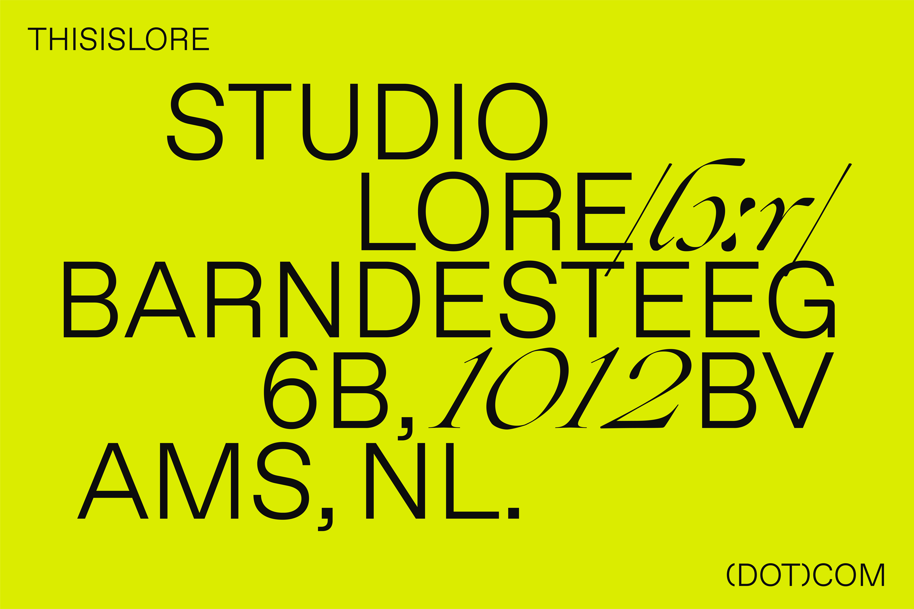
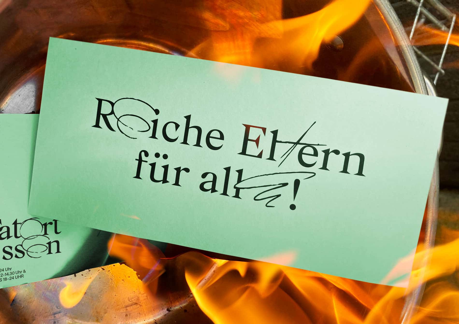
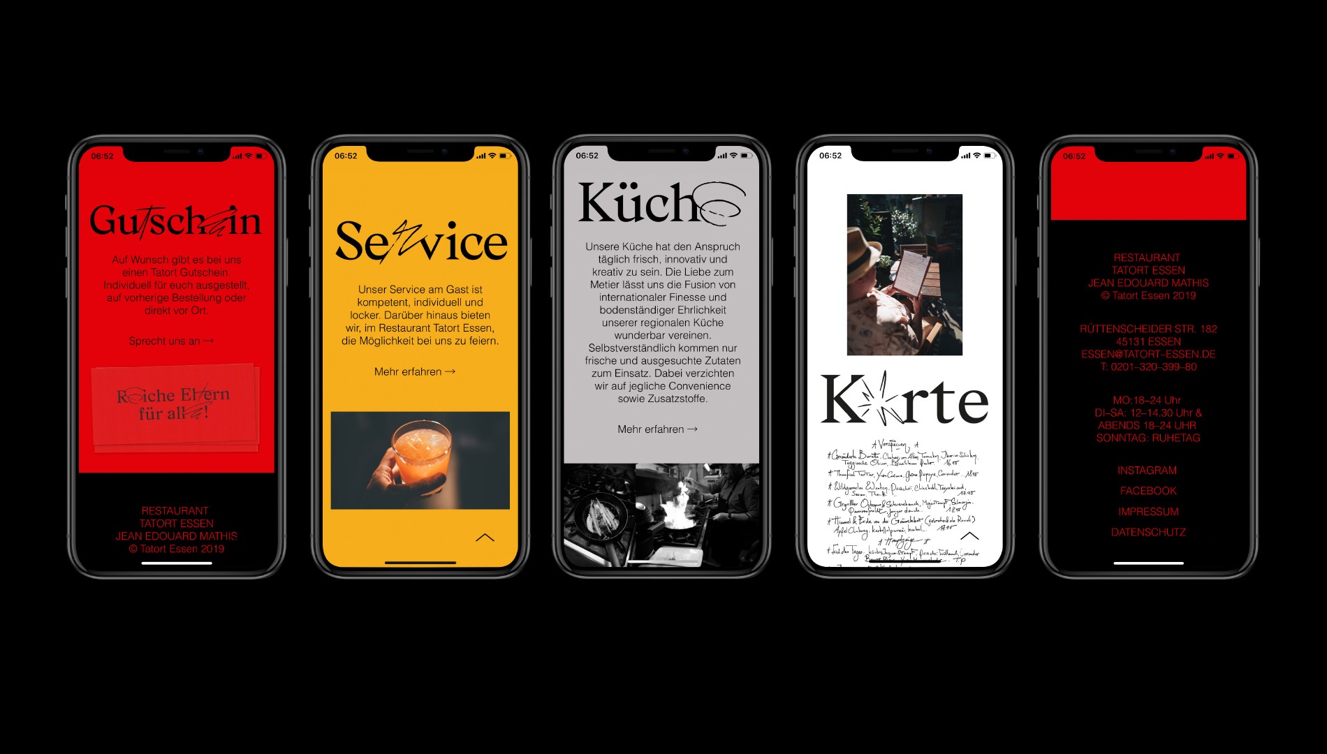
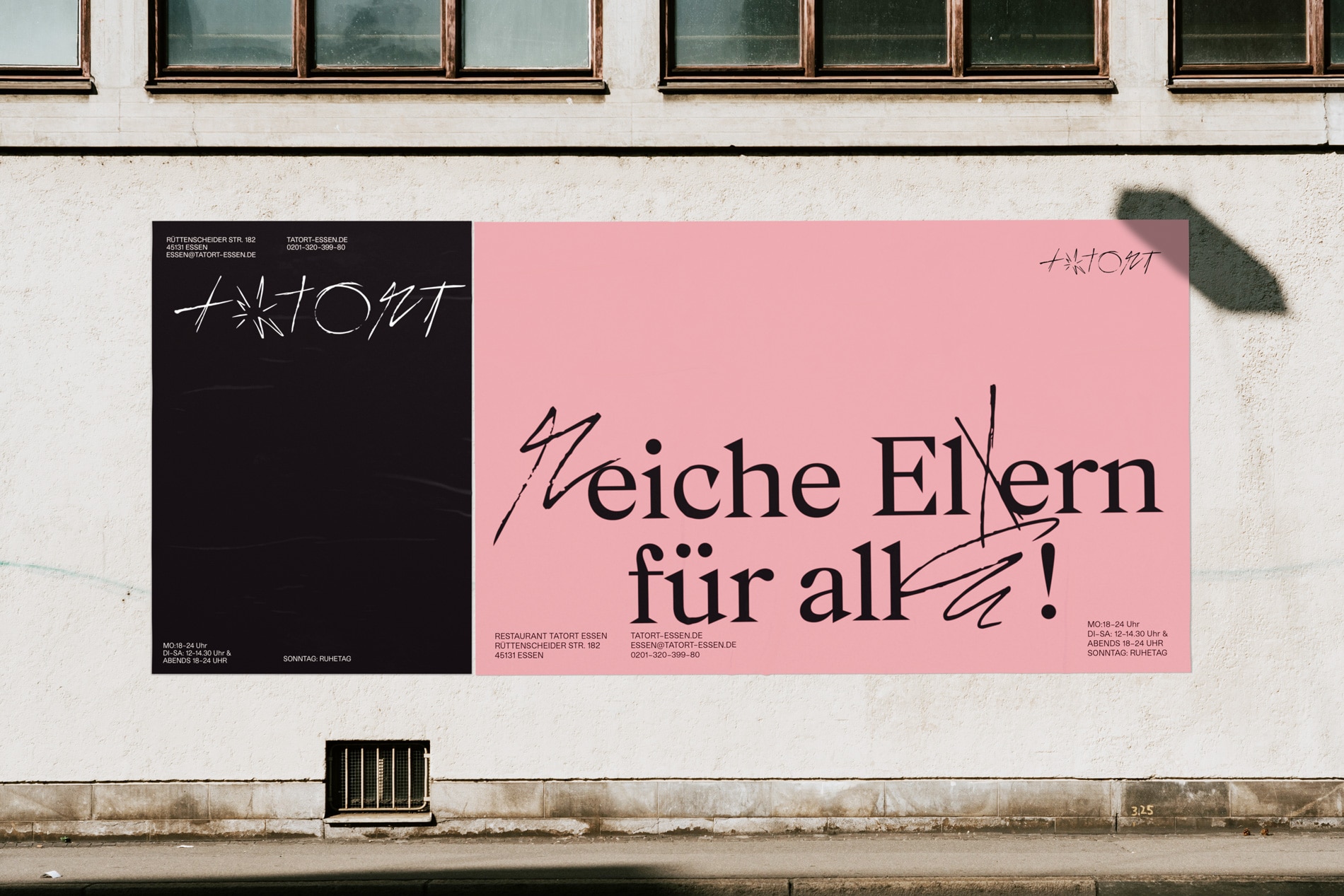
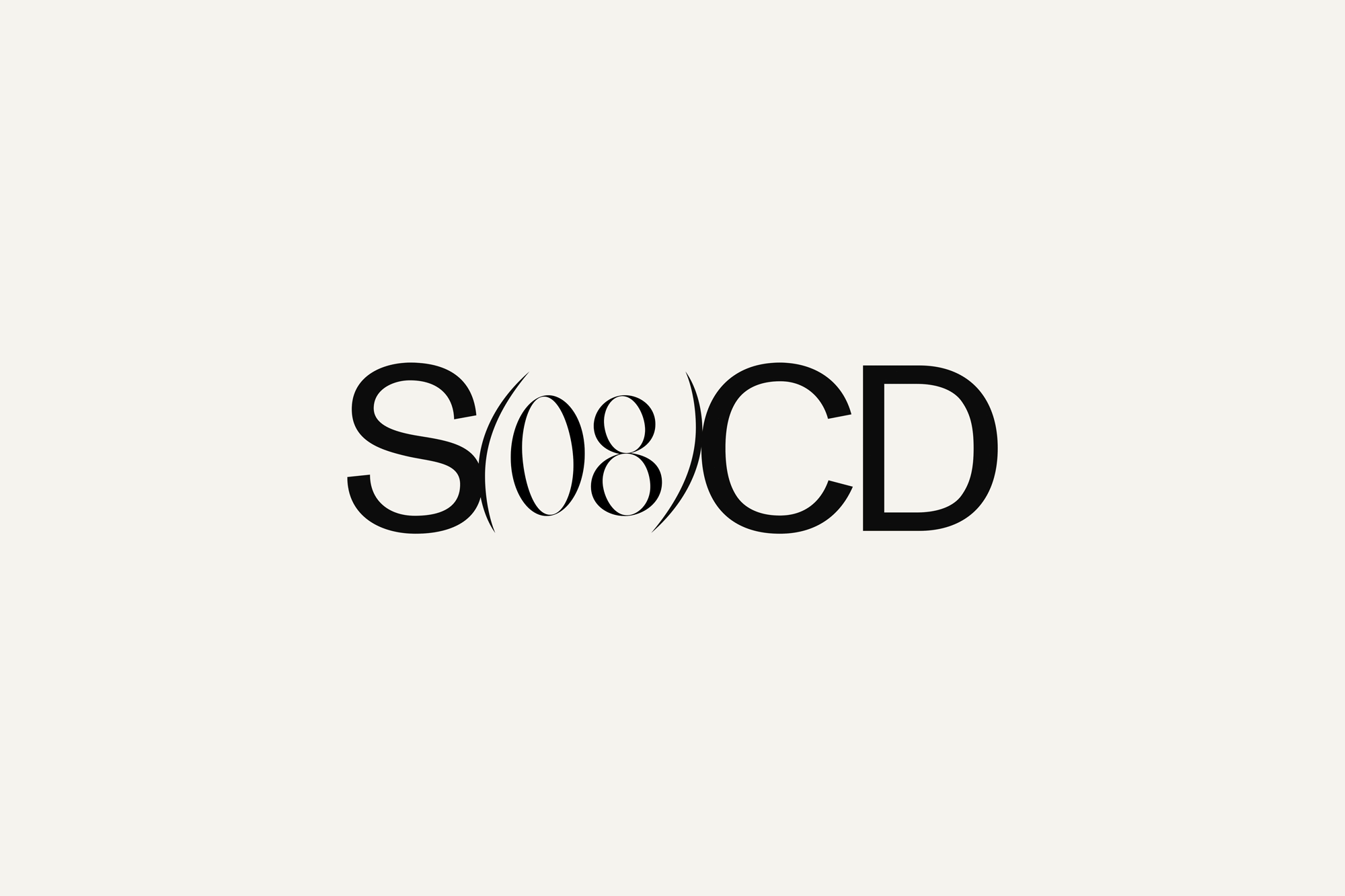
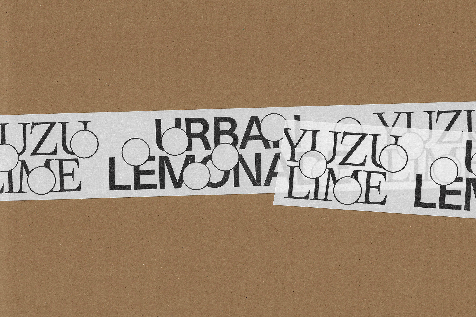
One thing we will explore is differentiating the two words within the wordmark. This could be done by using multiple type styles for the 'Signature' part of the wordmark, for example a looser, almost spray-painted feel. This could possibly be contrasting but complementary serif and sans serif fonts. This concept highlights the two sides to the education: sporting and academic; individuality and the team; and creative flair with control / discipline.
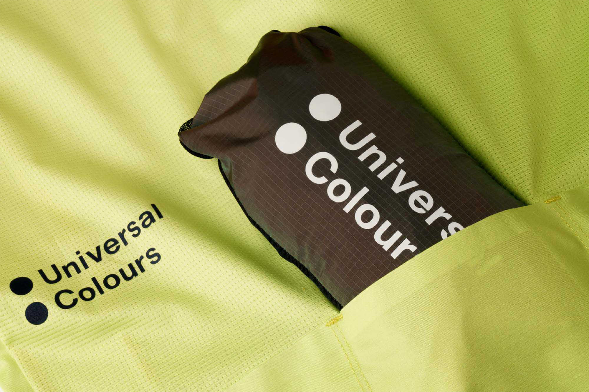
We will also explore the idea of using the double dot as a graphic mark which can be used as a separator or link between two words.
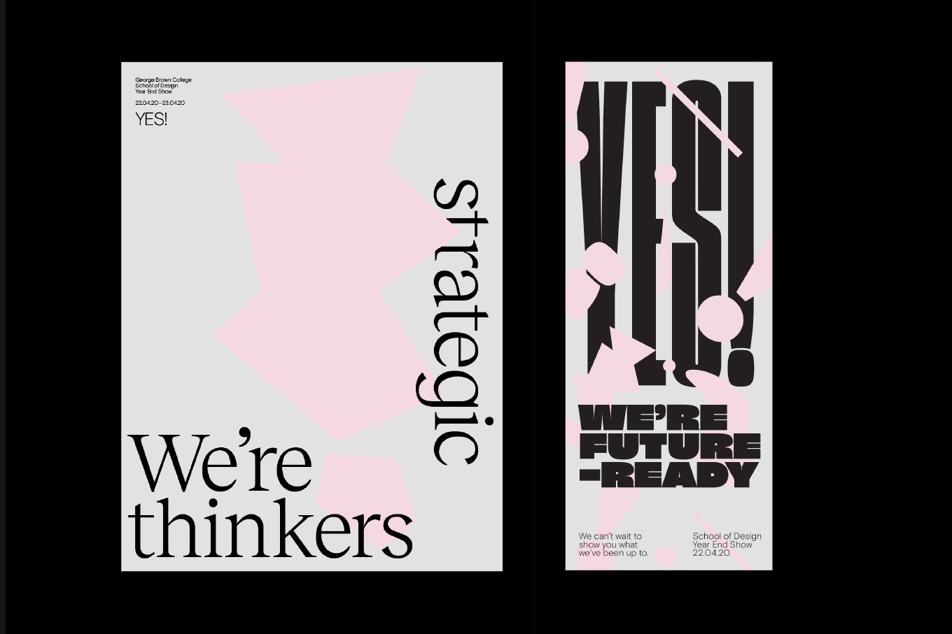
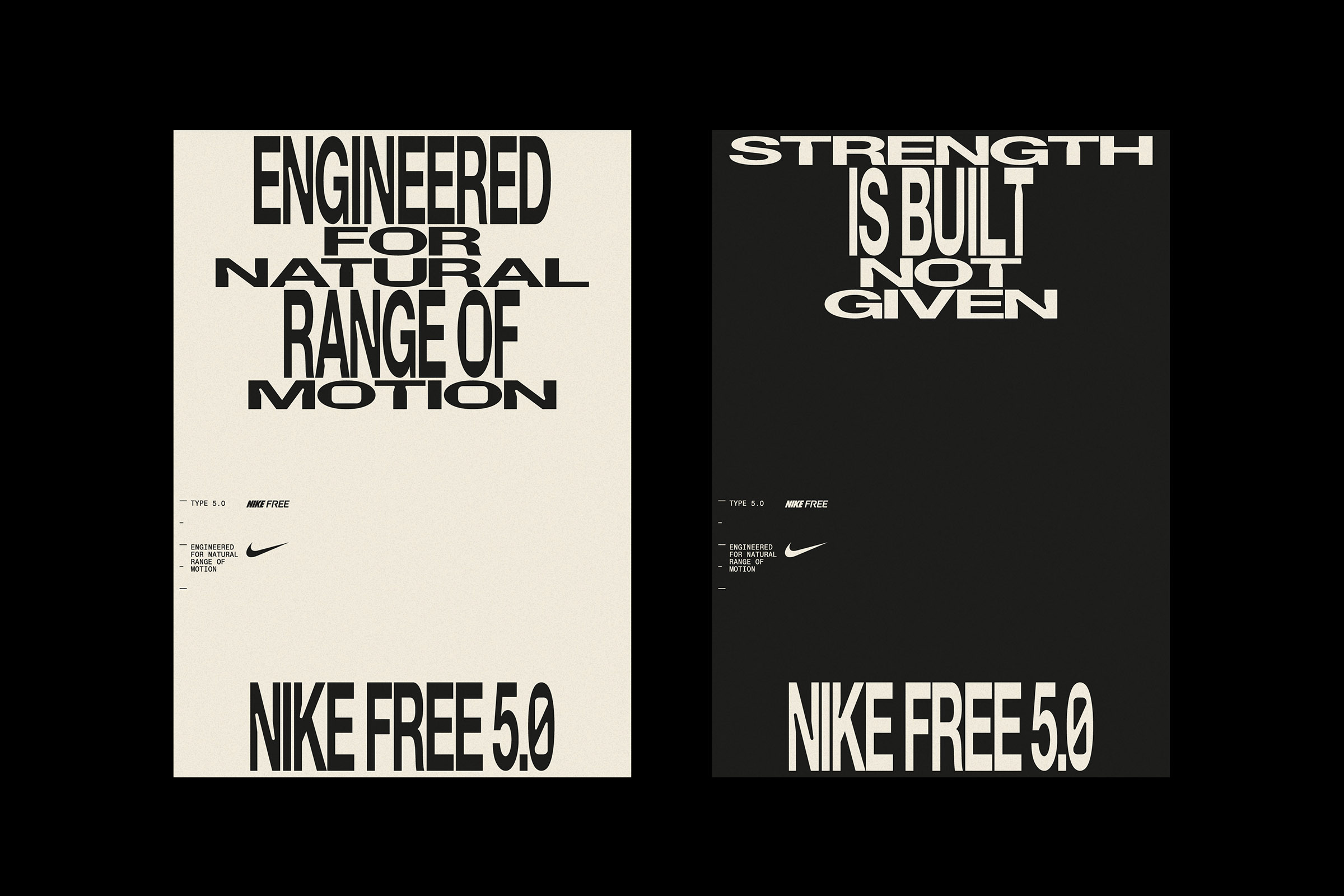
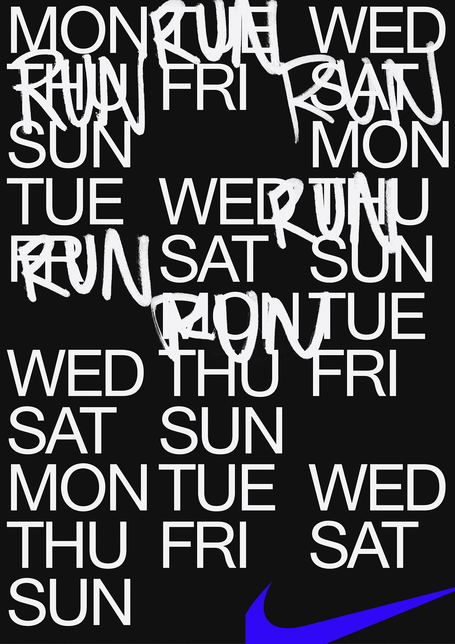
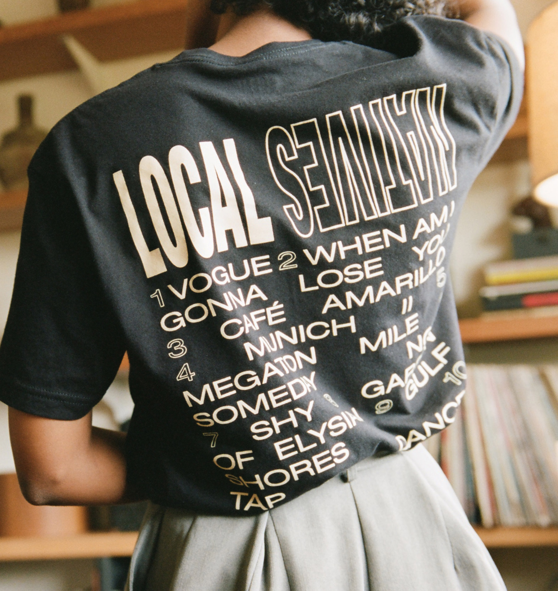
The Signature Squash identity should have a dynamic typographic style that speaks to the energy and fast pace of the sport and those at the academy. This could be shown in kinetic type where words stretch and compress, replicating the transfer of energy from player to ball.
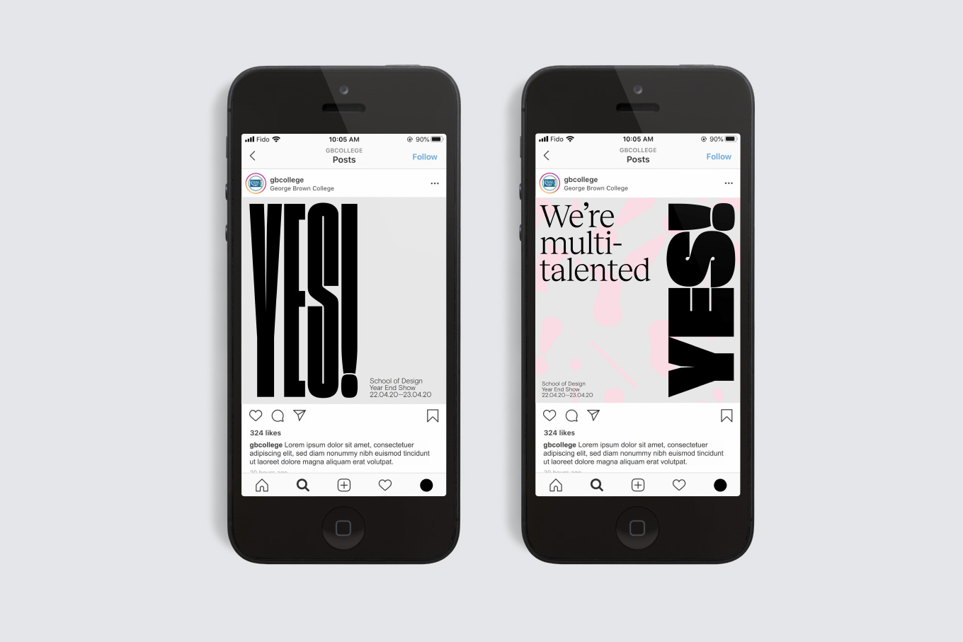
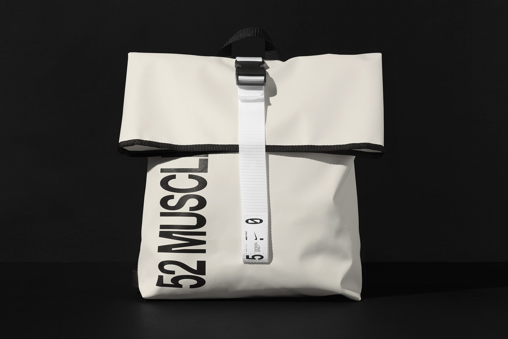
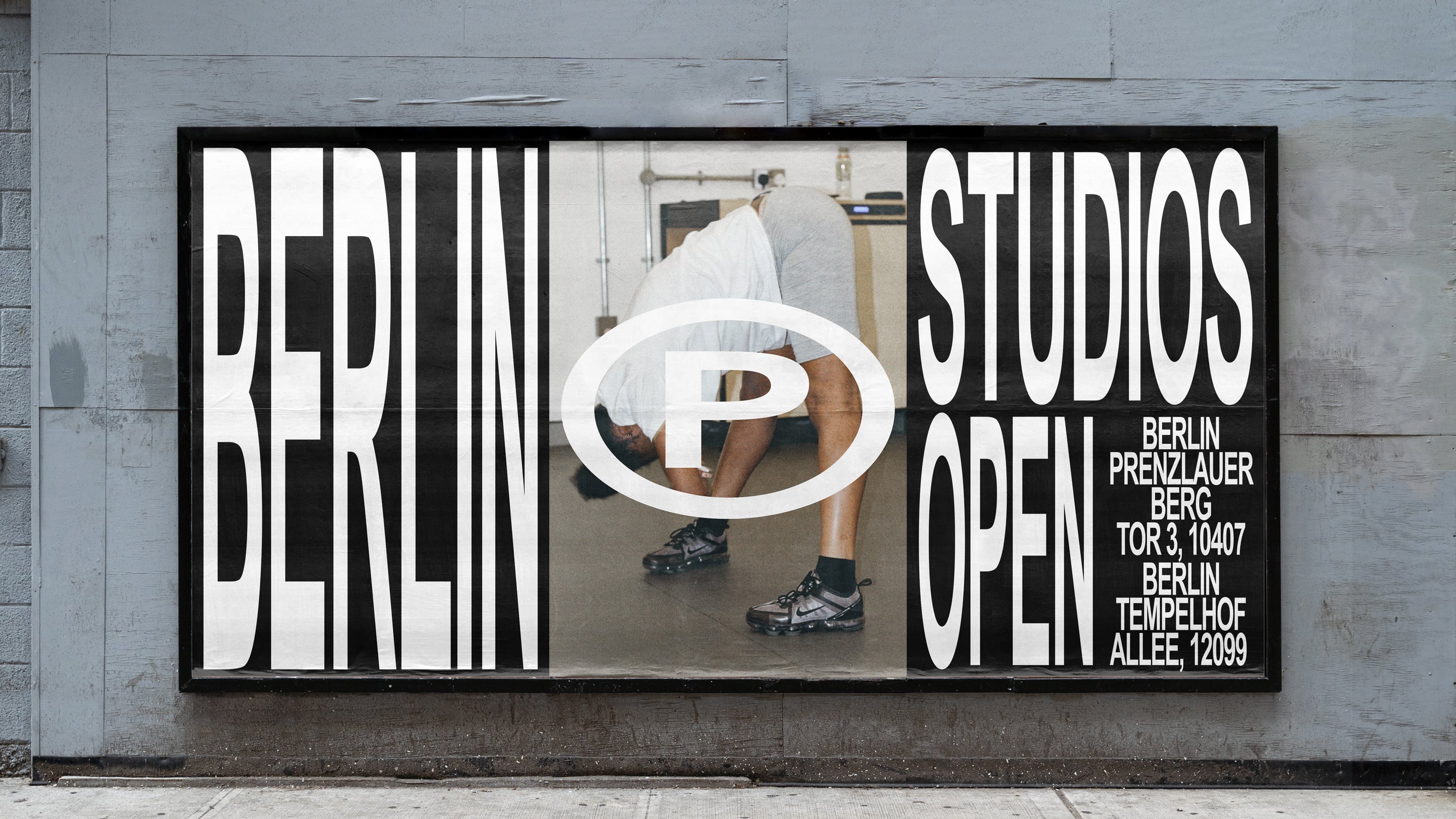
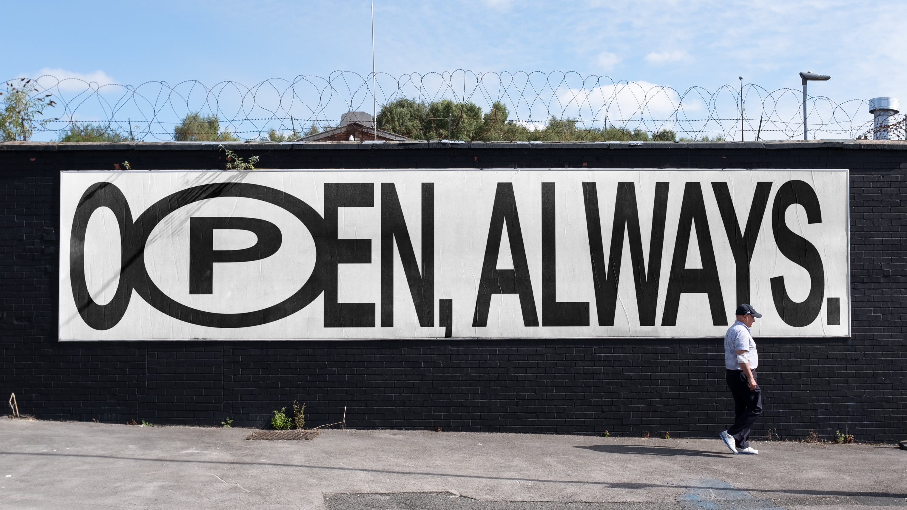
We would bring together the most successful typographic concepts when applying the typography across the many touchpoints, in print, on screen and in environmental graphics.
One thing we will explore is differentiating the two words within the wordmark. This could be done by using multiple type styles for the 'Signature' part of the wordmark, for example a looser, almost spray-painted feel. This could possibly be contrasting but complementary serif and sans serif fonts. This concept highlights the two sides to the education: sporting and academic; individuality and the team; and creative flair with control / discipline.
We will also explore the idea of using the double dot as a graphic mark which can be used as a separator or link between two words.
The Signature Squash identity should have a dynamic typographic style that speaks to the energy and fast pace of the sport and those at the academy. This could be shown in kinetic type where words stretch and compress, replicating the transfer of energy from player to ball.
We would bring together the most successful typographic concepts when applying the typography across the many touchpoints, in print, on screen and in environmental graphics.